4 Scenes to Enhance Your 3D Skills: From Viking Huts to Nightmare Fantasies
Concept Artist and Art Director Teo Mathlein already had a lot of 2D and 3D knowledge, but wasn't sure how to combine the two disciplines to make the most efficient workflow for the best artwork. In four assignments, Teo leveraged different techniques and processes to make the most out of his skills. Check out his impressive results, including:
 My name is Teo Mathlein and I work as a concept artist and art director, currently at Goodbye Kansas Studios in Stockholm. I already had quite a lot of experience working in 3D before taking this class. I’ve often struggled with deciding when to use 3D and for what tasks. I also felt I often wasted time working in 3D on details that turned out to be hardly even visible in the final image. I enrolled in 2D for 3D Artists hoping to consolidate my knowledge and learn new tips and tricks to speed up my workflow.
1. Assignments Overview
The class consisted of 8 different assignments over 10 weeks, but for this article, I’ve chosen to focus on the 4 of the assignments that I think best illustrate my different approaches to working in 3D. If you'd like to see the other assignments (like the Desert Temple above), you can check out my Artstation.
Watch this overview of 3D for 2D Artists taught by Sergio Castaneda and Maarten Hermans.
All the work is done in Blender. I should also note that in all of these assignments I always started out by collecting references, both for objects in the scene and for mood, lighting, and grading.
2. Viking Hut
The first assignment I'll discuss involved creating the interior of a Viking hut.
For this assignment, I started by roughly boxing out the space of the interior using only cubes and cylinders. Once I was confident that the basic layout of the hut would work, I took a step back and started modeling props to populate it with.
I made these assets using the basic blender modeling tools. I also got a lot of help from the “Quick Shape” and “Quick Curve” plugins by Jama Jurabaev and Aleksandr Kilimnik. These plugins help you create geometry by simply drawing shapes with your stylus in 3d space. They're especially useful to make models with an uneven and organic feel.
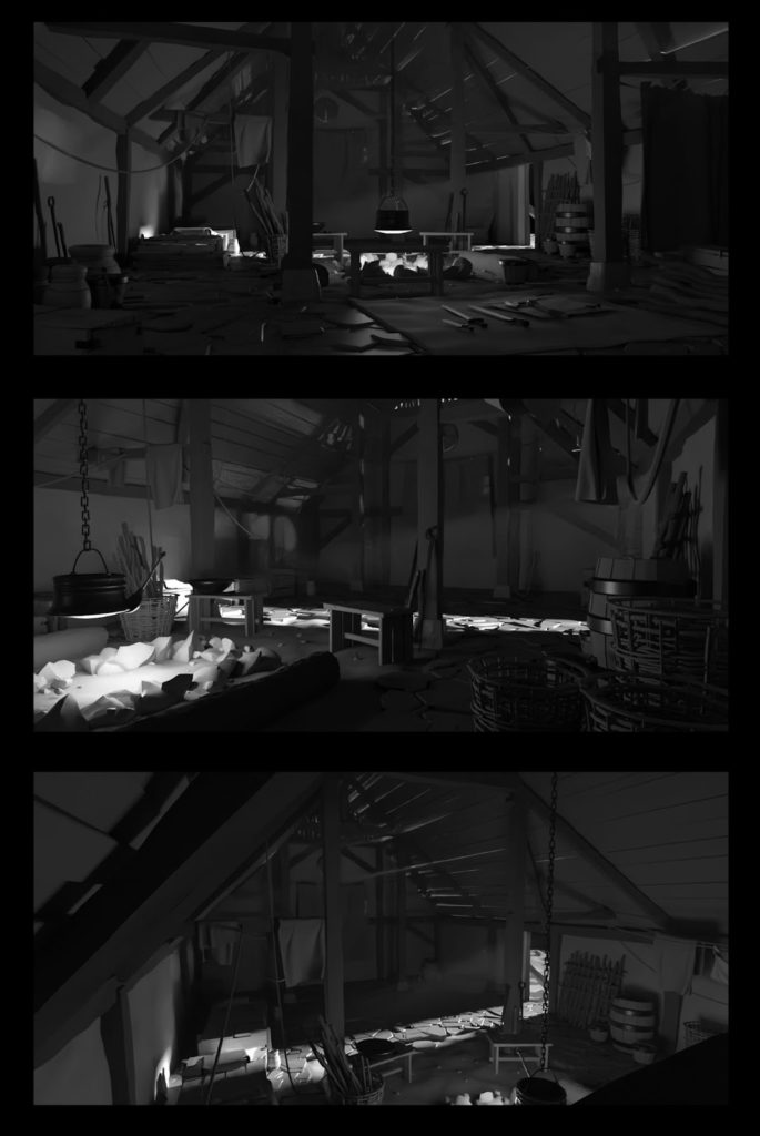
After creating the assets, I went back to my rough blockout. Then I started replacing the cubs and cylinders with the props I built. After adjusting the lighting, I started trying out different camera angles for the shots that I wanted to produce:
Here, I did all the rendering with Blender's real-time render engine Eevee. This allowed me to quickly navigate around in the viewport, try out different camera angles, and experiment with volumetric fog without having to wait for renders.
After deciding I was happy with these renders, I took them into photoshop to give the images some final tweaks. This step mostly helped to readability and heighten the impression of depth.
I rendered out the “Mist” and “Volume Light” as separate passes from Blender to enhance the atmosphere inside the hut. I also made a few adjustments on top to take down the contrast outside the focal areas and brighten the areas of interest.
This final step takes very little time but makes a huge difference.
Curious to see a breakdown of a stylized Viking hut? Read "6 Steps to Create a Stylized Dwarven Feast Hall."
3. Cabin in the Woods
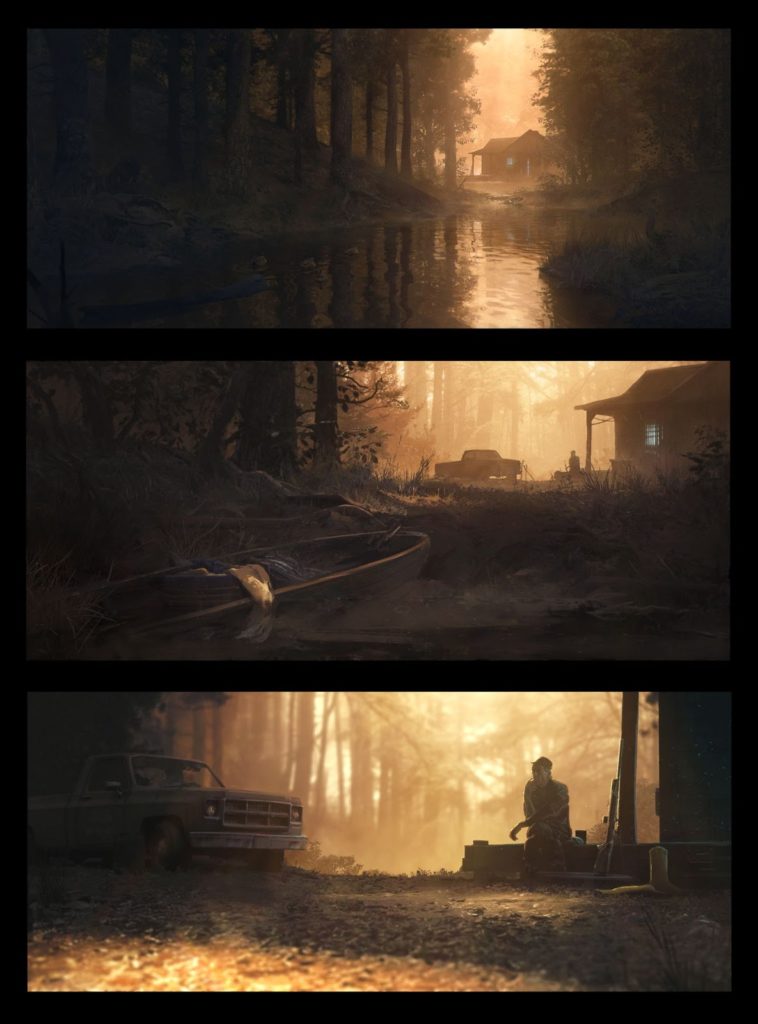
For week 6’s assignment, I used a completely different workflow from the one in the "Viking hut". Instead of starting by building assets in 3D, I began by making thumbnails in Photoshop. With these as a guide, I searched for pre-made models I could use to build the shots.
Then, I downloaded assets from Sketchfab, 3d Warehouse and Quixel Megascans to populate the scene quickly. This gave me a solid base to later paint on top of. For this assignment I used the Cycles render engine, as I wanted to go for more of a realistic look:
I used downloaded assets to build most of the scene. I couldn't find decent 3D models of all of the items in my thumbnails, so I added those in 2D instead. Because of that, I spent a lot more time on this assignment in Photoshop on painting and photobashing.
Our instructor Sergio pushed for us to always simplify the shapes of light and dark in our compositions, and I tried to take that to heart here. If you compare the pure render with the final image, you see that I’ve put a lot of effort into removing areas of noise and contrast outside the focal points. This does a lot to make the images more readable.
Making an image based on pre-made resources like this is without a doubt the fastest way to work, but it has drawbacks. It makes it very easy to lose your originality and start letting the downloaded assets take over the narrative of the image. In my experience, it’s best to work in this way only if you have a very clear idea of the image you want to make before you start finding assets.
4. Space Scavenger's Ship
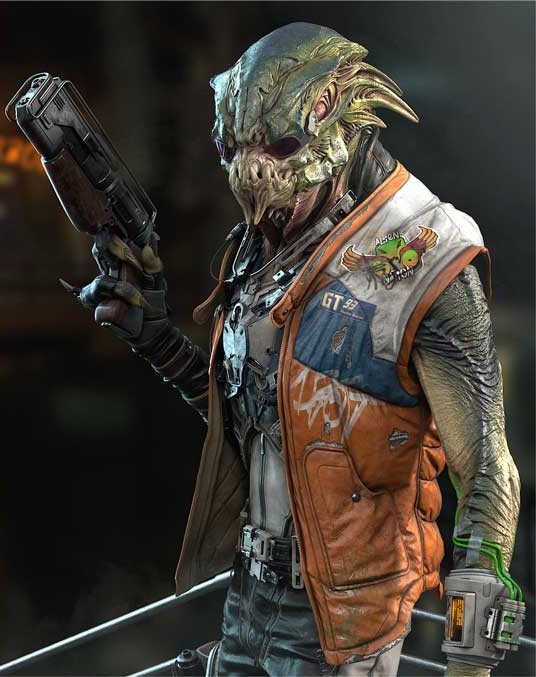
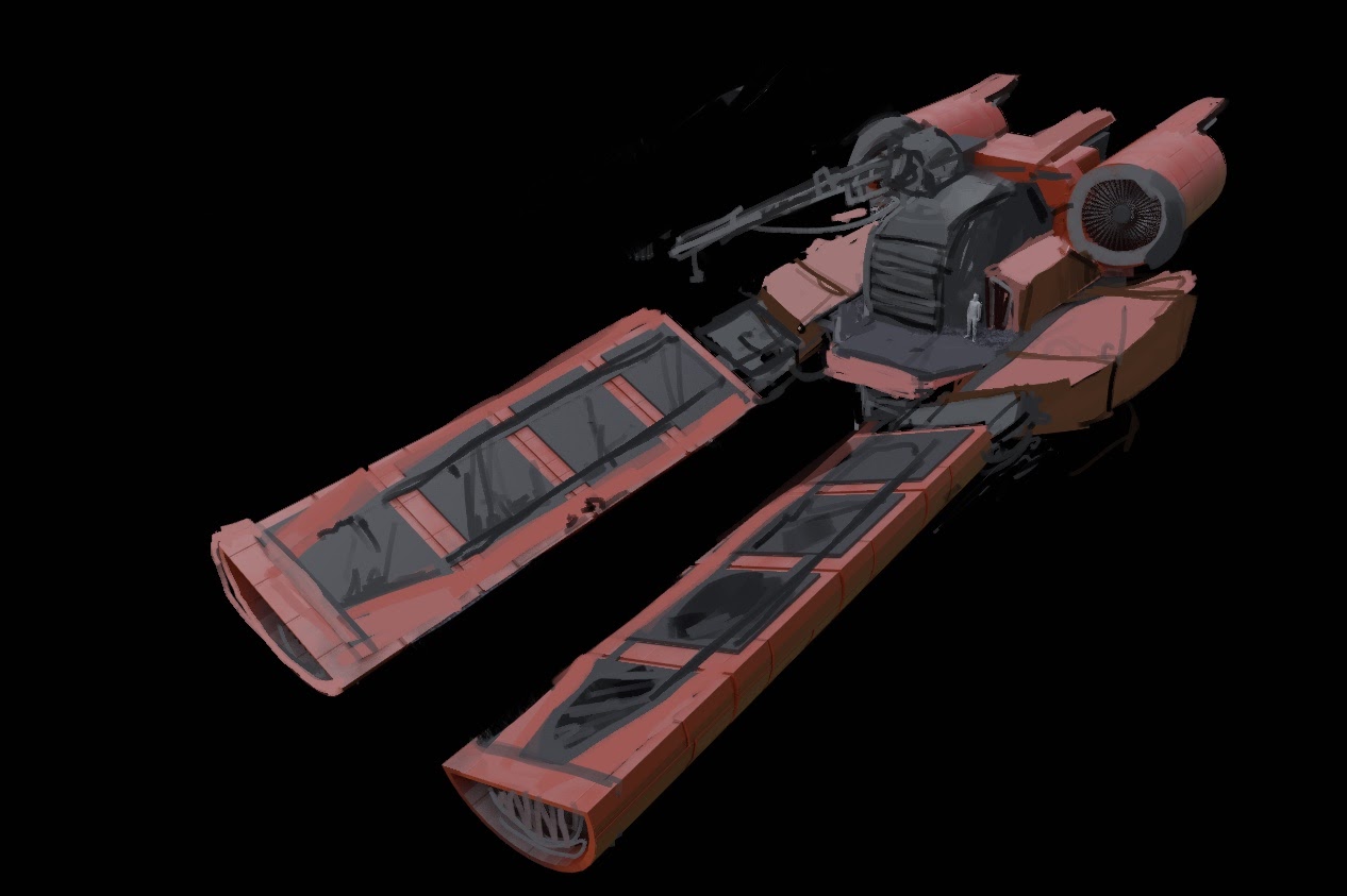
The 7th week's assignment was to create a “space scavenger's spaceship traveling through the clouds of an alien planet. First, I built the ship on its own before placing it in any scene.
Instead of trying to figure everything out in the first sketch, I wanted to iterate on the design going back and forth between 2D and 3D. I jumped into Blender and started blocking out the big shapes: Seeing it rendered out, I thought it looked a bit clunky and boring. So I made a quick paintover in Photoshop, to add more detail and break up the shapes. Using the paintover as a guide, I went back into Blender and continued working on the ship.
Scroll through the images to see this process.
Most of the ship is modeled from scratch, but some smaller tech parts are kitbashed using assets from Sketchfab. At this stage I was happy enough with the ship to place it in the scene, start exploring camera angles, and render it out:
As I figured the ships in the background would be out of focus, I kitbashed them together quickly using parts from downloaded assets. Then I went into photoshop and started working on the background. I added texture to the models, and grading the image. I was really happy with the result, especially since this was sort of a new workflow for me.
Check out CGMA's Hard Surface Modeling for Films course taught by Jay Machado and Andrew Bangel.
5. The Wrath of God
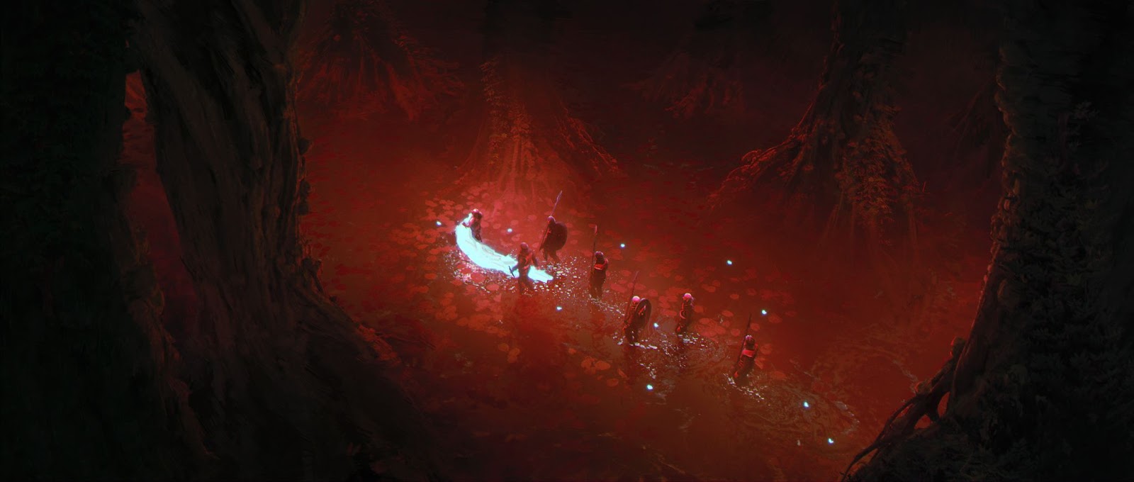
My idea for this final project was to make a homage to one of my favorite movies, Werner Herzog's “Aguirre, the Wrath of God”, but to change the setting to a nightmarish fantasy world.
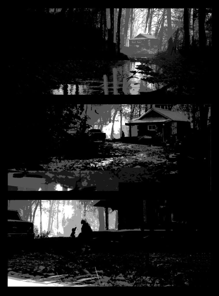
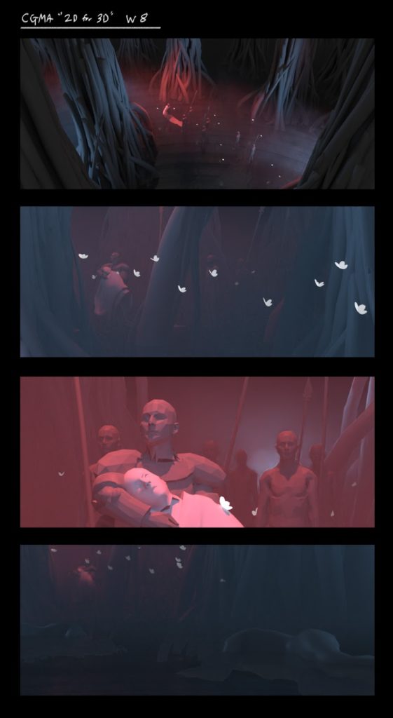
I had a clear idea of the story I wanted to tell, so I started with simple 2D thumbnails in photoshop.
Looking to perfect your thumbnails? Explore CGMA's Composition for Concept Art and Illustration course taught by Mauricio Abril and Axel Sauerwald.
Even though these were really rough, I wanted to make sure that the idea for these shots actually worked out in 3D before going any further. I went into Blender with these as a reference and made a very quick block out.
Even though this blockout was far from the intended look, it made me confident that the composition in the thumbnails would actually work in 3D. Again, the “Quick Curve” addon came in very handy for being able to create those trees in a matter of minutes. Using these renders as a base, I made another paintover to get a new set of thumbnails with enough information to use as a guide for creating the final scenes.
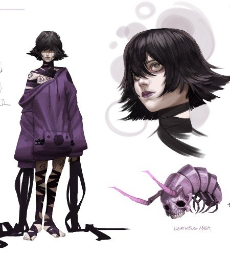
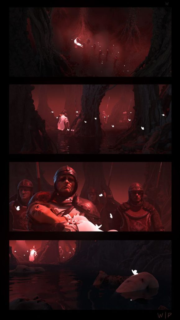
With these working as a guide, I had enough information to start building assets and characters. The assets in this scene came from a mix of kitbashing and sculpting my own props. The trees were sculpted from scratch, while the grass and minor environment props were from Quixel Megascans. The characters were kitbashed together using clothes and armour from different downloaded models, and exported to Mixamo for quick rigging and animation.
With this done, I began replacing the assets in the blockout scene, and started tweaking the lighting. Getting the volumetric fog to look like I wanted turned out a bit tricky, but it felt important in achieving the look that I was going for. Eventually, I ended up rendering out one version with fog and one without, then blending between them in photoshop.
initially tried making the girl in Daz3D, but she ended up looking very artificial and stiff in the final renders. Eventually, I replaced her with a photograph instead. I think that if you want to do a close-up of a character's face, you usually need to photobash or paint on top of the 3D to give it that extra spark of life - a point which Sergio also stressed in his feedback.
Using some more useful feedback by Sergio about simplifying shapes and enhancing readability, I took the renders into Photoshop. Here, I rendered out a lot of extra passes to make it easier to isolate lights and make quick selections in Photoshop.
Scroll through Teo's final images.
I’m very happy with the result here. Breaking down my process in many smaller steps like this really helped me push myself further than I think I could have if I tried to solve every problem at once.
Final Thoughts
- I would definitely recommend this class, just as much for what it does teach as for what it does not teach.
- The possibilities for software like Blender are insanely vast, ranging from rigging, animation, procedural texturing, fluid simulation, to movie editing, and more still. If you jump in thinking you have to master all of this you are either going to burn yourself out or spend the next 10 years watching tutorials.
- The curriculum of 2D for 3D Artists did an excellent job of narrowing down the focus to just the tools that are most useful when creating a 3D base for a 2D image - which was exactly what I was interested in.
- It also helped that Sergio Castaneda is a fantastic teacher, who has both a lot of technical and artistic know-how, and a big enthusiasm for learning and sharing new skills.
LEARN MORE
CGMA provides comprehensive instruction for Art, Games, and VFX industries in a variety of courses for a range of students, from 2D and 3D artists looking to supplement their college studies to industry professionals looking to stay up to date on emerging trends and techniques in the field.
RELATED LINKS
See Teo's images from all the assignments, plus his other artwork here.
Watch this overview of 3D for 2D Artists to get an idea for the course, then enroll here! This course is taught by Sergio Castaneda and Maarten Hermans.
Curious to see a breakdown of a stylized Viking hut? Read "6 Steps to Create a Stylized Dwarven Feast Hall."
Check out CGMA's Hard Surface Modeling for Films course taught by Jay Machado and Andrew Bangel.
Looking to perfect your thumbnails? Explore CGMA's Composition for Concept Art and Illustration course taught by Mauricio Abril and Axel Sauerwald.


