5 Steps to Craft a Creepy Coming of Age Comic
Story artist and character designer Benedetta Pia Sica dusted off an old idea and brought it to life in Comics: The Art of Storytelling. Don't miss out on her breakdown, which includes:
 Hi, my name is Benedetta Pia Sica and I’m a story artist and character designer from Italy. Thanks to my mom (art teacher, sculptress, and painter) and my dad who raised me with movies, cartoons, and comics, it felt natural to choose an artistic path. So, I graduated in 2D animation in Florence. Since then, I've collaborated with an online magazine, done concept art for an indie video game, and recently got the chance to have a short story published in an Italian zine called La Psicoscimmia.

1. The Story
Since the script was the backbone of our future assignments, I ended up picking this old, nebulous story I'd had in mind for ages. It wasn't perfect, but it was right for this class. I felt there was still a chance to give some dignity to the poor characters that were rotting in my sketchbook.

Maledictus is about Susan, a young lady that decides to take care of his father’s inheritance with the help of her strange companions, like Rothard. This story talks about personal growth with a sprinkle of body horror and nonsense (my jam).
Don't miss out on Comics: The Art of Storytelling taught by Miki Montllo!
2. Moody Mood Boards
After writing down my script and storyboarding the pages, I started on the research. I love this stage because it helps me to give more solidity and credibility to my designs.

Having a story with both historical and fantasy elements, I started gathering images that could help me establish the right “mood.”

3. Character Studies
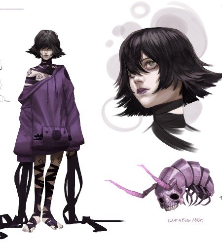
Once the mood board was over, I began to concentrate on clothes, weapons, and all the historical elements, so I could start designing the characters. Part of this process includes choosing the right shape to convey a message. Susan, for example, had to look classy and the canonically feminine Edwardian lady.

But for her design, I choose more pointy and triangular elements to emphasize her rude behavior.

On the other hand, Rothard has square and rounder forms to indicate his reliability, plus some recurring elements I used on the villagers and the creature in the forest too. Teeth and bulging eyes soon became a distinguishing mark throughout the pages.

Fortunato was the most challenging to design. Initially, he was heavily based on H.P.Lovecraft and had more pointy elements like in the nails and the shoulders. He looked more like an antagonistic figure but it wasn’t the case. In those four pages, Fortunato appears like a threatening figure for sure, but I wrote him to be more of a mentor to the protagonists.

Keeping this in mind, after I grabbed some references, probably binge-watching Phantasm at night didn’t help, I started reworking on him and choose more sturdy shapes and limited the triangular forms.
Scroll to see some more character-developing studies.
I ended up grabbing other photos and playing with shapes while keeping in mind why I choose Angus Scrimm as a new muse and what I wanted to achieve.

Check out CGMA's Art Direction for Character Designers course taught by Nate Wragg to make more project-driven characters!
4. Inking
My biggest challenge during the inking phase was to maintain continuity, so I had to redo my assignments after the corrections.
I reworked the pages and took more time on the cleaning up process, like Miki suggested, to give an organic look to the page. I used quick and precise strokes that later helped me save time while coloring.
Read "5 Steps to Creating a Spielberg-Worthy Comic" for another fantastic project from Miki's course.
5. Flat Coloring
I started with the sky to establish what palette I was going to use for the lights, shadows, and atmosphere. I choose a sunset to create a contrast between the warm, reassuring colors, and the unnatural situation the characters had to face. Another line of reasoning was adopted for the protagonists’ palette. The colors are limited and most of them are shared to highlight the connection between them. Susan has green and purple clothes like Fortunato and Rothard, which in turn share the same bluish dye I gave to the villagers.


Final Thoughts
- After the script and the storyboard, in which we roughly sketched the main key of the action, we wrote down what happened on the page and how many panels would take to narrate that sequence. Before the course, I used to draw the pages without really understanding how to use them effectively, or correctly place the balloons. I spent too much time trying to have more aesthetically pleasing “puzzles” than be readable.
- I treated the pages like I had to animate it, making them slow and tedious when, as Miki told me, I had to keep only the key of the actions and compose it to guide the eyes of the reader where I want. Basically, I had to apply the Kulešov effect (we also had a lesson on it), without losing time on useless details.
- 10 out of 10 I would recommend this course. Miki Montlló followed us with professionalism and disponibility. The techniques he taught us helped me improve my skills and understand what are my strengths and how to use them. He explained to us how to create a professional portfolio and how to promote our work on social media.
- Another thing that I loved was the ability to rapidly communicate with our teacher during the Q&A and instantly receiving suggestions or corrections to apply to our work, making everything easier.
LEARN MORE
CGMA provides comprehensive instruction for Art, Games, and VFX industries in a variety of courses for a range of students, from 2D and 3D artists looking to supplement their college studies to industry professionals looking to stay up to date on emerging trends and techniques in the field.
RELATED LINKS
Don't miss out on Comics: The Art of Storytelling taught by Miki Montllo!
Check out CGMA's Art Direction for Character Designers course taught by Nate Wragg to make more project-driven characters!
Read "5 Steps to Creating a Spielberg-Worthy Comic" for another fantastic project from Miki's course.


