6 Steps to Create a Stylized Dwarven Feast Hall
Stylized art brings out the fun and creativity in any creative mind! 3D artist Angus McMeekin is no exception, and he also brings Dwarven and World of Warcraft research, efficient workflows, and attention to detail to his Wildhammer Feast Hall. Don't miss out on this breakdown where Angus reveals his process for:
- Wildhammer Feast Hall: Inspiration
- Modeling the Scene: Silhouettes
- Painting Textures: Four Maps
- Vegetation: Convincing Depth
- Lighting: Warm Reflections
- Completed Feast Hall

 Hi, my name is Angus McMeekin and I'm a 3D artist. I was born and raised in Scotland and now live in Brisbane, Australia. I'd always been drawn to stylized art in comics, cartoons, and especially video games. Some of my favourites were Crash Bandicoot, Ratchet & Clank, and World of Warcraft. Halfway through high school, I realized I wanted to work in games and discovered a love for stylized 3D art. Now that I look back, I can't see myself doing anything else!

1. Wildhammer Feast Hall: Inspiration
There's something about the Dwarven culture in fantasy that I just love. The Wildhammer clan felt like a sort of sub-genre of the culture that seemed relatively unexplored. The main Dwarven culture (the Bronzebeard clan) is more focused on snowy mountains, grand halls of stone, and angular designs. The Wildhammers, however, live in smaller hilly regions in small, grass-topped, almost burrow-style homes, somewhat akin to Hobbits in the Lord of the Rings. Their architecture also uses much more wood, cobbled stone, and extensive gryphon imagery as opposed to the Bronzebeards heavy use of stone, primarily in large blocks, and ram imagery.

I started by exploring the Wildhammer areas to understand their culture as best as I could. Concept art from the Cataclysm game manual best illustrated the key elements that make up the Wildhammer culture. I noted the arced-shaped beams of the roofs and the split logs that uphold them, the sloping pillars, the stone brickwork, the gryphon imagery, the celtic-inspired patterns, and the mossy/grassy exteriors as key design elements. You can also see many of these elements in the houses in-game.

With these all in mind, I wanted to design an environment that captured the wild, drunken, and proud energy of the Dwarven culture. What better way to capture this than a Dwarven feast?
A goal of the environment was to feature some sort of 'Hero Prop', something unique that acts as a centerpiece and grabs the viewer's attention. I decided upon an unlucky, recently deceased Boar that had been hunted in true Wildhammer fashion, by Gryphon Riders, Hence the spears atop its back and the large ax embedded in its skull by a descending rider. They also serve as lines of action, helping to guide the viewer's eye back down towards the boar.
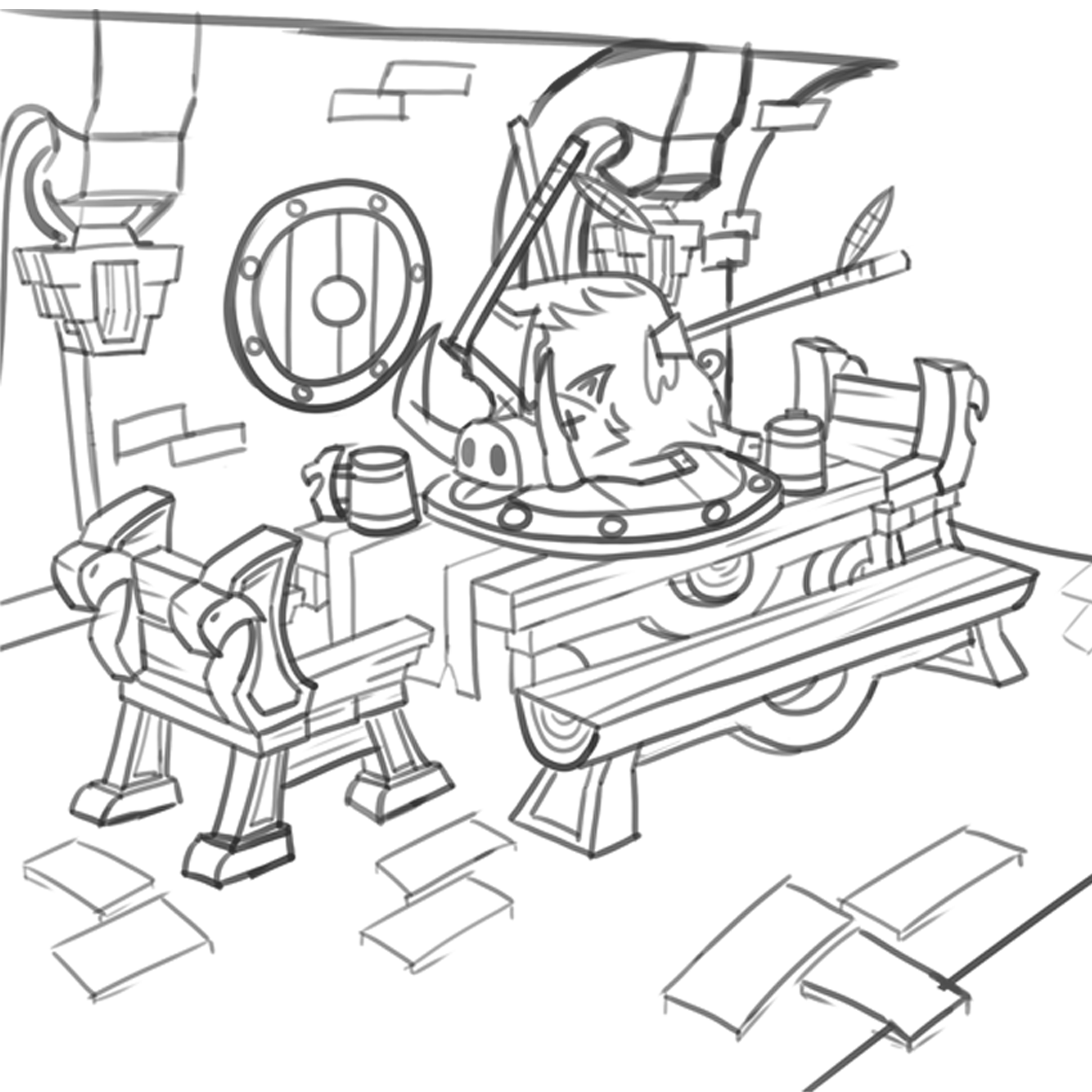
The boar is then laid atop the feast table, honoring the prize of the hunt in true, wild dwarven fashion. I wanted to capture the somewhat comical elements often seen in WoW, so I presented it in a goofy way with its crossed eyes and outstretched tongue.
2. Modeling the Scene: Silhouettes
I blocked out the majority of my props in 3ds Max. A lot of the details in hand-painted works can come from the textures so it’s all quite low poly, with the majority of the tri-count coming from the boar. A good rule of thumb is to add geo when it will affect your silhouette, so I added loops anywhere it could help exaggerate scene proportions. An example of this is where my pillars flare out towards the bottom.

I’m always trying to speed the creation process up, so I used plenty of symmetry and object instancing. This also came in handy for texturing as I could stack faces during the UV unwrap process to share texture space. This minimized the amount of painting I had to do while providing more texture resolution.
Note the table and chairs as an example. The chair was actually three unique objects repeated: the armrest, one single plank, and two feet. The table is one plank repeated and flipped to break up repetition along with one leg and a supporting beam. The split log that runs through the middle is just the same log used on the bench!
For the walls and floor, I used planes. The wall had a few cuts in it and was curved to emulate the curved roofs in Wildhammer architecture. Then I blended tiling textures together in Photoshop get a combination I liked. Again, this is a great time-saver. I could cover large areas, then break up repetition by blending in moss. I overlayed the entire texture with tileable moss, masked it all out then removed the mask in the cracks and areas that I wanted to reveal the moss.

Although I blocked out a low-poly boar in 3ds Max, it was purely for scale and proportions to sculpt in ZBrush. I started with low detail using methods similar to those in traditional 2D drawing, which meant working in simple shapes to block out the character's anatomy.
If you want to bring your game environment to life, don't miss out on CGMA's Environment Art for Games in UE4.
Using mostly spheres and appendages, I applied the move brush to push and pull the boar until I had a silhouette that I like. I kept all my objects separate until I have a rough blockout that I was happy with. This way it was much easier to move shapes without breaking the overall structure of the lockout. For smaller details, I slowly increased subdivisions, using pinch and detail brushes to define the silhouette more. See the boar's snout as an example!

With my blockout complete, I used dynamesh to combine my shapes into one single mesh. From there it was just a matter of slowly adding details. Some of my favourite brushes are Shane Olson’s free brushes, along with his Custom UI.
For the fur of my boar, I used some IMM and fur brushes from the ArtStation marketplace. I used the IMM brushes sparsely as they could make retopology tricky, opting to add just a few on the front of the boar to simulate some big bushy eyebrows. The fur brushes just affected the surface of my model so I could easily bake those details into the texture instead. Once I was happy, I just retopologized and UV unwrapped in 3D Coat!

3. Painting Textures: Four Maps
I baked out an AO, Curvature, Normals, and Diffuse Lighting maps in Marmoset Toolbag and combined them to create a base texture for my low-poly boar. Then, I applied paint on top of this using an overlay layer to get some color blocked out. From there, it was all hand-painting.

I cleaned up any baking errors and started with the major details, painting in parts that weren’t part of my bakes or weren’t covered by my gradient map, e.g. the eye colour. From there, I used the same process I used on the rest of my regular low-poly props: I blocked in base colours, added major details, then added colour variation and highlights. I also added overlay layers to quickly brighten or darken certain faces. See the shield texture as an example.

For certain surfaces such as the stone, I lused the brushes that Ashleigh provided as part of the course. Anything with a charcoal-style texture worked great for rock. Other than that, I mostly used the regular old hard-edge brush and the smudge brush with a nice sort of chalky texture to blend colours.
I set out a colour scheme early on in my concept using Gamut masks. This helped lock me down to certain colours and retain a harmonious palette. I wanted my environment to look warm from the candlelight.
If you love balancing and playing with color, check out CGMA's The Art Of Color And Light course.
4. Vegetation: Convincing Depth
Vegetation can end up looking flat or out of place sometimes. I actually created the texture for the foliage before the model. I started with a regular Photoshop document, painting out the various plant types I wanted around my scene – leaves, mossy clumps, ferns, and blades of grass – keeping it all pretty low detail and painterly.

It was all really small so I didn’t want the texture to be overly noisy, just enough shading to give it some depth. With the texture complete, I applied an alpha channel and placed it on a plane in 3ds Max. Using the cut tool, I cut shapes around each plant object to add some depth. I then shaped these cut-out objects by pulling and moving the verts and edges to better reflect the curves of the plant!
Improve your 3D vegetation game with "5 Ways to Make Your Foliage-Filled Scene Believable."
5. Lighting: Warm Reflections
I used Sketchfab for my lighting because I really like the tools and post-processing options. I placed two nice warm orange point lights in each of the candle lanterns to help cast light in all directions.

These didn’t reach quite as far as I liked so I also added a spotlight in front of the central lantern that shone down upon the table and boar. This helped to really illuminate the boar with that nice warm lighting and again, focusing attention on it. The boar, however, was blending into the background a bit too much and the light wasn’t catching the boar. A workaround for this was creating an artificial rim light.

I did this by taking the boar's geometry, applying a push modifier in 3ds Max (this nudges all the geometry slightly in the direction of its normals), flipping the normals, and deleting the front-facing geometry that would receive any rim lighting. I then applied a nice yellowy-orange emissive texture to it to really help it glow. This worked wonders in making the boar pop out from the scene. Lastly, I applied speculars to all my metal surfaces, which worked well with the light.
6. Completed Feast Hall


Final Thoughts
- When I finished university, I was pretty disappointed with the lack of professional feedback. I'd been making hand-painted assets for my portfolio but I felt the progress I was making, if any, was very small. It felt like there was a barrier that I just wasn't able to cross and I felt the best way for me to overcome it was to revisit the fundamentals of hand-painting and revitalize my skillset. I'd tried a few tutorials before but none had helped as much as I had hoped. I came across a CGMA study group in the Handpainters Guild Discord group that discussed the 'Creating Stylized Game Assets' course. The discussions and work being showcased really stood out to me and there were clear improvements being shown.
- For me, the hardest part of the production process was balancing my assets together. My colour values kept blending together so nothing stood out, but I know it can go the other way and be so different it doesn't look similar enough. It can all really come together in the end with just small touches and I think this is what makes art so difficult at times. You’ve really got to stick it through and keep pushing and chipping away at it and eventually it will work.
- Also, the class was held by Ashleigh Warner, a prop artist at Blizzard Entertainment working on World of Warcraft. Ashleigh was vital in helping me learn to identify issues in my art. She helped by not only pointing out textures that could be pushed further but how to push them further. I think this sort of feedback is what makes the CGMA course so great and it is what I had been missing out on in the online tutorials I had done before.
- If I were to go back and enhance the scene further, I’d likely keep working away on some of the textures. It’s one of those things that you could keep poking away at, adding small details and highlights. Ultimately, I only have so much time though!
- I’m happy with how it turned out and looking forward to applying all I learnt from the course in my future projects. The course really helped to bring out my love for making environments/props so I’m going to keep working on those in my personal projects. Hopefully, I will have more fun artwork to share in the near future as I continue to look for work!
LEARN MORE
CGMA provides comprehensive instruction for Art, Games, and VFX industries in a variety of courses for a range of students, from 2D and 3D artists looking to supplement their college studies to industry professionals looking to stay up to date on emerging trends and techniques in the field.
RELATED PAGES
If you want to bring your game environment to life, don't miss out on CGMA's Environment Art for Games in UE4.
If you love balancing and playing with color, check out CGMA's The Art Of Color And Light course.
Improve your 3D vegetation game with "5 Ways to Make Your Foliage-Filled Scene Believable."


