8 Steps to Create a Modern Adventurer's Costume: Uncharted
Concept Artist and Illustrator James Manabu created an incredible costume concept design for the classic character Nathan Drake in a film adaptation of Uncharted. James brings a modern and tech-oriented style to the classic adventurer, and you can check out his process here:
- Idea and Iteration
- TechWear Research
- From Thumbnails to Design
- Value Exploration
- Anti Spider-Man Colors
- Texture and Material Exploration
- Head Exploration
- Final Design
 Hello, my name is James Manabu and I'm from Washington, DC. My background in terms of art education has been a roundabout journey. I’ve always been drawn towards art, but I became an electrical engineer. Imagine my surprise when I discovered that art was a profession in the entertainment industry! Ever since then, I’ve been trying to develop the skills I would need to pursue a career I always dreamed of. Through actively searching for quality online art education, I found CGMA.

1. Idea and Iteration
My idea was to create a costume for a young Nathan Drake in a film adaption of Uncharted. While the videogame had established costumes, I wanted to take costume design in a different direction for film. I was considering a balance between a traditional treasure explorer and a modern, sleek look for a younger audience. I selected Tom Holland as the actor to practice adopting the costume to an established actor.
Since videogame-Nathan Drake is a treasure explorer who traverses his terrain with parkour-like movements, the costume for film-Nathan has to be functional and practical. The costume should read at first glance as someone who actively runs around and traverses obstacles.
At the beginning of the course, I remember stumbling because I was unsure about my decisions. But towards the end of the course, I was more aware of how to approach the topic on hand with the mindset I’ve developed throughout the course.
James Manabu, Concept Artist/Illustrator
2. TechWear Research

Throughout the course, reference was key. For example, I was inspired by real-world '50s/60s military uniforms such as the m-44 jacket, the m-65 jacket, and the fur pilot jacket. The m-44 jacket and m-65 jacket were functional in protection against the outdoor elements and many pockets to hold items. The fur pilot jacket was a fun idea to possibly invoke a feeling of flight as Nathan runs around. I thought I could include one of these jackets in the design for a retro-modern direction.
While researching, I stumbled upon an interesting area I wasn’t aware of. I discovered a fashion genre called techwear, which included athleticism and tactical gear of military wear with a modern fashion twist. It was close to what I initially pictured in my mind.

As a side note, the reference and research didn’t stop here. For example, I eventually researched fabrics, stitching, and construction to help the costume fabricator put the costume together.
3. From Thumbnails to Design
Based on the research, since there were so many directions to go in, I organized categories to help me see the potential directions. I created a lineup of concepts ranging from more military-inspired (left side) to more techwear inspired (right side). #1 was inspired by the m-44 jacket, #2 was inspired by the m-65 jacket, #3 was inspired by the fur pilot jacket, #4 was inspired by athletic wear, #5 was inspired by layers of athletic wear/techwear, and #6 was inspired by techwear. At this point, the concepts were meant to show a loose representation of what the costume could look like.

I was drawn towards #5 because I liked the visual breakup with the layered look. I thought there could be a lot of potential with different kinds of layered look so I iterated variations for #5. In the end, #5D turned out to be an interesting option because the combination of shorts and tights might not have been previously explored as extensively in the context of the Uncharted franchise.

After selecting thumbnail #5D, I started to design each component of the costume. At this point, the direction of the design was clearer and I had a general idea of what kind of clothing to include: military jacket, hoodie, shirt, shorts, tights, and athletic sneakers. While the thumbnail had the general shapes, I had to research specific references for each of those clothing items.

Here are some examples of how research impacted the design. With the sneakers, I was inspired by Y-3 sneakers because they looked athletic, sleek, and stylish. With the shorts and tights combo, I was inspired by how athletes wear compression tights to improve circulation and reduce muscle vibrations during intense activity. Kneepads could be integrated with the compression tights to protect the knee, which could help Nathan protect his knees from banging them against things. I started to think about accessories like a backpack for Nathan to keep tactical items or to store items during his adventure.

After research, I created the line drawing as a first pass design to clearly show the details of the costume. As a side note, I added the wrapping contours on the clothing to show the form because it helps me see the volume for lighting and rendering later on.
Get to know Instructor Phil Boutte and his favorite costume design insights in CGMA's webinar interview!!
4. Value Exploration
After the line drawing, I explored different value combinations to see how I could visually break up the costume. When zoomed out, it becomes easier to notice which value designs didn’t read well from a distance (marked in red). My thoughts were that both the silhouette and the internal shapes should read from a distance.

From there, I chose 4 different value schemes. #1 was dark value on light value, #2 was mostly dark values, #3 was mostly light values, and #4 was light value on dark value.
At this point, I wasn’t sure if I was going to commit to the exact values here because the introduction of color might change the values a bit. For me, it was more about exploring the value relationship and keeping the value relationship in mind when applying color.

5. Anti Spider-Man Colors
Color was a challenging subject because of several design constraints. First, at this young age, Nathan would probably wear whatever clothing he has available without caring too much about color matching. I had to be careful in selecting colors that don’t match too much to avoid the costume looking like a sport’s jersey uniform.
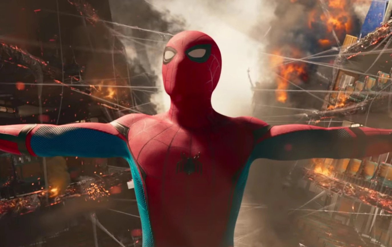
Second, I had to be careful in selecting colors that wouldn’t be perceived as another role played by the actor. In this case, I wanted to avoid colors that might suggest his role in Spider-Man. Third, while the colors shouldn’t match too much, the colors should still be cohesive to avoid a rainbow effect.

At first, I was attached to the color navy because I thought navy could be used as a throwback to videogame-Nathan Drake. And it just so happens that I was also attached to the color red because a red hoodie seemed like strong vibrant color. But some of the color combinations tended to remind me of Peter Parker/Spider-Man (e.g. #1A and #5). Because of that, I had to let go of the color navy and red to try other color combinations. But for some reason, something about the colors on this page just didn’t appeal to me. I wasn’t satisfied with the color so I was determined to try again.
6. Texture/Material Exploration
At this stage, a couple of things changed. Before moving to texture, I had to rethink the design and color first because I knew I could make improvements.
First of all, the previous design was looking too symmetrical. To change that, I rolled up the sleeves of the jacket. I added a pouch to the hip to add a little interest to the silhouette. I added an undersuit/compression shirt, which would provide additional protection if his outerwear or shirt was ripped or removed during the script. I redesigned the shorts to resemble stitching and patterning usually seen on athletic shorts. I thought that Nathan would need gloves to protect his hand and fingers when climbing terrain. While researching real-world examples of mountain climbers and the like, I found interesting discussions of different opinions about wearing gloves for climbing. I decided to add fingerless gloves to protect his hands while his exposed fingers would have a better grip on his environment or other handheld tools.

Second, I revisited the color. The idea was cohesive colors without matching. I understood what that meant conceptually, but what did that mean visually? I tried to visualize by experimenting and added a 2-color hoodie that’s teal and cyan to break up the colors. I added the orange compression shirt to pop the upper body. The intention was for the cools of the blue accent of the sneakers, the navy shorts, and the teal/cyan hoodie to tie together. And the warms of the orange compression shirt, orange accents, and yellow accents to tie together. At the same time, the cool and warm colors vibrating off each other. In the end, I think the colors avoided the matching look of a sport’s jersey but still work together as a whole.
Third, texture and materials. Since the costume was meant to be grounded in real-world clothing, the materials were relatively straightforward. For example, The jacket was made of cotton canvas, the shorts were made of polyester, the hoodie was made of cotton, the compression tights and shirt were made of polyester, spandex, etc.
I wanted to add visual interest with the textures. I added a mesh texture on the compression tights and inside the hood of the hoodie, which also adds a feeling of athleticism. The shirt has a square texture pattern and the shorts have a ribbed texture pattern. I originally thought about adding a texture to the hoodie, but the upper body was looking too noisy as a whole so I used the textureless hoodie as an area of rest.
Curious about costume design for fantasy? Read "6 Ways to Design Story-Driven Costumes: Fe’avi the Last Dragon."
7. Head Exploration
One of the areas I haven’t explored yet was the head. I explored different hairstyles to see what would work with the character. Longer hair, shorter hair, pointy hair, spiky hair, undercut, etc. It was interesting to me how much a hairstyle can change (sometimes dramatically) how the actor looks. This helped in differentiating Nathan Drake from other characters played by the actor. I added green checkmarks to the ones I liked for the character and ultimately decided to choose the option “I”.


Check out CGMA's Head Drawing and Construction course taught by Christian Nacorda and Mathias Osland to perfect your character's facial anatomy and features!
8. Final Design
Even at this stage, more refinement was done. The previous backpack strap had a conventional buckle fastener, but I added a fidlock fastener to make the backpack look more modern. The shorts were slightly tweaked to redesign the waterproof pockets to add more details and cutlines. While the details were small, the details added another level and depth that would have been missing otherwise. At this point, I finally felt the design was complete.
This was the final design with color, textures, lighting, and rendering. I added a background and blurred the background to focus on the costume. I originally had a somewhat elaborate background because I wanted to sell a mood, but I had to simplify the background to avoid distracting from the costume itself. With the insightful comments from Boutte during each week, I think the final design conveyed my original intentions of a sleeker explorer who looks like he can actively run and traverse obstacles.
Final Thoughts
- One of the lessons I learned from Boutte was the process of pushing the design to create a more cohesive character. At the beginning of the course, I remember stumbling because I was unsure about my decisions. But towards the end of the course, I was more aware of how to approach the topic on hand with the mindset I’ve developed throughout the course.
- Another lesson I learned was to always look for ways to improve the design no matter the stage (if possible within reason and time constraints). Looking back, I think the final design worked better than all the other previous designs. And that wouldn’t have happened if I stopped thinking about the design.
- I’m glad I took this course because I now have a better understanding of how to approach costume in ways I wouldn’t have thought otherwise. When I compared the initial design with the final design, it’s clear to me how much my thought process improved from the feedback I received from Boutte each week. He helped me develop a critical eye, and his comments prompted me to ask myself the right questions to add more dimensionality to the character. I can’t wait to create another design with the same process! For the next time, I want to try incorporating additional tools and techniques like photos, Daz3D, and other 3D tools to speed up the workflow. I recommend learning from Boutte to level up your design skills!
- Before I enrolled in the course, I took Analytical Figure Drawing and Anatomy of Clothing taught by Ron Lemen at CGMA. I found it helpful to learn the foundations of figure, anatomy, and drapery before learning the application of those foundations. As a side note, I recommend both of these courses by Lemen because he is also a generous instructor with tons of knowledge to share about the figure, anatomy, drapery, and materials of drapery. Even if you have experience in these areas, you’ll learn many new things from Lemen!
- As of now, I’ve had great experiences with CGMA because of their online platform and instructors. In addition to feedback, I personally find the weekly Q&As to be super valuable because of the opportunity to speak directly with the instructor. The instructors I’ve had have been incredibly generous with their time and attention, and it’s cool the instructors are working professionals on amazing projects at the same time as teaching. Since I don’t have quality art education around my area, it’s been great to learn from these highly skilled instructors online through CGMA.
- I hope sharing my experience with Phil Boutte’s Costume Concept Design course was helpful. If anyone has any questions, feel free to contact me 🙂 I hope I can share future experiences with you again!
LEARN MORE
CGMA provides comprehensive instruction for Art, Games, and VFX industries in a variety of courses for a range of students, from 2D and 3D artists looking to supplement their college studies to industry professionals looking to stay up to date on emerging trends and techniques in the field.
RELATED LINKS
Get to know Instructor Phil Boutte and his favorite costume design insights in CGMA's webinar interview!!
Curious about costume design for fantasy? Read "6 Ways to Design Story-Driven Costumes: Fe’avi the Last Dragon."
Check out CGMA's Head Drawing and Construction course taught by Christian Nacorda and Mathias Osland to perfect your character's facial anatomy and features!


