The Pale Mask: Pursuing a Passion of Comic Art
Artist Alba Jaen takes us through her journey of creating the first pages of her comic and how she pushed her narrative in Comics: The Art of Storytelling.
Introduction
Hello, my name is Alba Jaén and I’m an aspiring comic artist and illustrator from Madrid (Spain). I’ve always loved drawing and painting but really didn’t think about the possibility of earning my living through art. During my teen years, I was really into manga style, and during high school, I decided that I wanted to study illustration. First, I studied Fine Arts at Complutense University of Madrid and then 3 years of Illustration at ESDIP Madrid art school. During the second year, one of the classes was on comics, and while making the project (along with my current writer), I realized I really enjoyed storytelling and the process of comic creation, which led me to study more about comic creation. After three years in illustration and building a portfolio, the process showed me what skills I needed and what I wanted to improve. That’s how I found CGMA, and have taken several courses from Fall 2018 to Fall 2019.
The Comics: Art of Storytelling class was one of the classes from CGMA that I was most interested in, but decided to take the class the last, to improve as much as possible, as creating comics requires a lot of different skills and you should be a balanced artist before taking it. With the course, I wanted to learn more about storytelling, the comic process, and anything comic related. In addition, I also wanted to learn directly from instructor Miki Montlló, a comic artist I look up to and have followed on social media for some years.
Primary Storyboard
“Four convicts condemned to death are graced with the opportunity to be exonerated of their condemn if they fulfill a dangerous mission: get into some ruins with centuries of antiquity to recover a valuable and powerful artifact: The Pale Mask.”
That’s the synopsis from “The Pale Mask”, the project I was working on during the course. The story idea and the script is from the writer I’ve teamed up with, Luismi Fernández. The story is set in a fantasy world but has Lovecraftian details.
Miki’s approach to the storyboarding process was really clarifying. It was really important to learn how to read and manage information from the script (depicting only the essential) and to have a clear main idea for every page.

The storyboarding process, although difficult to solve, I believe is one of the most interesting -and the most crucial-, as deciding what goes into each panel is both challenging and fun. Even though for this stage it wasn’t needed, I wanted to think about the shots that might work for each panel, to have a greater idea of how the final page composition might look. This definitely helped me with the layout of the pages the following week.
On the first pages of the story, the light changes were crucial for the narrative, so I decided to include some basic color keys to remind me of later processes where the light changes should occur, and although it took me a lot of extra time, it has been really useful as it makes it more clear.
Secondary Storyboard
Composing the page requires you to organize every panel in a way that’s easy to understand for the reader, be smart with the distribution of information, as well as making it as appealing as possible. It’s also important to start planning the placement of the text bubbles, as they are crucial to guide the viewer’s eye. Therefore, this week was even more challenging than the previous one.

I tried various layouts for the 9 pages I storyboarded. Pages with less amount of panels were much easier to organize, but the ones that had a lot of information really needed more changes. During this process, I learned about rethinking and simplifying pages to make them appealing and not overwhelming. I put a lot of effort into this stage, but it was definitely rewarding, as it made the final pages much better.
Characters and Location Design


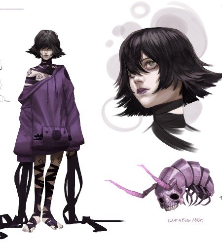
Characters from my project are a bizarre group of adventurers that you might encounter in a fantasy roleplaying game. Therefore, I needed each of them to stand out on their own. Before the start of the course, I did some sketches of the characters to explore ideas, which helped me to get to the final designs I used for the course. I talked several times with the writer about the characters and what best suited them, looking for references of historical outfits and weapons. For example, the gnome, Hinbrick, is inspired by the clothing that German Landsknecht soldiers used to wear. In order to make each character a clear and distinctive silhouette, I used props and clothing, as well as a different pose that best suited their personality. Last, I did some color iterations before I decided on a color scheme for each character. After Miki’s feedback, Yaromir would become bigger and I’d have more variety of sizes in the party.


I did a lot of research for each specific location and also anything that could help with the mood and color palettes. Miki gave me really useful advice, especially on lighting, to help me improve the designs.


Penciling
Before starting directly into penciling, I prepared the page with the margins, gutters, panel sizes and also locating the speech bubbles with the text that I would use for the project, in order to know how much space I would have for the drawings. Having these guides made it easier to plan what final shots would appear in each panel and also allowed me to simplify some of them, to be more effective and readable. After that, I took specific references that I would need to use and I sketched and refined the drawings. The weapons would repeat every time the characters would appear in a panel so I looked for 3d models of them so that I could rotate them and use them for reference. During the lecture, Miki taught 10 useful shots, and for the last panel of the first page, I used the “same action-same frame” one, where various characters perform the same action in different stages. Also, I used this stage to start planning the dark areas of ink, as my project really needed that inking to enhance the narrative.


Inking
Planning where the dark areas would be helped me with the process of inking. However, the backgrounds were a big challenge, especially the long shots of the cave with the characters, as they needed great masses of dark areas and to show a menacing atmosphere. I paid special attention to this, especially in the last panel of page 1, so it would turn out with a proper mood for the scene. Miki pointed out that my backgrounds were too symmetric (which looks really artificial), and helped me search for a balanced asymmetry in order to get a more organic look. He also advised me with the characters, especially their faces, knowing where to locate details and where to simplify to get a better read, working efficiently. The sound effects were changed too, needing to be more clear and more visual.

Color and Finishing a Page
Thanks to the script and the basic color keys of week 1, I knew what kind of light source I wanted in each panel. Panels lit by the torches needed more orange-yellowish tones for the light. There were some panels with a supernatural green light and others with a magical light cast by Hush.
During the feedback, Miki mentioned the pages needed a stronger light and that the colors were dull and lacked saturation, and that by making those changes the pages would be more impactful. You can see on the example the progress of 2 pages, from the flat colors, my initial approach to start applying color, and how it finally ended after the feedback.

The last week, apart from how to finish a page, Miki gave us advice on how to build a portfolio and show it to the publisher and how to manage social media. All the advice was really useful, as promotion is also part of an artist’s job.


Conclusion
As I mentioned in the biography section, Comics: Art of Storytelling was the course that I was most interested in and I highly recommend it, even if you’re not really into comics. First, Miki is a great instructor, his lectures are well arranged, each one has demonstrations as well as weekly recommendations, such as art books, comics, authors, artist, depending on the topic of the lecture. Also, Miki does live sessions with all the students during feedback, as he likes to interact with students and directly talk to you when providing feedback, which has been great. I believe Miki really understands the level of each student and knows the best way to push you to make the most of your project. He is really easy to get in contact with and has no problem in solving doubts. Also, he kindly shares his experience as an artist and provided useful advice.
Doing this course really makes you improve at every step, but I believe storytelling and narrative is where I’ve learned most. It was great to follow other student’s projects through each Q&A, and I believe I have learned a lot also from my classmates and the feedback Miki provided them. Everyone was really nice and had awesome projects that I hope they continue so that we can all enjoy.
In conclusion, I loved taking this class and I encourage everyone to take it. You have to work hard, but it is definitely worth it.
You can see more of Alba’s work here:
https://www.instagram.com/albajaen.art/
https://www.artstation.com/albajaen


