Changing Your Design
Austin Kwidzinski shows us the breakdown of how he developed his warlock in our 8-week course, Character Design for Film and Games.
Introduction
Hello, my name is Austin Kwidzinski. I am a visual artist from Mission, British Columbia, Canada. I am a graduate of the University of the Fraser Valley with a Bachelor of Fine Arts Degree. Currently, I am working at The Reach Art Gallery in Abbotsford, BC, where I facilitate art tours and art lessons for both kids and adults based on the current exhibitions. I chose to take this Character Design for Film and Games course with Marco Nelor because I have always admired the realism and efficiency of his work and was eager to learn how to apply those skills to my own art practices.
Research and Development


For the first week of classes we were tasked to look at different images that appealed to us or that we drew inspiration from and put them all together in a cohesive mood board. I chose my designs based on aesthetics, whether it was the costuming, lighting, poses, colors, facial features, etc. From there I started the thumbnailing process by first using silhouettes. The silhouettes made it much easier to be free with the process and to try out different design ideas by really focusing on the shape language. This allowed me to explore more by trying out new things and to not to get carried away or hung up on any of the finer details. Moving forward, I chose to explore a warlock character based on the prompts given by Marco. I was drawn to a darker, more maleficent aesthetic, so my chosen reference images would reflect those ideologies.
Sketches for a Client

I decided to narrow down my first selections to five of the most inspiring characters from the previous page so I could work out their designs more fully. The exploration phase in week 1 helped in the design process. It allowed me to establish specific features by designing head pieces, shoulder armor, sleeves, body armor and footwear. These were changed and expanded upon from the original sketch entirely. At this stage I was looking to expand more on the shape language in an exploratory fashion. I looked at including sharp angular shapes for both the body and head, pushing the nefarious aesthetic I was going for with my warlock.
Narrowing Down the Selection
For week 3 we started to fine-tune the designs even further by selecting 2 of the more expressive and inspirational designs to move forward with. Marco and my fellow classmates helped in this process by giving valuable feedback on what they felt was working and what was not. Marco pointed out that we are able to identify with characters more if we can see them with a face. This helped immensely when we moved into the head explorations and I was able to implement their suggestions into the character design. Marco gave great feedback on design elements that could be pushed further from week 2. I was able to simplify some of the design components like the armor and clothing as well as the overall shape of the silhouette.
Head Explorations

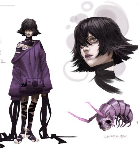
I chose a fantasy warlock character and tried to incorporate some darker elements into the piece. Warlocks tend to go with lighter armor as death is not a fear to them since they have a devotion to their chosen deity. I liked the idea of having some markings on the face to indicate some of the ritualistic practices that my character would perform. I experimented with a few different face shapes and ethnicities for my character but ultimately decided to go with option D in the illustration below. Both Marco and I felt that this option exemplified the strong character traits I was looking for.
Final Glamour Shot


The final rendering proved to be more of an undertaking than I initially anticipated. I think the biggest challenge for me was rendering the character’s stance to completion without having to go back to make a lot of additional unnecessary changes in the process. The designs ended up changing a lot from the beginning. I removed the helmet entirely so that the character could be more identifiable with the audience. I also changed the design of the armor and how it would naturally fall onto the body since I had posed the character to be more assertive by having him stepping forward. The piece shares the same shape language overall by having sharp edges in the weapon and armor. My process for rendering from black and white to full color was to focus on adding the base colors over the initial black and white image. From there, I could start to add dimension to the colors using a mix of warm and cool tones.
Final Thoughts
I am very satisfied with my art piece because of how much I learned in the process of designing and creating such a dynamic character. I was always problem-solving and coming up with new ways to tackle the assignment. I think the main skills I improved upon from taking the course were in the presentation of my work as well as not being afraid to try out new variations of any design ideas I had. I learned a lot about techniques one can use to speed up the process of character creation. After this course, I have been able to utilize the helpful feedback Marco gave me on my work to focus on rendering techniques as well as the thought process of what makes a compelling character. I continue to implement the valuable feedback Marco and the other students provided and have been able to apply the skills I have learned to my current art projects.
You can see more from Austin here:
ArtStation: https://www.artstation.com/austinkwidzinski
Instagram: https://www.instagram.com/austinkwidzinski/?hl=en


