How to Level Design: An Overview
Charles George Kucharzak discusses level design for games, its principles, and how he approached his coursework in Level Design for Games.
Introduction
Hi there! Well, my name’s Charles George Kucharzak, friends call me Charlie. I’m from Chicago and grew up here my whole life. Since I graduated, I felt like I wasn’t quite ready for industry, so I decided to take some CGMA courses, mentorships, and I finally created my portfolio website. I’m currently searching for and applying for entry-tier level design positions. As for how I got into level design, it started with the modding community! Battlefield 1942 maps, Garry’s mod roleplay maps (both single and multiplayer), etc. You can view the most recent works on my portfolio.

Choosing CGMA
I chose the course Level Design for Games because there are very few resources out there for level design. There’s a massive amount of texts for architecture, interior design, but the level design isn’t all that formally taught in a classroom setting. I have a fairly traditional learning style of teacher + student, but with a mix of hands-on. I think that’s why CGMA was the right fit for me. The coursework is taught in a way that is very easy to manage, even if you have a part-time or full-time job!
Level Design Principles
The key rules I’ve learned are as follows:
- Nodes. Create your level with the rest of the world in mind. That means don’t just have a battle arena in the middle of the sky. What lies outside those bounds? Buildings? Mountains? More of the battlefield and this specific chunk is just a skirmish? Be mindful of the world outside of the level.
- Interdisciplinary. Create your level with art and code in mind. I’ve always thought of design as the marrying of art and coding, the glue that holds things together and this is where all the magic happens; the parts that the players actually touch. So one must keep composition, color, and lighting in mind, but also understand how a script would apply to an enemy encounter. This is ideal but not every level designer does everything. There are technical level designers who hyper-focus on such scripting tasks as well.
- Understanding Space. This wraps around to Nodes, but this is more specific to the area you’re specifically designing for. For example, if you’re making a bar, yes keep in mind the outside area, but where is the barkeep standing? Is there enough space for him to move around in? What space does this serve game-wise? Is it a safe area or a combat zone? What shapes am I supposed to be using? What are my metrics?
- Understand Beats. Everything in-between is up to the player. You can control those specific moments, but remember that it’s a game, and not every specific shot is going to be perfect. A free resource that covers this in amazing detail is a talk by Miriam Bellard about spaces being designed according to cinematographic rules and guidelines.
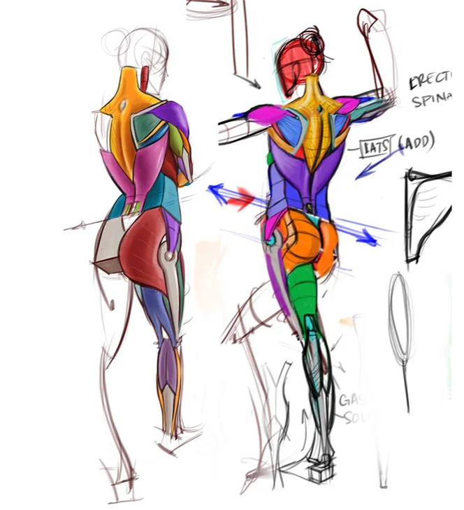
I personally struggle with the dialogue of “Is it art, or is it design?” The answer is a mixed bag and it’s not a straight cut answer. We can argue all day about the semantics of art and design, but at the end of the day, there are disciplines and there are focuses. When it comes to creating environments that players interact with, there are two sides of a single spectrum. Perhaps there’s more to it (i.e. a 3d spectrum) but for simplicity’s sake the following diagram shows the following: On one side is design and on the other is art. Level designers are mainly design-focused, thinking of how the player navigates through space with regards to traversal, combat, interaction, story, and/or NPC mechanics. They also have to keep in mind how they’re designing the space with regards to how artists primarily focus on color and shape theory, texture detailing, composition, and other artistic principles. These artistic aspects are not a priority, however, but something they have to keep in mind.
Depending on the studio, the position may vary on this spectrum, but the title may still be a “Level Designer” or it may change with regards to how focused the position is (i.e. Level Artist, Mission Designer, Technical Level Designer, etc.).

Level Design in Action
It all starts with an initial design. Whether it’s on paper, digital, or conceptual (inspired by an existing piece), it must be designed with these core aspects in mind: story, mechanics, and intent.
For the story, one must keep in mind the existing areas around that the player doesn’t interact with. This will influence the playable space as well. Mainly aesthetically, but functional as well! From a design standpoint, one must ask themselves the following: What is the function of this space? Is it a narrative space that allows for exposition to the player?
For example, we’ll take The Last of Us giraffe scene. The player climbs a ledge, always following the NPC, not knowing what lies around the corner building suspense. There are several 90-degree turns, further increasing suspense, allowing for possible combat encounters, or allowing for enemies to hurt the NPC. The players then find themselves encountering a giraffe, slowly. They then ascend stairs, all the while following the NPC, encouraging them to discover where the giraffe went. They both enjoy a view of a small herd of giraffes walking through an overgrown area, and the skyline of the city is in the background. This intimate moment with the NPC allows for a massive break from trying to survive in this post-apocalyptic city.
Had this been a combat encounter or chase scene, the space would require cover, enemies, flank routes, etc. But instead, this is a story beat that follows a scripted event. Were they required to explore and/or perform a puzzle action, there might be an open area or a vista for the player to view everything and analyze the situation from.
With the intent solidified, understanding how these spaces connect to each other must be decided. Combat encounter after another exhausts the player not only in a resource sense but mentally as well. There needs to be these story/calm or safety beats. Mastering when to place these in relation to one another is one that simply comes with time.
As for general practices that allow guiding the player in the right direction, a critical section that teaches this is in Week 2: Understanding Space. Some of the key points that are covered are Void, Mass, Positive and Negative space among several. Understanding how humans interact with environments is paramount when designing a space. Again, using a combat encounter as an example, do you want the player to have an advantage in this specific situation? You might want to give them prospect over a vista with lots of covers and a decent amount of ammo. But say you need to hit story beat where they lose their ammo completely.

This would then drive the player to leave the safety of their high terrain position and find another position. This would then invoke quite a stressful reaction, one you may or may not want. This all depends on the agency that drives the player to continue playing.
Iterating Game Elements Placement
Placing different game elements also depends fully on the story, mechanics, and interaction. What did the player just do, what do you want them to do in that space based on the story beats and pacing you’ve previously set, and what do you want to set your player up for in the future? Answer this question and you’ll understand how to place elements. Whether a health pickup is 5 “Unreal Units” to the left or right is irrelevant at this point.
However, I must contradict myself by breaking the rule I just established by saying that how you tweak these for players to actually enjoy or rather progress is through repetitive play. One won’t know if a space is “fair” or gives enough leeway for the player to succeed at the given task unless several playtest sessions are performed. Granted, in a small team, this may not always be possible, so do this to the best of your ability. In a competitive shooter map, for say Counter-Strike or any other big community game, you can always publish your map to said community and receive feedback and iterate based on that feedback.
If You Want to Be a Level Designer
Jokingly, I’d say that the hardest thing for a level designer is getting into the industry. But seriously, it’s feedback. Creating levels is a difficult task in and of itself, but getting genuine and critical feedback from players and designers alike is very difficult, at least for me it is. Understanding the nitty-gritty of compiling projects to publish in a concise and easy to use package for others to playtest has proved quite difficult.
Seeking out communities, whether public or private, broad or specific, has proved the most useful for combating this. Receiving feedback is critical, I believe, for being a level designer. Being stuck in a feedback loop is deadly to not just a career standpoint, but a mental one as well. It’s really demoralizing “pushing pixels” and moving cover from one side to another without actual outside critique. Whether the toxic “oh this really sucks” from a rude person or the well thought out feedback of a peer, this is better than going insane asking your own worst critic if this is “right” or if it’s “good”.
Level Design for Games Course
For those wondering about the content in the course, it’s a course where you create to demonstrate proficiency and understanding of the topics. I didn’t believe any of my works were worth showing other than the last, simply because they were me learning the foundations of level design. I’ll go into more depth of my final assignment which is on my ArtStation and portfolio.
The video above shows an entire playthrough of the environment. In this assignment, I was given a brief description from the instructor, the story, and action bits to hit. The following beats were as follows:

To explain, when the player enters/spawns into this space, they first explore to understand their environment and surroundings. This is to give them a sense of space and receive a grasp on the overall rules of this space. You can’t simply throw them into a combat area, that would be just cruel and confusing!

Only after they are done exploring and wish to progress, a “valve” (this can be referred to as a one-way gate or transition area) is used to restrict their movement back into the previous area. In the image below, it is a boulder that is triggered to fall in the pink volume. This has roots in technical limitations as to not bog down the system with memory issues, but for the sake of explanation and relation to level design, it forces the player to move forward in the environment.
Only then after the valve, they engage in “small combat”. I interpreted this as a small combat arena fit with cover, flank routes, and enemies. Below is an overview of a small combat area.

After they are done with the combat, they then continue on and explore some more, understanding more about this environment through the shape language and props being used. After some time, another valve is implemented. Below are the exploration areas and the valve which is a cliff.


After this second valve, there is a large massive combat area. This area is where they fight the last of the enemies make a stand to guard the treasure they stole from you. I chose to make the treasure visible as soon as the player passes this valve. I did this so the player can visually identify quickly their end goal instead of having to focus on enemies and traversal of the space, only to find the treasure simply by adventuring. I wanted a mostly linear path to the treasure with only enemies and terrain as the obstacles.


Afterword
Lastly, I would like to thank the CG Master Academy first and foremost for providing such an amazing platform for branching out to allow designers like myself to grow. This class has taught me so many fundamentals that I feel like it’s almost like a bible to me. It covers anything and everything.
If you wish to contact me, you can contact me here at [email protected]. If you wish to view my portfolio works, you can do so here and my LinkedIn is here. If you wish to contact me socially, you can find me on Twitter @Jack0Knife or on the NLD community forums.


