Rendering the Details
Giorgia Vincenzi shows us how she improved her rendering skills as she developed her Warlock design in Marco Nelor’s course Character Design for Film and Game
Introduction
Hello, my name is Giorgia and I come from Modena, Italy. I have always been working in the fashion industry, but now I’m trying to follow my real passion which is drawing concepts for imaginary worlds, characters in particular. I attended the International Comics School in Florence to improve my drawing, then I found CGMA, and I could not resist trying the online course Character Design for Film and Games with Marco Nelor. I chose to take this course because I was searching for a professional method of creating characters from start to finish. I thought this was a complete course with a good mentor, Marco. I really wanted to reach his artistic level in rendering characters, but I still have a long way to go!
Research & Development

I really enjoyed this first phase of the course, because many people think that concepting a character is easy and should be fast, but there’s a huge research of images and materials behind it. This helps give you the right mood and right style to the character depending on his description and narrative. Marco gave me some character write-ups in science fiction and fantasy genres and I had to choose one. I chose the Warlock template and started searching for references that could help me create my idea of a warlock. It’s important to search for references for all parts of the body in order to clarify the character and not neglect anything (for example, I did not pay attention to the feet in my moodboard).
Once I was satisfied with the creation of the moodboard, I started drawing some rough silhouettes that could convey the idea of a warlock: an elegant, sharp man corrupted by darkness. I even wrote some materials that I could use. and some notes.

Sketches for a Client
As a starting point, I chose three silhouettes that satisfied me the most, and I refined their concepts with readable lineart and more details. I wanted to show the client three characters with the same features but giving very different sensations.

I enjoyed thinking of wood as armor and branches as decoration or crowns. That combined with long, tattered clothes, could give the character a decadent, royal aspect. Tiny details of bones, rocks, teeth, and claws would remind of evil rituals while blind white eyes are a symbol of corruption. I just wanted to use natural materials (leather, porcupine thorns, skulls, and feathers) in his costume, as if he’s a hermit in a deep, dark forest.
Moodboards and rough sketches really helped make the design easier. You may think what you have in mind at first is the best design, but then you discover you missed a lot of cooler forms and details just because you did not search for more and different visual experiences. It helps you understand your sketches: what is good and what is not, what kind of material or anatomy proportion you would like to use.


Narrowing Down the Selection
Marco analyzed my sketches and really helped me choose one. He made me realize some anatomical errors (for example figure A shoulders) and told me that sketch C stood out the most due to his materials, skull, and design. He taught me I should never add a feature without thinking what it’s about. The skull on the shoulder is simply a giant bird skull that I used as decorative shoulder armor and Marco told me that I should have thought about how it would have been with real-life anatomical proportions.


I ended up studying some skull forms inspired by creature design and I chose the longest and the sharpest one thinking it was the best for the general design. Marco continued telling me to clarify the belts’ material and to be aware about the legs anatomy under the clothes. I needed to consider some larger details to improve the character’s armor. He suggested armour on the arm, to study better the skull lacing and to add a bag attached on the belt that may perhaps contain some ritual stuff, because every feature on the character should tell something about his story. The viewer should understand immediately who he is, what he does. I have always had difficulties in representing shadows, Marco gave me some advice that helped me become much better. Below is the improvement after the instructor feedback.
Final Glamour Shot

Rendering the image was the longest and most complex process because it was the first time for me. At the beginning of the course Marco gave me a common exercise among digital painting artists which consisted of creating some material spheres in Photoshop. I had to be as realistic as I could in copying some references without the help of textures.

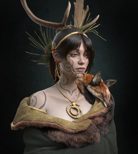
This exercise made me realize that I was able to render materials by myself, with no “copy and paste” of photos. It was a matter of opacity, dimension, and brush control. Many beginners make the mistake of using a texture image for painting their design and the final result is a picture with a high contrast between realistic and cartoon looking parts. I recommend using photos to help you in your process of rendering, but remember to paint on it in order to unify the textures with your painting style. I searched many references for every material I had, I turned it into grayscale images and I tried to replicate how the light reflected on it. I also added more texture to the dress which was too uniform. It really took me many hours to reach this final result and I know there’s still so much to learn and improve.
I’m never completely satisfied with my art pieces. I always think of ways to improve my design and after some days I would totally change it. From taking this course I mainly learned the professional method to develop a character concept and I’m really feeling much more confident with rendering. I’m having so much fun in the creation of new characters by using the steps I learned in this course and I hope to become good enough to be noticed by some professional team.
You can see more from Giorgia here:
Portfolio: https://giorgiavi.artstation.com/
Linkedin: https://www.linkedin.com/in/giorgia-vincenzi-0b41b9b9/


