Making a Scene Inspired by Dungeon & Dragons
Ilya Pavlov (also known as Elijah Pauls) shares a breakdown of his environment Shattered Lands, including its blockout, rock and grass creation, sand material, lighting, post-processing, and more.
Introduction
Hey everybody! My name is Ilya Pavlov (Elijah Pauls), I am an Environment 3D Artist currently working as a Level Artist at Sperasoft Keywords Studio in Saint-Petersburg, Russia. I came from Moscow where I first started delving into 3D (sculpting in ZBrush) as a hobby. After realizing that 3D sculpting is actually a part of some great world of the game industry and feeling passion for computer games since early childhood I entered the Game Graphics faculty at Scream School in Moscow. At that time, it was the best opportunity for me to study many things I needed to know and get some basic skills to begin my path as an artist in games.
It was approximately four years ago. Since my graduation, I was working as an environment game artist on a few projects in Moscow which were a mobile FPS game in Unity and two VR games for full-body tracking experience in Unreal Engine.
It’s been a year since I moved to Saint-Petersburg to work with a great team at Sperasoft Studio on a couple of cool AAA projects.
About the Class
The first thing I learned when I became a game artist is that you shall never stop learning and honing your skills, that’s why I have taken the CGMA course Organic World Building led by Anthony Vaccaro. Being a fan of open-world games and always interested in creating massive landscape environments for games, my choice of the course was obvious for me. During this course, Anthony covers almost everything you need to know to build a good piece of an outdoor environment, including the principles of game world-building, landscapes, shaders, materials, vegetation – and all that with his great experience in the game industry came out really useful.
Shattered Lands
Idea
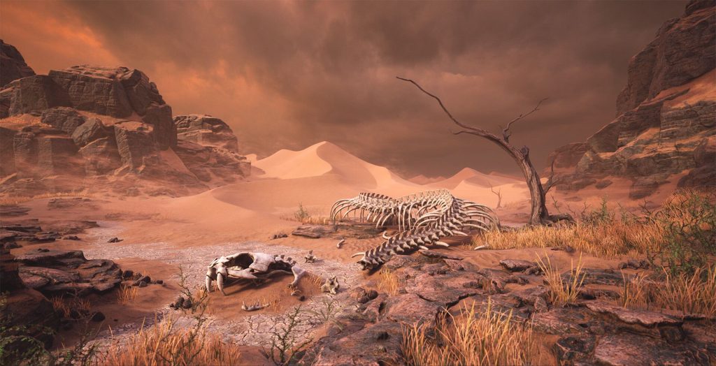
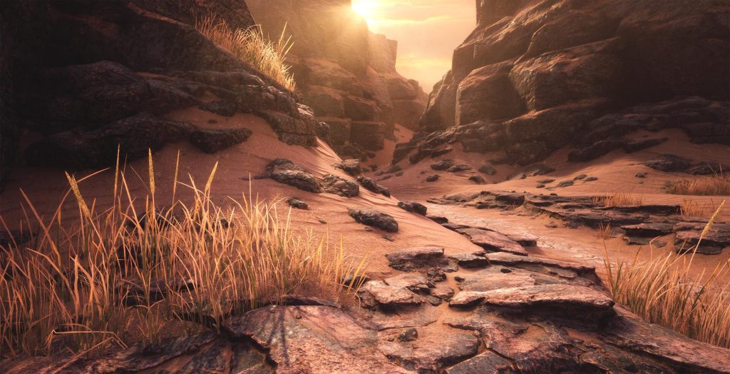
The theme for my scene Shattered Lands was chosen long before the start of the course, as I was always fond of D&D and the game worlds players create there. There is an official D&D setting called “Dark Sun” which is known as a “sword and sorcery” post-apocalyptic fantasy world where the mighty evil sorcerers drew their powers from nature itself. This led to the environmental disaster transforming once green and fertile lands into a burned lifeless desert. A part of this desert along with some hint on its remaining inhabitants was the main idea for my scene.
Reference
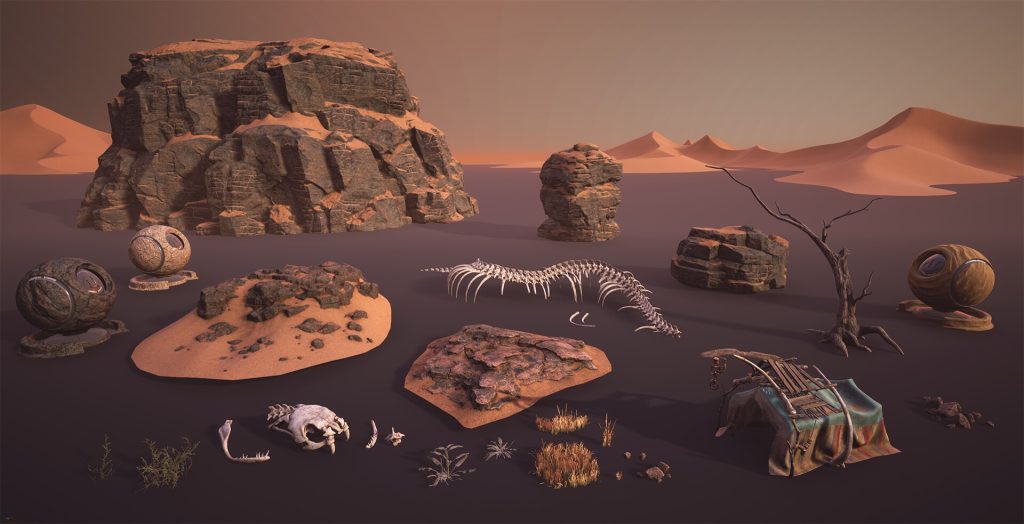
After the theme was chosen it was time for gathering references and making a plan on how many meshes and materials I would need to make the sandy desert look interesting enough.
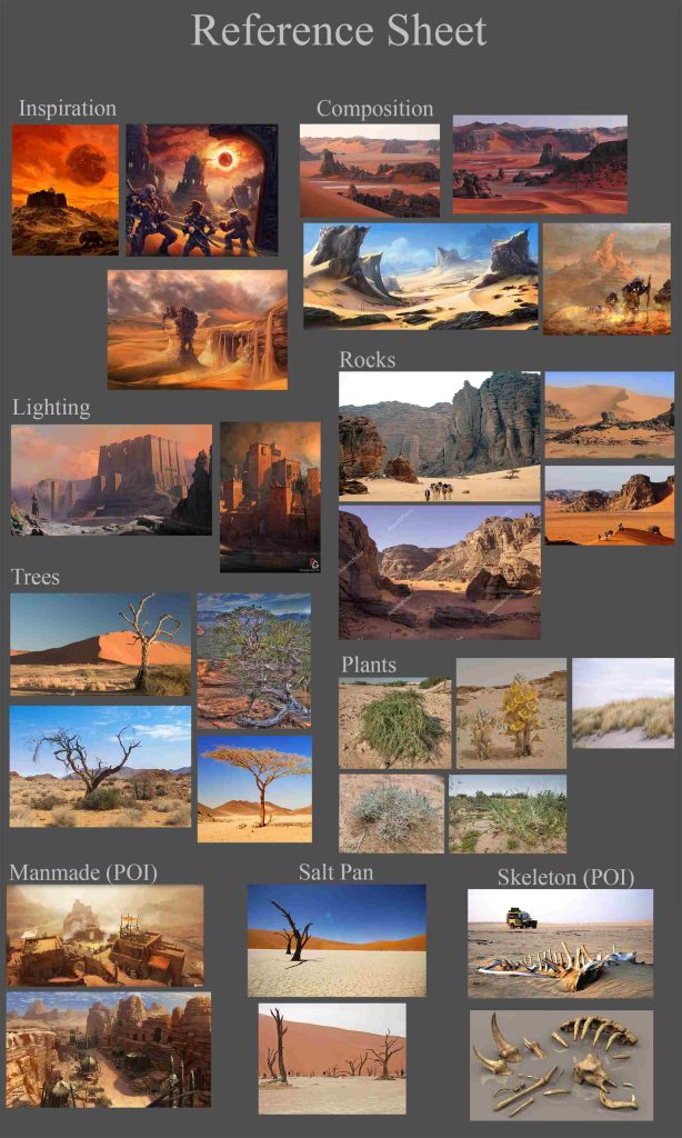
During the initial stage of the reference research, I tried to gather a few images as I could just to get an understanding of how this scene should look like as a whole and what essential elements it shall contain. After some research, I found out that I really liked the photos from the Algerian Sahara desert with its reddish sand and dark gray rock formations which resemble the illustrations of Dark Sun deserts from D&D books. At that point, I decided that I would need an extra ground texture to make break sand and rock, and the cracked ground of the dried lake from the Namib desert reference did the job. I also decided to make a few types of desert vegetation and found some relevant references for it. Even though ancient deserts filled with large dunes typically lack vegetation, from the art perspective some plants, especially the grass, in the outdoor environments really add a lot of interest to the otherwise bare ground.
So at that moment I almost had the vision of what I am going to do and the destination was to make a dramatic post-apocalyptic fantasy feel in a sandy and rocky wasteland.
Blockout
When the scope of work was determined I started with composition and blockout. I had a few difficulties trying to find the right composition and I drew some sketches to see what I could choose to start blocking the scene in the engine. For example, the image below was my first idea for composition and the structure of the scene and I even finished the block out based on that concept:
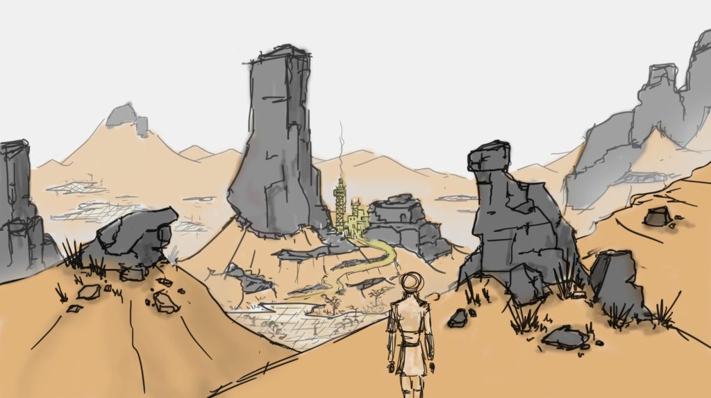
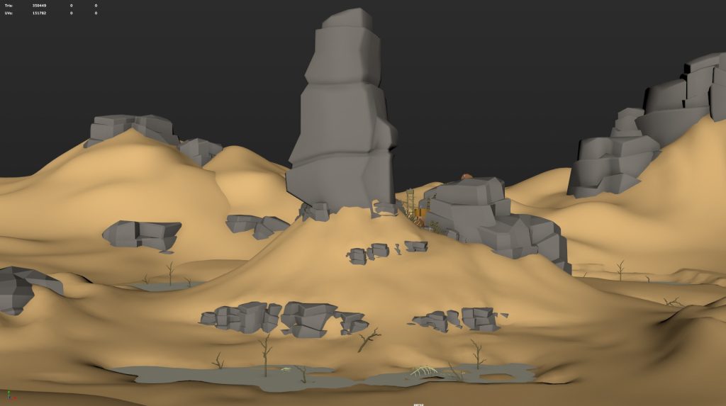
However, Anthony saved my life reminding me of the difficulties that lie behind making a scene of such a big scale and urged me to reconsider the scale which meant to change the composition and start the research and sketching again. Unfortunately, the final composition sketches were drawn on a piece of napkin and lost so I am not able to show them. But the initial blockout almost completely recreates the main idea:
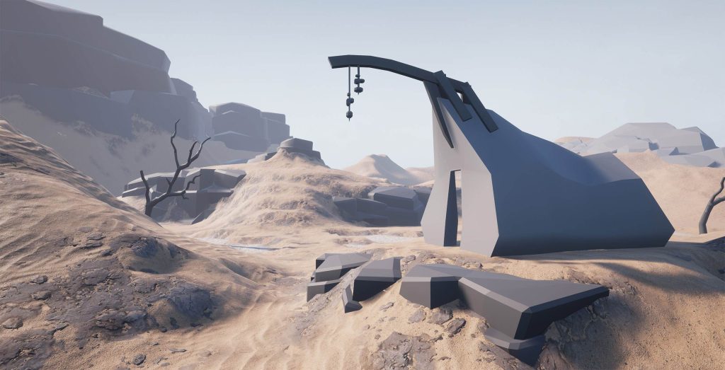
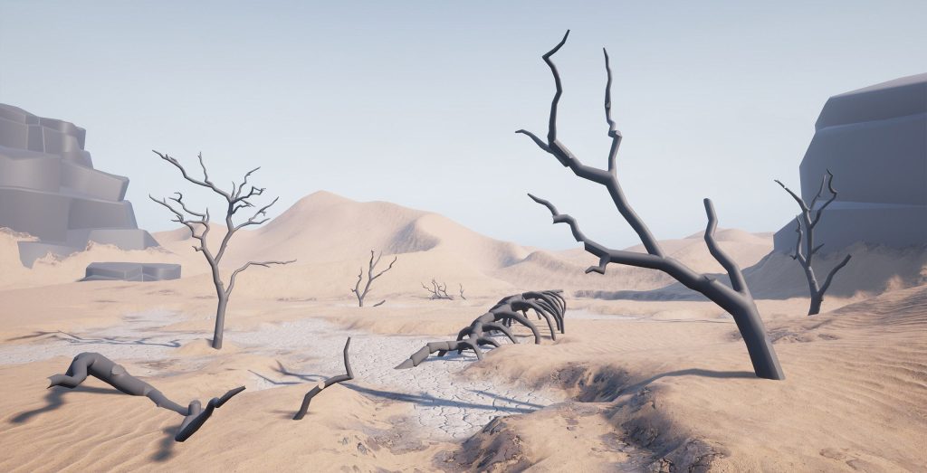
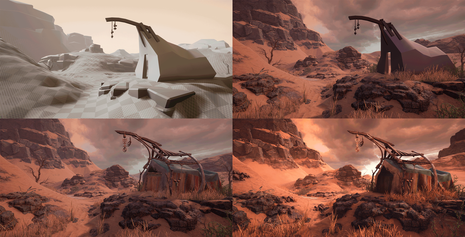
To build the blockout, I first started with a few gray mat meshes of rocks, some basic shapes for tent, meshes of tree trunks from one of my previous projects, and Unreal Engine landscape system. The main thing here was to find the right camera position for two beauty shots and good direction and angle for the directional light source (sun), plus placing big rock grayboxes and sculpting the landscape inside UE4.
Rock Production
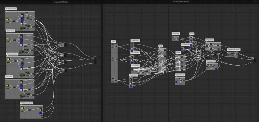
Once the blockout was done the content production began. First of all, I had to set up some shaders in UE4 Material Editor and even though I had some experience with that before the course, Anthony’s lectures were of great help to speed up the process. I needed two complex shaders – one for the landscape material with a height-based blend for layers and one for big rocks with detail normal, vertex painting, and mesh slope-based blending.
The pipeline for rocks was quite traditional for modern games. I started with sculpting in ZBrush taking my blockout rock pieces as a base for scale and proportions. I wanted my rocks to look heavily fragmented and eroded, not just cracked but built out of separate blocks. That is why I started the sculpting by replacing my blockout meshes with different simple dynameshed cubes with a little Crumple brush pass on them, scaled differently to have some visual interest. When I was satisfied with the basic shapes of the rock formations for the 360-degree mesh I continued with more detailed sculpting using primarily Trim Smooth Border and Trim Dynamics brushes with quad alpha. Sometimes, I applied the Crumple brush to separate pieces of rocks to see if I can get some interesting breaks in forms. For the biggest 360-degree rock formation, I also sculpted a crumbling sand mesh as a separate subtool. The last step was to sculpt a few plane rocky alphas to make a quick detail pass for all the rocks I had.
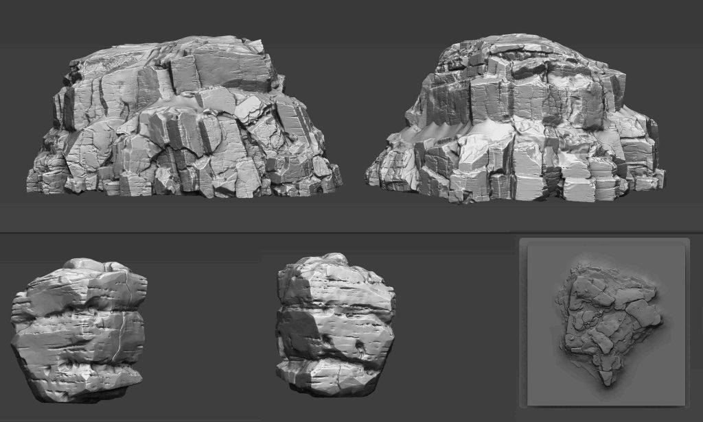
I used decimated versions of the rocks as low-polys for baking after cleaning and UVing them in Maya. A little tip which I learned for decimating a high-poly mesh with large polycount in order to get the cleaner result for your low-poly: it is better to redynamesh the copy of your high-poly mesh at lower resolution first just to make it easier for ZBrush to decimate the mesh correctly.
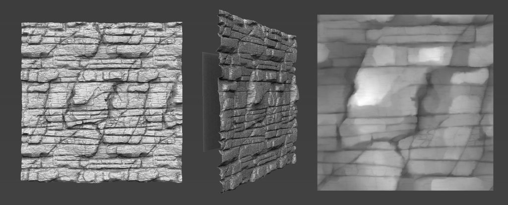
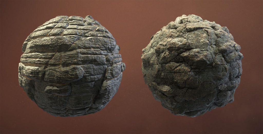
After baking the unique normal map for the rock meshes, I proceed with creating three different tileable rock textures. The pipeline I choose is the combination of ZBrush sculpting on the plane with WrapMode to get nice hand-made tileable rock patterns and then converting the sculpt to heightmap to use it as a base in Substance Designer. There, I added more details and did all the texturing work to have finished materials for use in the engine.
Back in the engine, all three rock materials along with some sand material were blended together by slope blending system and by vertex paint in UE4. I actually included my baked color ID map from ZBrush as a black&white mask to separate the crumbling sand from the rock, because otherwise, it would be difficult to paint this section of sand material by hand.
Grass
Another great organic modeling experience was making the vegetation, particularly the grass. I had some previous experience of modeling grass and baking it on the texture plane to make an atlas but this time I wanted it to feel as realistic as possible. The first attempts were to simply model some straight grass-blades in ZBrush, then deform them and spread to make a grass batch. In the end, it didn’t look natural because I didn’t follow the logic of how the grass actually grows. Then I decided to model the grass-blades not from a simple plane but from the cylinders in Maya and this approach worked way better.
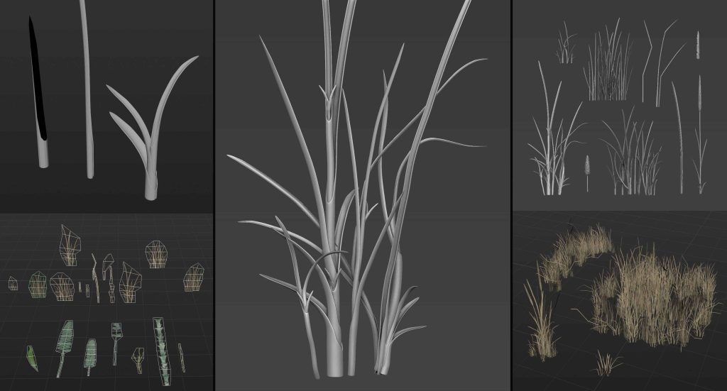
I also made a few additional plant types to fill the atlas and cover all my needs for vegetation in the scene, then baked the high-polys on the plane, painted it in Substance Painter and modeled the actual game-ready vegetation meshes to use as foliage in the scene.
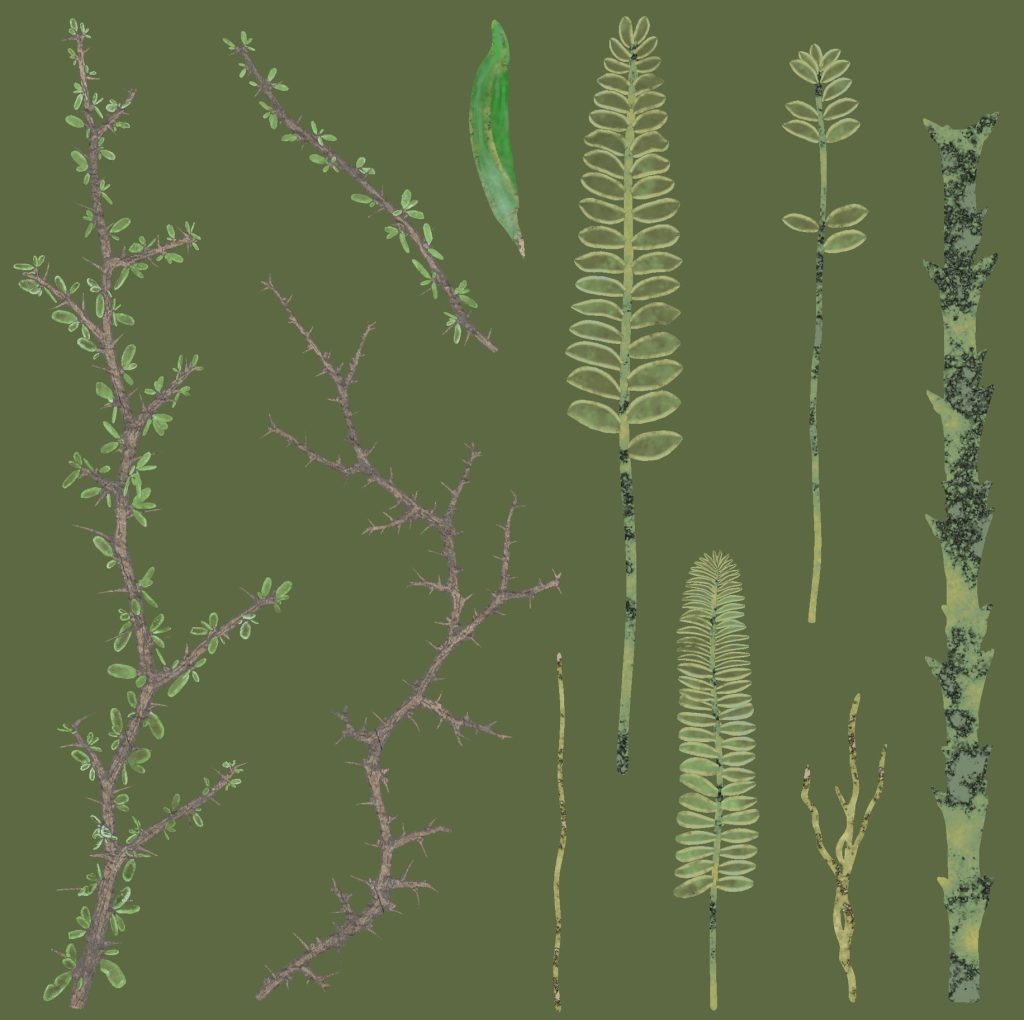
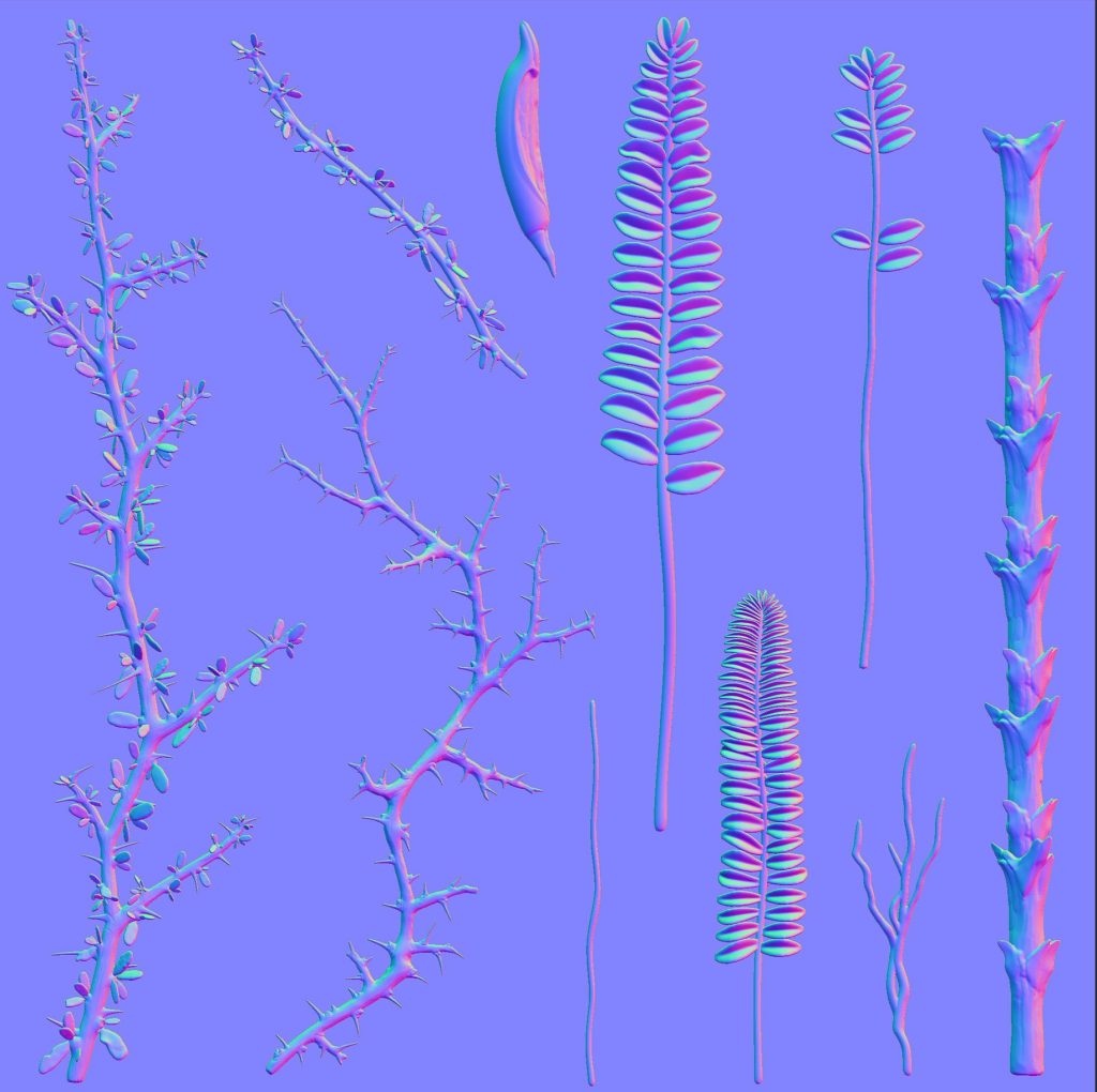
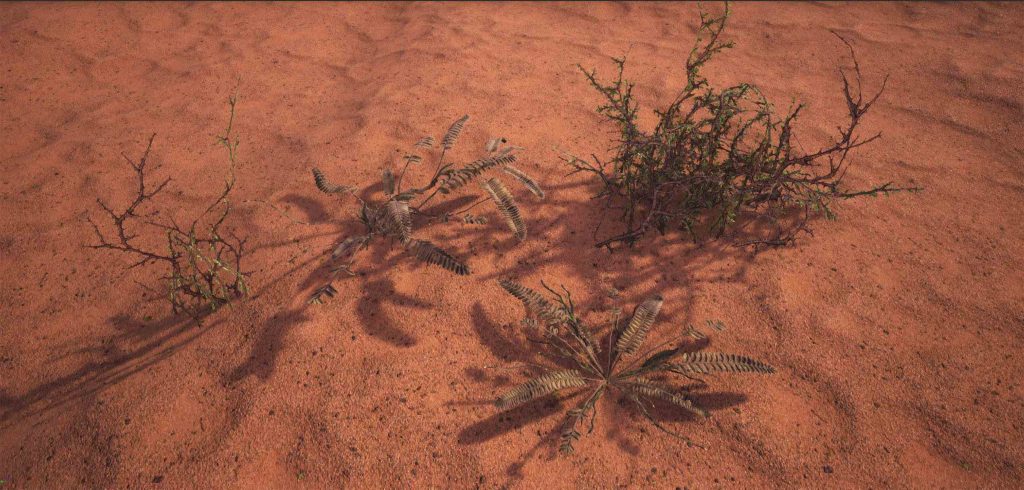
Sand Material
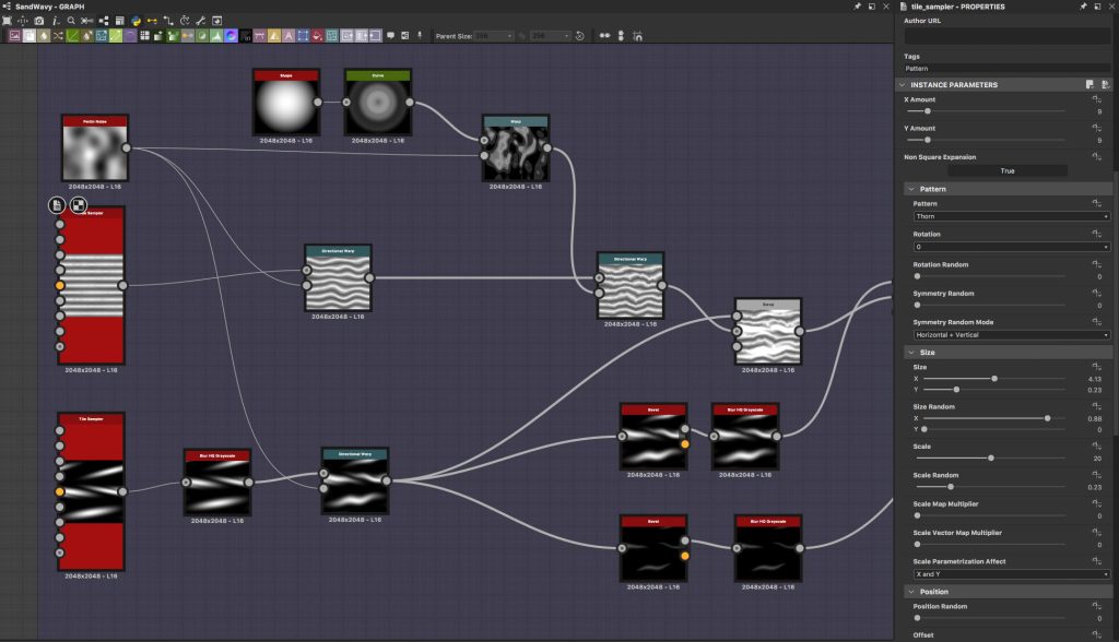
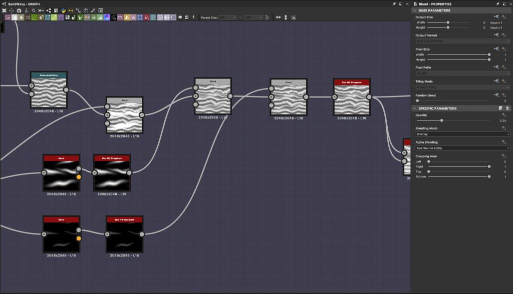
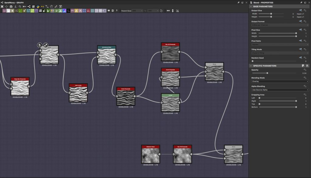
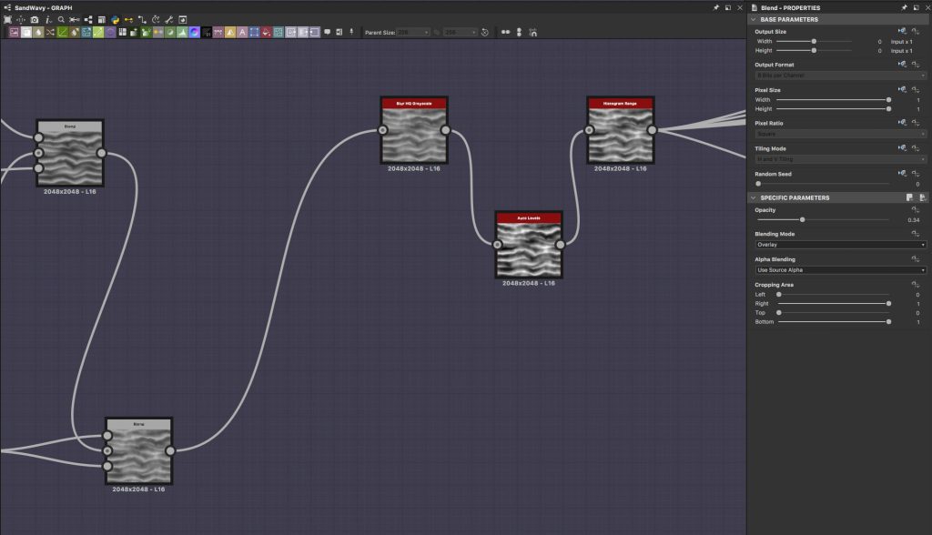
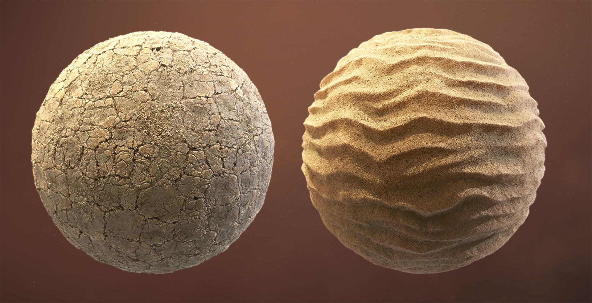
Since the moment I have chosen to do the desert environment I was sure that there would be a lot of work to make the sand material. I didn’t really feel very comfortable working in Substance Designer and of course, I had to watch lots of tutorials and buy some SD materials from other artists to study their graphs and understand how they achieved their results. Luckily as a starting point, I had this nice “Creating Sand” tutorial by Josh Lynch and Daniel Thiger’s tutorial on his Bedrock. I tried not to stick strictly to the methods I learned from the tutorials but to grab the main idea and try to make the materials according to my vision and references I had.
Creating Sand In Substance Designer by Josh Lynch
The interesting part was to make this windswept wavy sand pattern as I was going to have two types of sand material for blending in the landscape. I spent some time experimenting with different nodes and methods to get the waviness to my liking and I ended up with this (there might be some doubtful decisions in the usage of the nodes):
Assets
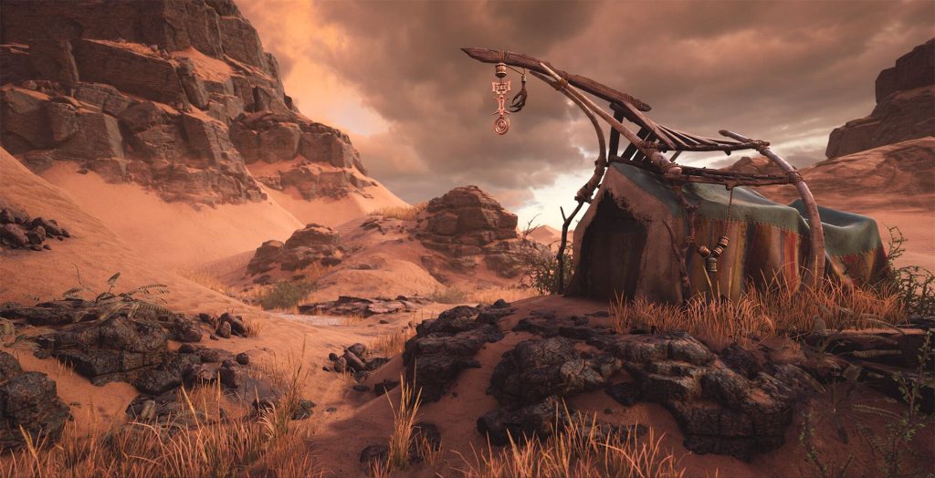
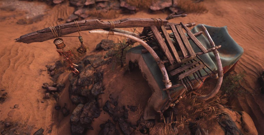
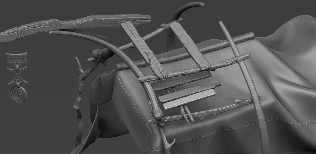
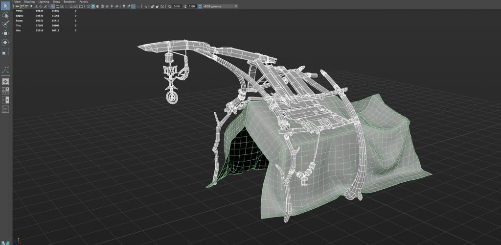
When all the environmental assets were in place it was time to proceed with points of interest which were the tent of a desert wanderer and the skeleton of a giant snake. It took me some serious amount of time to establish the design of the tent first and there were several iterations of the detailed blockout to find the right proportions and interesting shapes.
To make the cloth of the tent look natural I created some simple internal structure which was used as an avatar in Marvelous Designer. It was then detailed in ZBrush just a little and baked uniquely on the hand-made low-poly mesh.
As for the wooden planks and staves, I decided to sculpt and bake them uniquely on a single atlas. The splintered wooden ends were also sculpted separately and then mapped on a few small planes, which were then put at the ends of the low-poly planks for some additional detail noise. All the painting was done in Substance Painter.
Lighting
I’ve always considered lighting my weak spot so I wanted to prepare for the lighting work in this project beforehand. And for that, UE4 Lighting Academy was more than helpful. I watched every episode and tried to follow the main principles that Tilmann highlights there and used some nice tips and tricks to save time where it was possible.
I have chosen to use baked GI since I was going to make some static beauty shots, so I wanted to have as much depth and occlusion as possible without worrying about any dynamic assets.
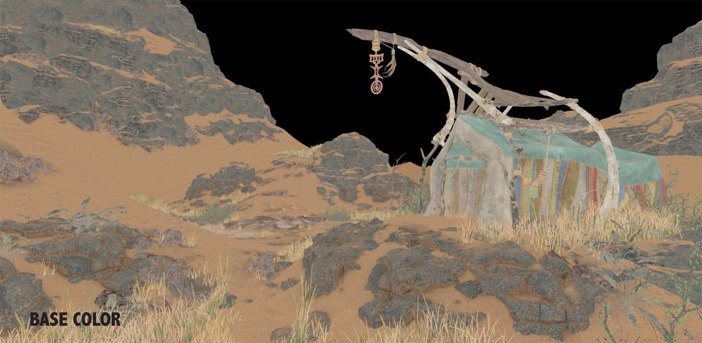
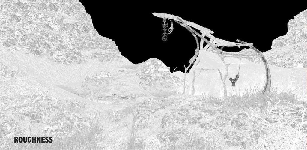
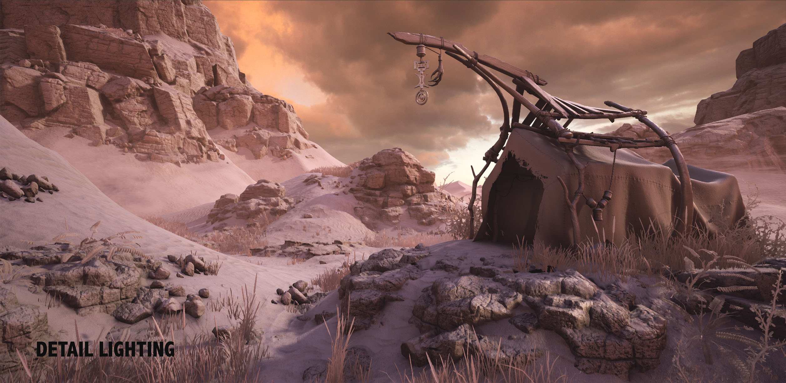
The artistic idea behind the lighting was to portray this overheated but slightly evening light, make the whole image in the rationally monochrome reddish tone. I definitely didn’t want to use a classic orange sand/blue skies color scheme because, in my opinion, this would have ruined the atmosphere of the post-apocalyptic, dusty, overheated environment. The HDR sky that I used was found on CGskies.com and slightly edited in Photoshop. It was one of those lucky coincidences when something you find almost absolutely corresponds with what you planned. However, the sky I used is actually the late sunset sky, and my directional light (sun) angle was way higher, so I had to fake the skylight and spent some time to find the right balance between the sky’s color, skylight intensity, exposure, sun’s intensity and temperature to get the picture that would look satisfying to me. Once I set up the balance and got that picture I was free to experiment with fake spotlights to have some additional nice lighting/shadowing breakdowns.
Post-Processing
And at the end of all – the post-processing. In the earlier versions of UE4 we used LUT map for color grading, however, now we can set it up right in the engine with quite a comfortable color grading instrument inside post-process volume. Personally, I like to use Photoshop to experiment with color grading instead of exporting LUT maps just to be able to quickly tweak things back and forth. Once I tweaked the contrast and curves in the screenshot image from the engine (as said, in Photoshop), I then go back to the engine to recreate the desirable image in UE4 by means of post-processing volume only.
Afterword
I want to thank CGMA and Anthony Vaccaro for his great course and of course 80.lv for letting me share some breakdown with you. And thank you all for attention!
