Spectra: An Artists' Challenge to Bring a Supernatural Story to Life
James Rumfelt talks about the weekly challenges he faced on his design journey for “Spectra” and the key advice he gained from his instructors Reilly Brown and Miki Montillio.
Introduction
My name is James Rumfelt. I grew up a military brat, in little towns you’ve never heard of. I graduated from a little town in Missouri called Fair Play, it has 480 people in the entire town, and my senior class had 16 kids in it. I wanted to be a comic strip artist as a kid, even getting my first strip copywritten at age 14. I always loved comics and aspired to do that one day. My plan was to attend the Joe Kubert School in NJ, but we were poor and I didn’t have the resources, so I left on a bus out of that place headed for basic training in the Air Force. I spent 8 years building bombs as a munition’s specialist. I left the military in 2007, went to college at the University of Advancing Technology in Tempe Az, and graduated with a Bachelors in Game Art and Animation. After that, I got a job as an Illustrator with the 82TRW in the Public Affairs career field. After working on a few freelance games (nothing you’ve heard of I promise) and doing AR/VR work with the Air Force, I really wanted to get back to making comics. It’s the best way to tell a big story, and even though they’re a ton of work, I love it. I had already taken several CGMA courses, and I really wanted to take a course with Miki, I loved his work on Warship Jollyroger. When I got into class and found out Reilly Brown was teaching, I wasn’t sure how to feel, but about a day in I was so glad. I basically got to learn from 2 amazing artists, and Reilly was fantastic. I loved every second of it.
The Idea

The art I created for this class is based on “The Spectra Chronicles,” a project I’ve been working on for the past five years with a friend and writer. Fittingly, our friendship began over art, when he commissioned a drawing of a character he created for his daughter. We became friends instantly, and discovered we had something important in common: we both have sons with autism who we see as superheroes — people with extraordinary abilities who have a hard time making their way in our world.
So, “The Spectra Chronicles” was born. It’s the story of Huxley, an eight-year-old autistic boy who becomes a hero not in spite of his autism, but precisely because of it.
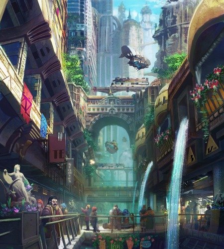
Huxley lives in an arcane-punk world, filled with powerful magic and dark forces. His sister, Kyra, is one of the Spectra, an ancient sect of women charged with protecting their homeland using the emotional magic of Elossa. Though it gives them great power, they do not realize they are only wielding a fraction of Elossa’s potential; their “normal” minds cannot contain its full force. As the darkness of Eboleth looms, Kyra and Huxley discover that his unique, autistic mind is the key to unlocking the full power of Elossa — but that overthrows centuries of custom and tradition, and makes Huxley the object of fear and suspicion.
To protect her brother, Kyra must take him and flee. Along the way, she must learn to communicate and connect with her challenging little brother so that, together, they can use Elossa’s power to save themselves and their world.
We want “The Spectra Chronicles” to be a great story people will love in its own right. But we also want to give autistic kids and their families heroes they can truly relate to and recognize. And ultimately, we hope to help people see autistic kids the way we see them — as people with incredible gifts and abilities who sometimes struggle to live in a world of mere mortals.
Page Layouts


I really tried to listen to Miki every week, and stay as basic as I could. Composition and layout aren’t my strongest suits. To me, that stuff falls into a graphic designer area, and I just struggle there. So, I tried to listen to the things he said in the lecture and apply them in my first attempt. Of course, I ended up trying to make things too complicated and they all seemed cool. Like I remember having Overlap and Staggering all over the same page, I was breaking like every panel with some piece of the action, it was just too much. Reilly came in and really got me on track, helped me to simplify things, and lay them out so much cleaner. You hear the term “less is more” in art from the time you start drawing. I never really understand how to apply that. With Reilly’s help, I was able to really see and apply those principles in week 2 for some much stronger compositions and layouts.
Character Designs


I featured my main characters from my story. Kyra and Huxley (The protagonists), Barra (The big bad), and Cael, who’s a supporting character the guide. Kyra is a brawler, I tried to stick with blocky shapes to show her power and stability, but she’s also a girl, and I want her to look feminine. Some characters are really great with this balance. She-Hulk, Wonder Woman to name a few. I tried to just copy some of those design elements and showcase her attitude as well. Kyra is jaded and combative, she hates authority, and it struggling to care for a little brother she doesn’t understand. As the Father of an Autistic son, I know how that felt in the beginning. This workup was my humble attempt at capturing that.
Huxley is Kyra’s younger brother. I wanted to keep him soft and round. Everything on Huxley is well taken care of, he’s very particular about his clothes and his things. Younger kids with Autism tend to have a lot of dietary issues and sensory issues that make eating troublesome for them. Our boy was very skinny, well still is. So I wanted to make sure Huxley was thin, and his body type was appropriate for an 8yr old. Kyra carries him a lot in the story, I wanted to make sure that sizing worked also.
The entire series is about Kyra and Huxley. Their relationship with each other. Trying to work to figure out how to live together and love one another, despite the complications brought on by Huxley’s Autism. I wanted to tell a story about someone with Autism being the hero because they have that disorder and someone who loves them working so hard to communicate with them and meet them in the middle.
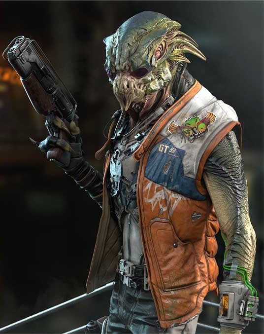
Barra, I used a lot of angles to keep him scary and menacing. Barra initially serves as just the creepy tech guy for the Spectra team, but he’s corrupted by an entity called Eboleth. I wanted to showcase some of his abilities after the corruption and still show off some of the techs he develops before he’s turned. Ultimately, he chases Kyra and Huxley through the entire series.
Cael serves as the guide. He’s given abilities through part of this ancient order he’s in. It causes the member to age dramatically. So, in reality, he’s only about 20 years old, but when he was given his gift it aged him. He’s basically the Occupational Therapist in this story. The Guide. He helps teach Kyra how to care for Huxley and also helps to keep him safe. I tried to keep Cael gaunt and frail-looking, but he needed to look like he could be as good once as he ever was. That’s a hard thing to do, Reilly definitely helped me with that, and Brett Bean! I had Brett in the class before this one and he helped me develop some of these characters there as well, another fantastic class and instructor.
Developing Environments


Again, I’m not great at composition. I had to rely a lot on Reilly for this week. He helped fix so many issues with my comps. Less is more, less is more. Keeping your composition straight forward and easy to read is the way to go, especially when you’re learning. He helped me to understand that starting at the beginning is still a great place to start. You aren’t an expert until you’re an expert. He showed me some really cool artists who are masters of composition and helped me understand where I could end up once I have a better grasp on that stuff. For now, I’m taking it slow and trying to apply solid practice. For me I redid my pages almost every single week, after listening to crits and looking at what Reilly had said, it was almost always better to scrap it and start fresh with that new knowledge, and it was really great to see my stuff improving every single week.
The Rules of Research


Research is important always, that’s a big thing I’ve learned at CGMA. Research and there are no rules! Meeting the deadline is the only rule. Don’t steal stuff, but it’s okay to steal stuff…just do it ethically. I was doing a bit outside environment, so gathering reference for the vegetation and the rocks were important for me. All the shots Miki talked about I was familiar with, but I don’t consciously think about using them. Again, always trying to do something “less obvious” and “More interesting”. Which usually means I just make a page that doesn’t work. Reilly helped me with that in week 5, and I ended up using the “Landscape as a Mood” shot that Miki spoke about. I wanted to try and capture the big beginning of an adventure. Like the beginning of Lord of the Rings or The Goonies. Reilly had me work the comp a few times to land where I did, it was a lot of work, but worth it, I was really thankful in the end.
Inking: The More You Know


INKING IS HAAAAAAAAAAAAARD! I was inking the first issue of The Spectra Chronicles a few years ago, and asked a friend (A Joe Kubert alum and DC Artist for a time Tony Vassalo, you can find his work here) to look over my pages. He literally told me to just stop inking I was so terrible at it. It was solid advice at the time, but it’s something I really want to improve on. Bill Watterson and Skottie Young are idols of mine, their inking skills are unprecedented. They put so much identity into their lines, I want to be able to do that so bad. I made a pass at my pages, digitally inking, and one of my fellow classmates was saying some kind things, Reilly listened and then was like “Listen I don’t agree, this isn’t that good and I’m sorry to be unkind but letting you off the hook here isn’t going to help you get better”. That’s what I LOVE about CGMA. Every single instructor in every class I’ve taken here (This is my 8th) has been like that. You’re spending the money to take these courses, you’re here to improve, you don’t need to hear you’re doing great if you’re not. Reilly showed me a lot about how to improve, took the time to really help me work through it, and my 2nd attempt was light years beyond my first, I was so grateful.


Attempting Color

I’m so scared of color. I tend to dive at color in the most passive way. I’m afraid to make bold choices when it comes to it. Reilly took one look at my first pass of color and pointed that out. My characters were getting lost in their backgrounds, nothing stood out. Just a sea of gray. Color sets up how we feel about so many things. The importance of color can’t be understated. After Reilly gave me my critique I went back in and started over, what I got the 2nd pass was again far better, a lot bolder, and much easier to read.
The Last Week


My cover concept and page 2 rework.
The hardest part about the final week is just calling it done and good enough. That’s the issue with comics, and I think art in general. We’re all waiting until we’re “good enough” until we are masters before we put out our work or the thing we’re working so hard on. One of my favorite artists working is Jake Parker, he talks all the time about how finishing something is more important than making something perfect. Perfect doesn’t exist. Make your thing, get it out into the world, the next thing you make will be better, and the one after that. You learn when you do, so DO SOMETHING. My pages changed tremendously from 1-8, they literally ended up being redone almost every single week. It was great to watch them evolve. Tips I would give other artists taking this class are to come into the class with an idea of a story you want to tell. Use this class as a time to work on your story and your characters. Don’t get married to anything you make. Listen to your instructor, and if you need to start over after they TEACH you, just do it, your work will be better every single time you do that. Be humble and just come ready to work.
Final Thoughts
I was really happy with my character designs and my final inked pages. The skills I improved most on were inking and composition. My instructors were amazing. I can’t say enough good about Miki and Reilly. Reilly gave incredible feedback, honest and effective, his dialogue was inviting, he was engaged, patient, and just amazing. I really loved every minute of this course. Every piece of feedback he gave me made my comic better. He’s an amazing artist and an amazing teacher. I’m still working on my comic and intend to for the next several years. Currently almost finished with Issue 2. I worked on pages for issue 3 in this class to get a little bit of a “jump-start”. I would recommend this course to anyone interested in making comics. It sets you up for success. It pushes you to improve and you get to learn from someone working in the industry and that feedback is PRICELESS. They’re not telling you things they *think* will work, or stuff that worked 20 years ago. They’re telling you things that work right now.
You can check out the course Comics: The art of Storytelling to learn more.


