Creating Captain Blackbeard With ZBrush and V-Ray
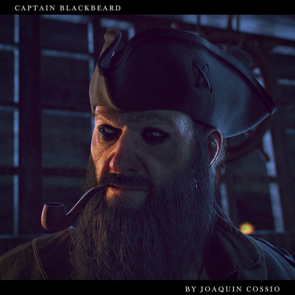
Joaquin Cossio did a detailed breakdown of his Captain Blackbeard character he created as part of an online workshop.
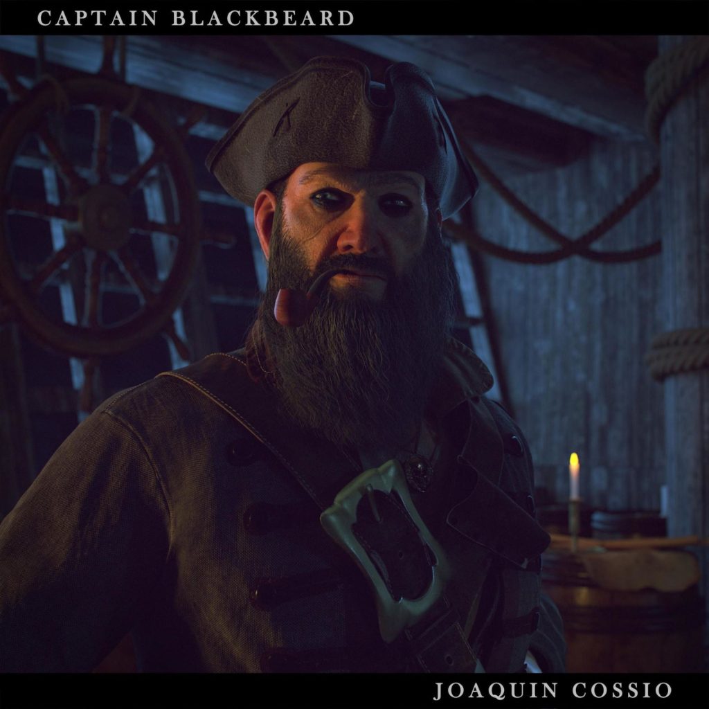
Introduction
 Hi folks. First, thanks for stopping by! My name is Joaquin Cossio and I’ve been working as a 3D generalist for around 4 years. Recently I’ve been working as a 3D character artist for cinematics and games. I grew up in a little town on the outskirts of Montevideo, Uruguay, a little country located in South America. Once I graduated from high school, I wasn’t sure about my future, but when I discovered the 3D world I decided to start my career at a school called Bios. In my third year at Bios, I got my first professional job as a freelance 3D generalist for several local production houses. Working in a professional pipeline helped me to learn so much more. Over these years I discovered a tool called ZBrush which blew my mind and changed the way I did art. Two years later, I got my first project as a character artist at NIKO Post & Films. I had the opportunity to work on an amazing project for “NBA – Green Energy Team”. There I improved my character creation skills, especially in face modeling. Currently, I work as a freelance character artist for Plus Infinity Studios, a small Indie game company located in Colorado. I got a job there after finishing an online course at CGMA. Thanks to Pete Zoppi who recommended me although there were other amazing artists.
Once I decided to focus all my attention only on character creation, I knew that I had to improve my skills. After searching on the internet for a while, I found this cool course by Pete Zoppi (character creation for film/cinematic) at CGMA. It got my attention right away, not only because he was an amazing artist but also because I thought it was a great platform for studying. My main goal was to use all my knowledge from previous years and use it in a single character. Also, I found this course to be a good way to learn about the pipeline of big cinematic companies.
References
The first step, and I think is the most important one (at least at the beginning of any project), is to gather references. Usually, I spend one or two days in this stage, depending on the project. Looking for the good ones is a tough task. So, I use and recommend Pinterest because you can save everything in boards and come back to them any time. This way, you don’t need to fill your hard drive with junk. After a specific concept or an idea catches my attention, I start to break it down into sections. Making your own references is an important point as well. If you have a chance to gather references from real life, it will be more useful than google research, for sure.

I used Black Sails as the main reference and other 3D references from other artists who inspire me.
Once you are happy with your references, it’s time to get your hands dirty. So, the first step is blockout, where you need to block the whole shape of the character without thinking through details. The idea is to get a good shape to start working with. At this point, we can even use base meshes to speed up the process, but be sure to think about how it will be used later.

Face
This is probably the most important part of a character, so I spend most of the time working on it. I will try to explain most of the workflow to speed up the process and end up with a very detailed face.
First, I usually start with a base mesh. You can use your own or even download one from the Internet. It’s very important that the mesh contains the main loops and a relatively low poly count, so you can work more efficiently (you can download my own base mesh for free on my website).
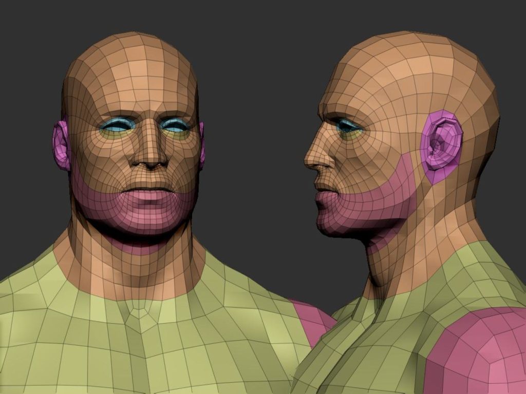
Second, think mainly on primary forms. I recommend spending more time on this part because it gives you the main shape of the face, also use symmetry at this point to accelerate the process. Try to follow references all the time, use anatomy books as a good source of inspiration.
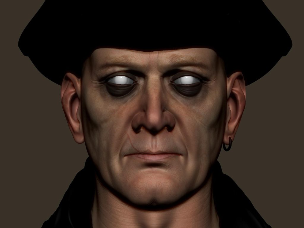
Third, start by adding some asymmetry to your character, mainly on the points of attention, like eyes, nose, mouth, ears; this will make your character look more natural. What’s very important at this point is using layers. This will allow you to go back in case you want to change something; at the same time, it lets you use morphs to fix parts you want to modify.
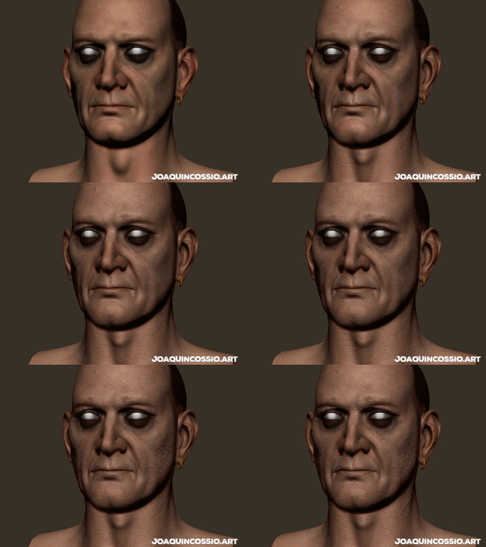
Fourth, once you’re happy, you’re ready to sculpt secondary forms, but the good thing is that you don’t need to sculpt it by hand because you have texturing xyz displacement maps. So now we need to export our model in a pretty high resolution to the software that you’ll use to project textures. In my case, it’s Mari, but you can use Mudbox as well. The advantage of these maps is that they will give you a very detailed result pretty quickly. But I recommend you to check the tutorials from texturing xyz to get a better understanding of how these maps work and how to prepare them before projection.
Once the map is prepared, we can import our model and start to project the displacement. I recommend working in the highest possible resolution your PC can handle. I used 4k maps, but it’s better to use resolutions over 8k; this way, you can be sure that you pay attention to the smallest details of the map.

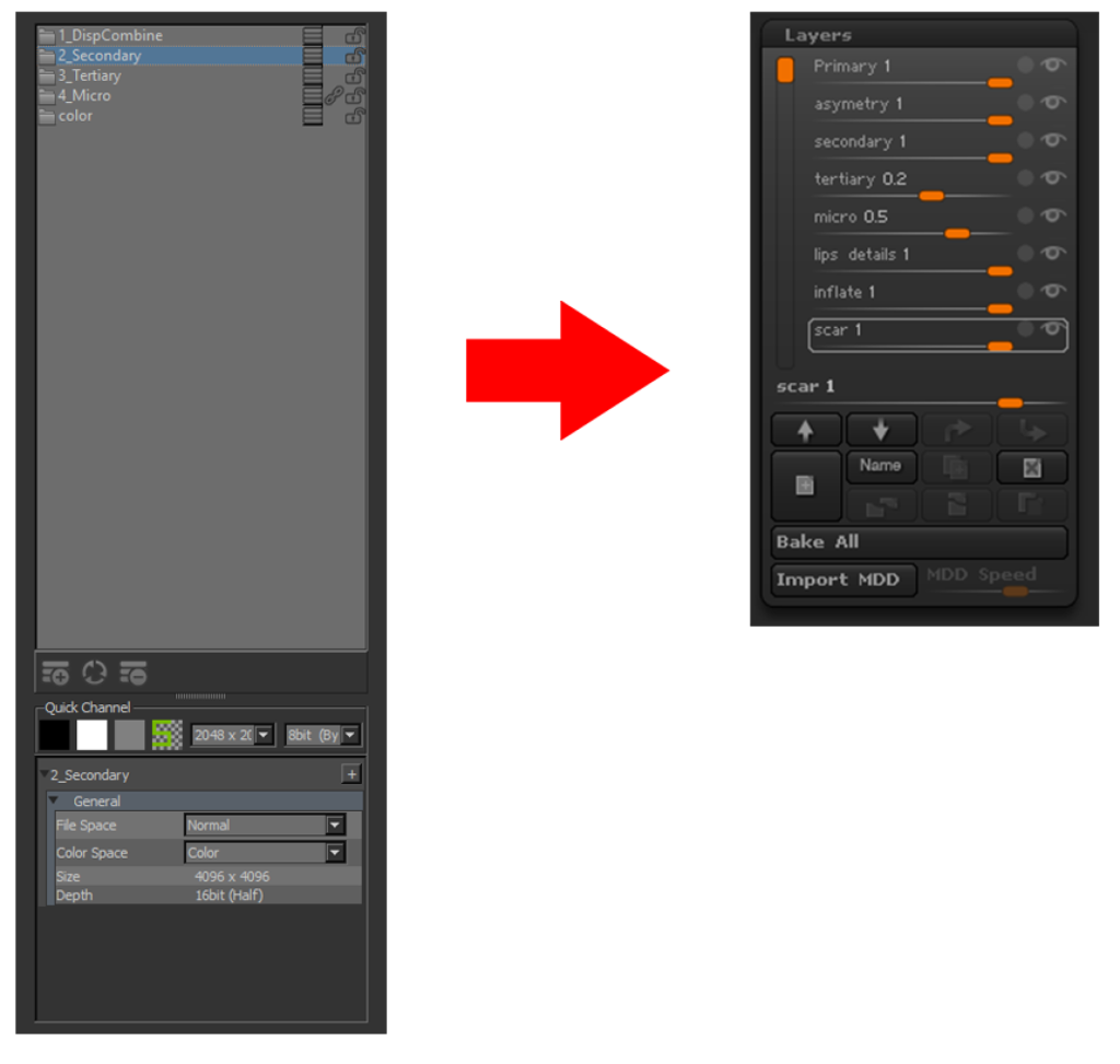
Once finished, we go on to exporting the three channels separately. These contain secondary, tertiary, and micro details; this way, we can apply it as displacement information. In this case, I used ZBrush, and as I said before, it’s very important to use layers with levels of detail, as shown in these pictures:
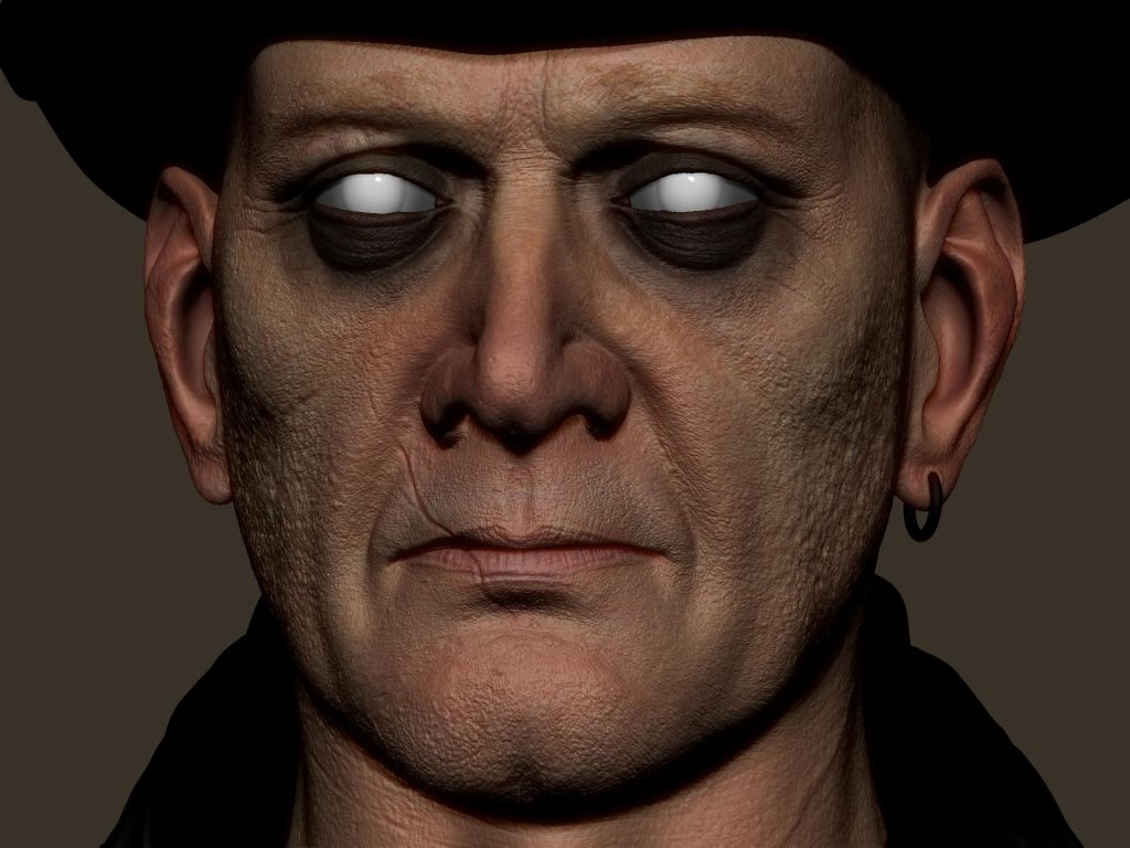
Next, we’ll see the character with all the maps applied and some other extra details that are specific to this character.
Detailing the Assets
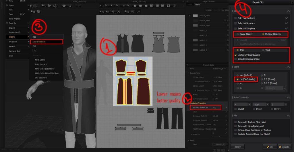
For clothing, I used Marvelous Designer. Added this amazing tool to my workflow changed it drastically. Now I can start with a pretty solid base, and later, in ZBrush, I only need to add secondary and tertiary forms. Speaking about that, let me outline a very short tutorial of how I export my mesh from MD to ZBrush.
- First, select what you want to export. Just to keep it organized, it’s better to do it separately.
- Make sure that your particle distance is lower; around 5 to 10 is ok.
- Go to file, export, obj (selected), save it
- Once the export windows show up, select multiple objects: “Thin” with “unfold UV cord” active and select “cm (DAZ Studio)” for the scale.
Note: the scale depends on the 3D software that you are using. I always use the same setting for 3ds Max.
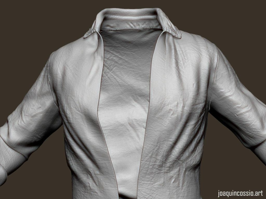
Once in ZBrush, import your model. As you can see, everything looks really ugly but don’t worry; we’ll fix it in a few steps.
- Make sure that your model has polygroups. If it doesn’t, you can do it very easily using autogroup in the polygroups panel; go to split panel and select “group split.”
- Go to the geometry panel and press zremesher; just leave it everything by default.
- In the same panel, go to “EdgeLoop,” panel loops, then select 2 in the edge loop slider, thickness 0.01, Polish 0, Bevel 0, Elevation -100, and hit the button Panel Loop.
- Boom, you have a beautiful shell, now just do a couple of subdivisions and repeat the same process for the rest.
Once it’s done, we are ready to add all the extra details. I used alphas from surface mimic for micro details.
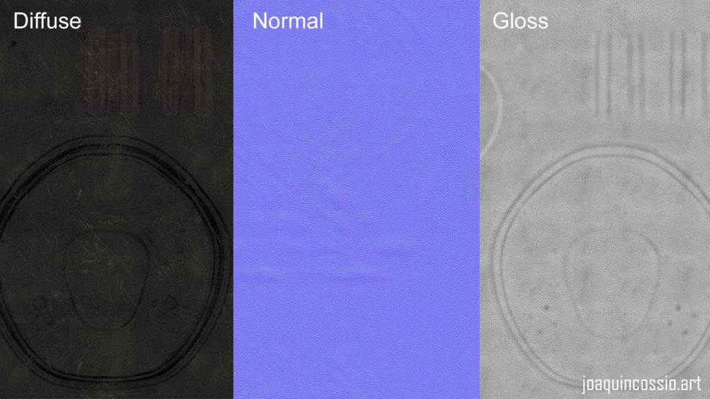
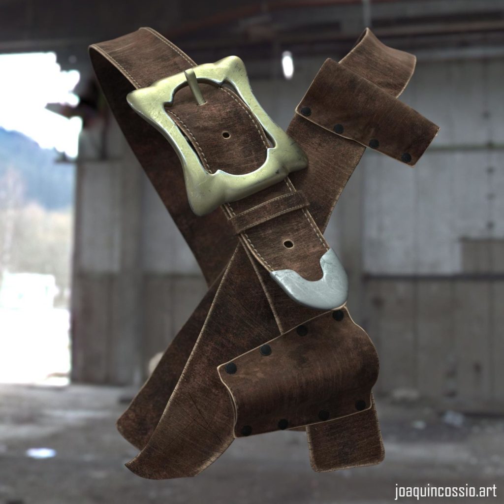
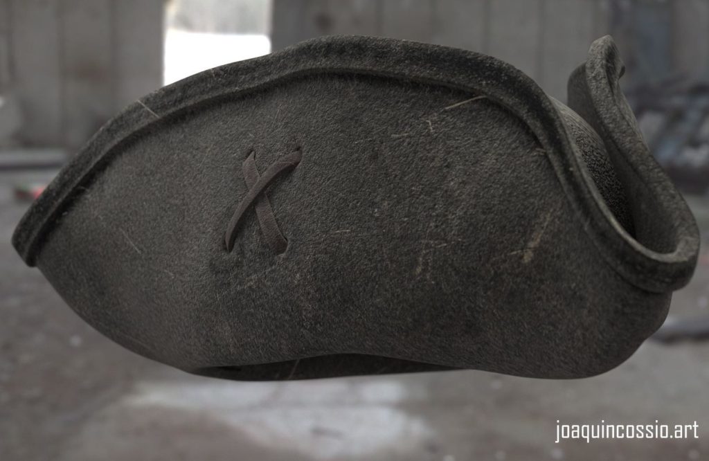
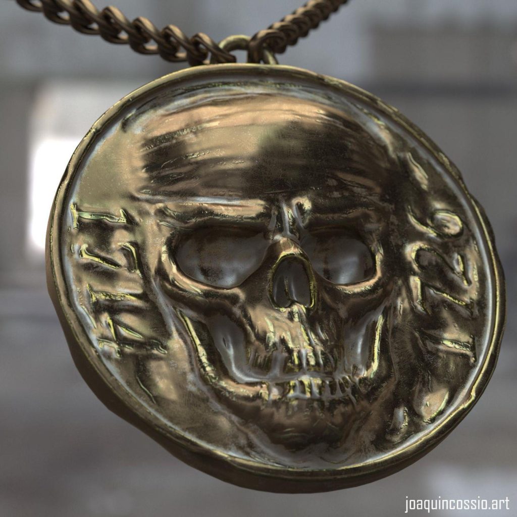
On the other hand, for the Hat, I used a classical workflow. I created a simple model using polygons and forms in 3ds Max, trying to follow the friendliest topology possible and always thinking that later I’ll apply a smooth modifier. Once our base is completed, we proceed to create UVs, add some extra details in ZBrush if needed and export it to Substance Painter or Quixel. In the texturing process, you can play with different color variations, dirt, scratches, etc. These tools can handle a ton of details, so taking advantage of that, we can use it to speed up the process. I used the same workflow for the rest of the assets.
Skin Shader
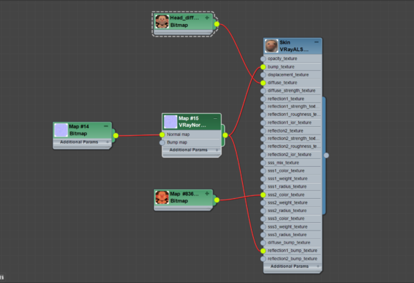
In this project, I used the new “Alshader” skin shader for Vray in 3ds Max, which lets us get more realistic results in a simpler way.

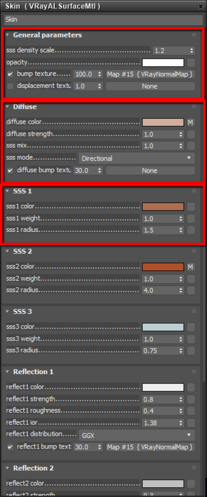
When we’re creating a skin shader it’s very important to think about layers. Although new tools let us basically do it automatically, having knowledge of the process lets us understand the concept in a simple way. The challenge is always to achieve a realistic but pleasant aspect. The realistic doesn’t always look nice, for that, I recommend using different photographic illumination techniques, this way we’ll get more interesting results.
Basically, we only need to control the three main values of the material. “Ss density” defines the amount of scatter our model will get from ambient light (low values add more scatter), “sss mix” controls the mix between diffuse and sss material. Values close to 1 are defined as a material with scatter, “sss1 color” defines the scatter color, it changes depending on the skin tones. Playing with these three values we’ll achieve very interesting results.
We can see how the shader is created by applying the diffused color in the corresponding channel and using a variation of reddish skin color in the “ss2 color” slot. Adding more skin layers gives us more control over our final result, but the idea here is to make it as simple as possible.
Hair
Hair is hands down one of the hardest parts of any character to work on. It’s always been a step that I’d sometimes decide to skip due to lack of knowledge. But in this case, I decided that the hair would be a very important part of the character because it’s a distinctive feature of his image.
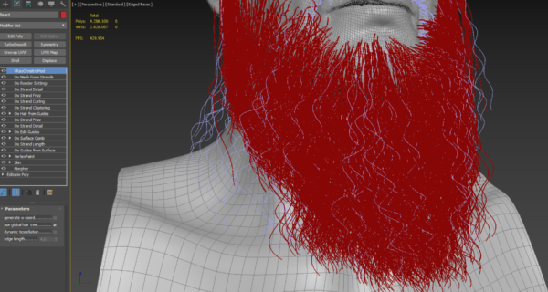
I used Ornatrix for 3ds Max, which is not too easy to use, but once you get the hang of it, it becomes simpler. Anyway, this character took more than a week of work until I liked the result, and the character was easy to pose. I used layers to design this character, and when it came to working on the beard, I created two separate hair systems. One of them was the main form and the other was for “flyaways,” it let me get a more realistic result and was easier to control. In this same way, I created different layers of modifiers that allowed me to control clumping, frizz, curling, details, and shape.
Presentation
The best way of presenting your character is to create a small story behind it, a reason why your character was created. It shows that the character has its place in space and time, lets people feel interested in our piece of art. It doesn’t have to be too complex, but it has to have a message.
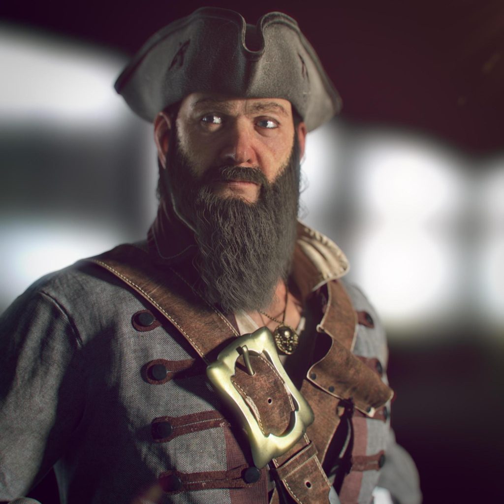

It took me about a month to create this little story for the final render.
Lighting and Rendering
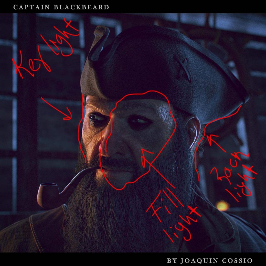
On the other hand, the illumination plays a very important role in the scene since it defines the composition. In this case, I used a basic three-point technique, one warm main light (key light), one cold (fill light), a rim light, and a cold (backlight). It’s important to play around with color values in post-production to draw more attention to the effect.
Posing
When it comes to posing a character, I recommend using simple rigging because it lets you get different pose variations without wasting time. I used CAT, a default rig of 3ds Max that’s very powerful and simple. We can use plugins that let you create skeletons automatically. We create the poses by references that show the situation that the character is in.
Conclusion
Without a doubt, I’ve learned many new techniques during the course. I understood many processes that I would skip before because I lacked knowledge. I learned that using high-resolution maps lets you work on the smallest details and gives a big boost to your work, at the same time letting you achieve incredible results quickly. Also, I learned new ways to create shaders, composition, and illuminate a scene properly. I want to point out the incredible attention to detail that Pete Zoppi has; thanks to that, he makes your work evolve during the course.
I recommend people take this course if they want to make their workflow better and, of course, learn a ton of new tools.


