UE4 Lighting Production Breakdown
John Griffiths discussed his approach to lighting on the project he worked on during the Art of Lighting for Games course at CGMA.

Introduction
Hello, world! I’m John, and I’m a Lead Environment Artist.
A bit about me before the main event: I started out as a freelance 2D Flash Animator but from countless hours of playing video games growing up, I knew that I wanted to eventually work in game development building worlds. I’ve now been working in the CG-industry for ten years and have worked on a variety of projects from animated short films and advertisements, to video games and Virtual Reality productions.
I’ve been involved in a lot of different projects over the years, and I now have a good breadth of tools, pipeline, and skill knowledge. Having said that, my professional roles have mostly been geared towards asset creation and world-building rather than post-production and lighting so I knew that my experience in these areas needed some improvement.
When I learn new skills/tools on my own, I gather as much information as I can on the subject on the internet. This could be YouTube tutorials, image breakdowns by other artists or simply reaching out to the community on Twitter. When it came to improving my skills in lighting though, my usual method didn’t work as well. Lighting is subjective and, in games especially, it needs to be able to work in real-time when the game is played. With these in mind, I found it quite difficult to create a lighting setup that looked good and that was functional. To understand what I was doing properly, I needed someone to show me first hand how to light effectively. That’s when I considered participating in the CGMA Art of Lighting course.
Course Overview
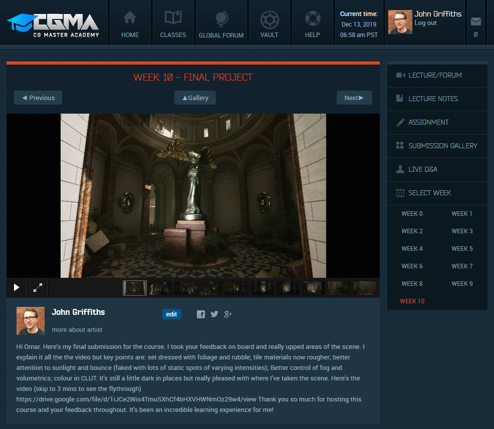
The course was broken down into ten weekly sessions, each designed to build up your lighting knowledge from the ground. Each week, you were provided with a scene to light, video training from Omar Gatica showing his approach to lighting it, and space to upload and share your work with your fellow classmates. At the end of each week, Omar would give video feedback on your work along with any tips or improvements that could be made. We also had a weekly live Q&A session with Omar to discuss lighting, in general. These two forms of feedback were invaluable to my skill growth as I could better understand what Omar was looking for in my lighting submissions.
Throughout the course, Omar showed us how to approach lighting in a methodical manner. This made it much easier to understand what lights were needed, and how we could better control them as we refined the lighting. This meant that lighting for every scene can be approached in the same way and provide consistency to the way you work.
For our final lighting project, we had to light one of our previous submissions in a different way. I wanted to convey a sense of discovery in my project, so I opted to do a closed interior scene.
Setting Up the Scene
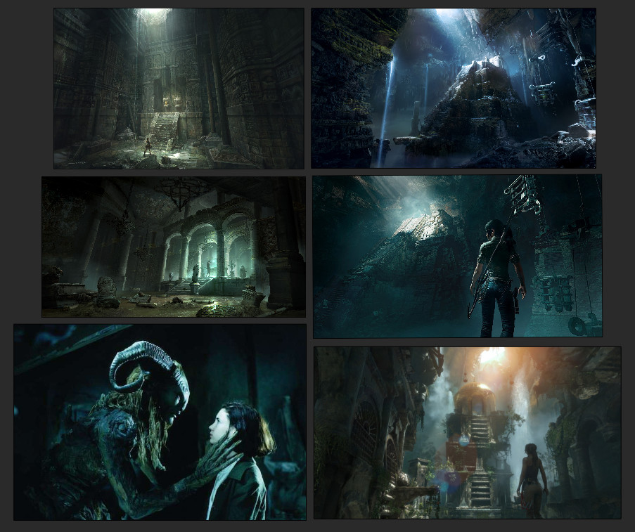
Like with any project, you have to start with some references. I took mine from the latest Tomb Raider saga and a still from Pan’s Labyrinth that really honed in to what I wanted to achieve: leading the player/eye with light. I wanted to have one main source of light and use it to create pockets of light that would help guide the player through the scene. The reference shows this on a much grander scale, so I had to keep in mind how this might work in a smaller environment.
Although the focus was on lighting, we were encouraged to adapt the scene to our needs (as long as the majority of our time was spent on the lighting). I knew I wanted one main source of light, so with this in mind, I created a few holes in the ceiling for the light to spill in from. It’s worth noting that I didn’t create any new assets for this adaptation, I deleted what I didn’t need and used geometry already in the scene to flesh out the new areas. I then set up a sky and directional light (the sun) and played with the light angle, so that the coming-in light (and shadows created) looked good throughout the level.
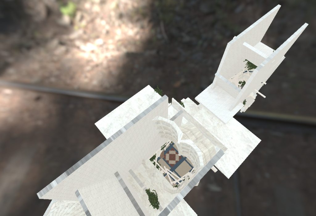
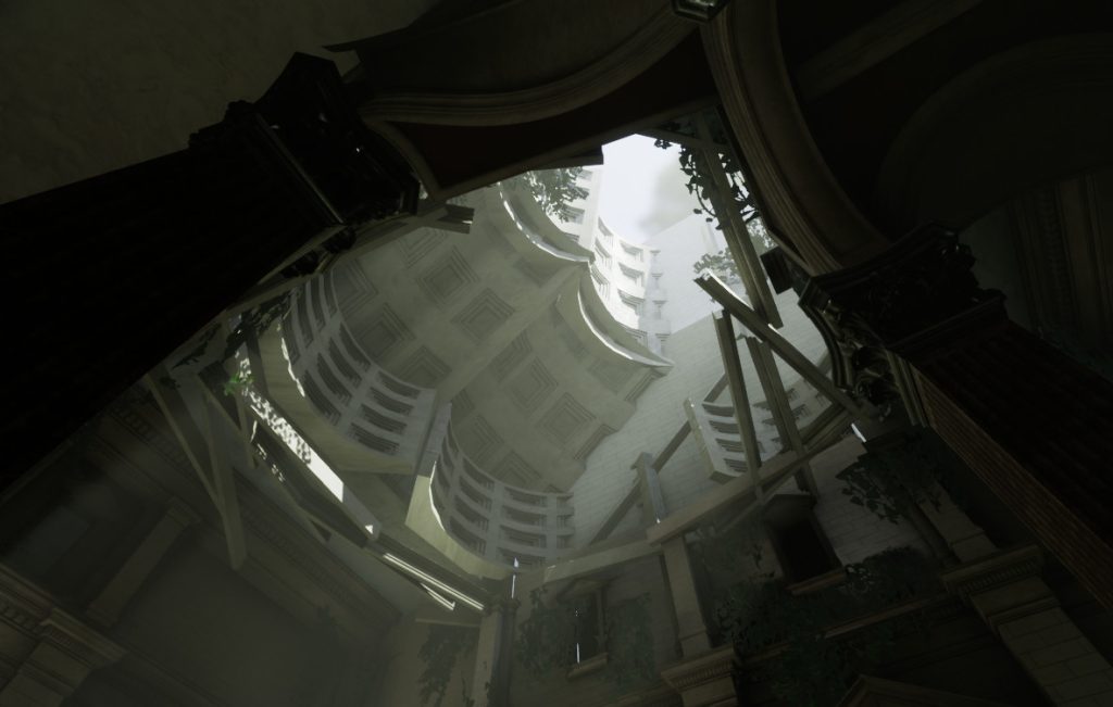
At this point, it’s good to add additional utilities to the scene to help with the look of the lighting but also with the functionality of it. This included adding a Lightmass Importance Volume, Reflection Capture Spheres, locking the Exposure, checking Lightmap resolutions on assets, adding Fog and a Post Process Volume.
Although you won’t be working with some of these utilities until the end of the process (eg. Post Processing or Fog), it’s still a good idea to set them up now. It’s even a better idea to begin to organize your scene! Group similar items together and label them properly. This is not only good for your own sanity but also for the sanity of others who might be diving in and out of your levels
Blocking the Lighting
With everything set up correctly, we can now focus on the lighting itself. At this stage, it’s good to be more free with the lights you put in. We’re not too worried about the technicality of the lighting but rather placing lights so as to make the scene look more aesthetically pleasing. Use Point and Spot Lights (keep them as Stationary) and adjust their Intensity, Attenuation Radius, and Color as you go. You want to place them in logical locations but also in places that create visual interest or lead the player. In my case, I used Point Lights to fake the bounce light from the main Directional Light and Spot Lights to add rims to the statues.
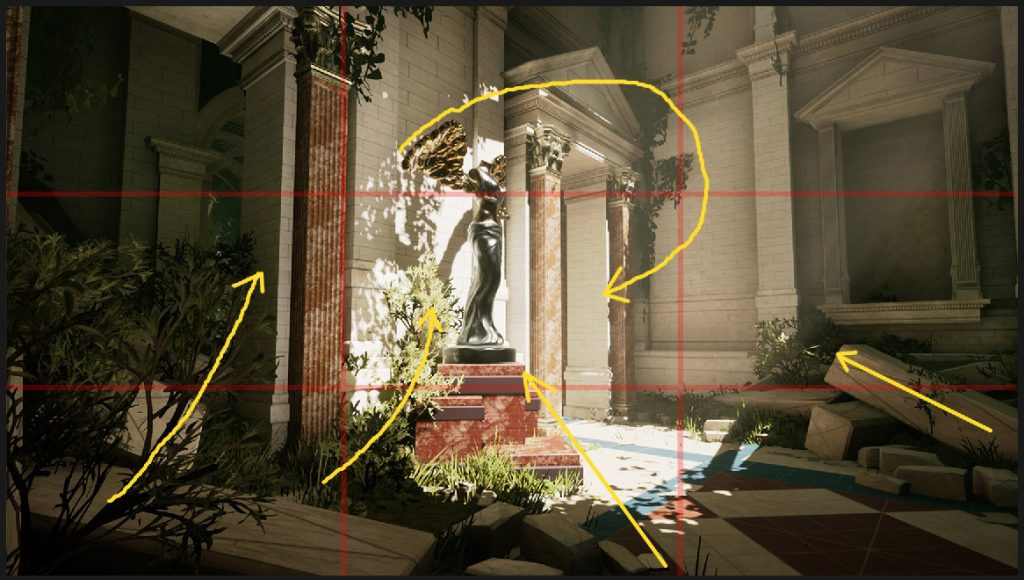
At this point, it’s a good time to start thinking about the camera angles you want to use to show off your lighting. You can do this with individual cameras or bookmarking the viewport (Ctrl + 1-0) to save a viewing angle. You want to be creating visually pleasing images, and composition plays a large role in this. Think about how assets are arranged, where the light is focused and what we want the viewer to look at. All of this helps to guide the eye around and into the image.
Before we further refine the lighting, we need to check that the materials in the scene look at how we want/expect them to. Physically Based Rendering (PBR) is now commonplace in game development and as such it is something that has to be considered when lighting. PBR materials are defined by three main input values: Albedo, Roughness, and Metalness, and depending on what each of these values is will create an entirely different material. If a material is not lighting how you expect it to, then you’ll need to go into the material itself to find out why and correct it. You can use the Buffer Visualisation to help assess which materials are PBR correct and what isn’t so you know which ones need fixing.
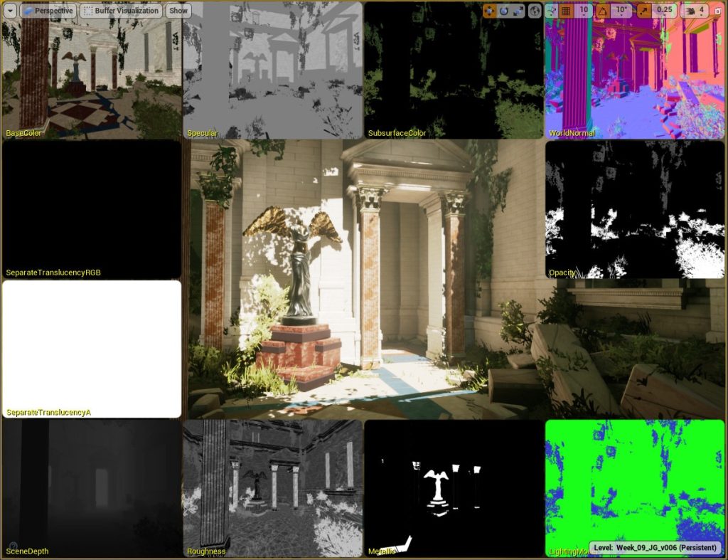
Before we move onto the final part of the process, it’s good to get into the habit of building the lighting after each significant change you make. This means you’re getting a better idea of what the finished lighting will look like as you go rather than right at the end.
Refining the Lighting
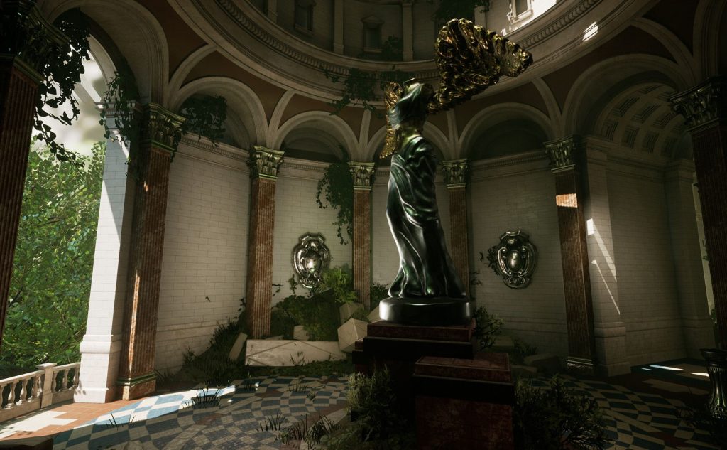
As I mentioned before, I changed areas of the scene to better accommodate the look I wanted to go for. I also created bits of debris to help fill out space and used some foliage I had previously made for a different project to tie it all together (the ivy is from the Unreal Marketplace). The debris meshes were essentially cubes of different sizes with the wall material slapped on them. I grouped these meshes together on export and arranged them in the scene to create stronger compositions. Without this, I don’t think the scene would have looked as good.
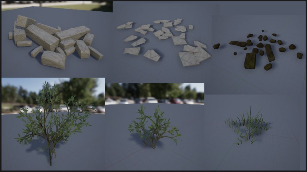
To make it faster and to set dress the scene, I add a Landscape mesh and sculpted it to create mounds of dirt, and I used the Foliage tool to paint the vegetation onto both the landscape and the meshes around the level. To make the level feel more abandoned, I hand-placed foliage around the ceiling holes, so that I got more interesting shapes in the cast shadows. This touch helped solidify the overgrown nature of the place without the player having to actually look up and out of the scene.
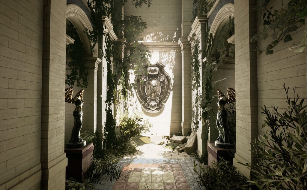
With the scene set dressed and the materials adjusted, I turned my attention back to the lighting and started to change my blockout lights from Stationary to Static and continued to build the lighting after each round of changes. Doing this with groups of lights at a time helps check that the look is retained and can help trap any errors as you go. Once I was happy with the Static changes (and the built lightmap), I’d go in and add a few extra Static lights to help make assets “pop”. This was generally in the form of small Spotlights behind the statues to help give them more of a rim light, separating them from the background.
The last tweaks came in the form of fog, light volumetrics and adding a LUT to the Post Processing Volume. The fog was created using the standard Exponential Height Fog utility and moving the sliders up and down to find a look that worked. This was emphasized with volumetrics from the Directional (sun) light and again, adjusted until it looked good. I used a Colour Look-Up Table (LUT) to add more color into the scene.
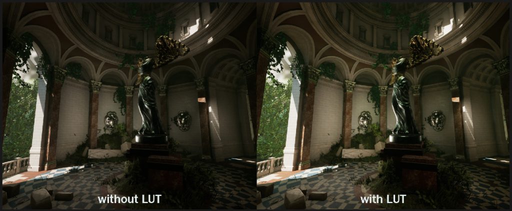
And that’s it! Easy right?!
Feedback
I touched on this briefly before but wanted to talk about it in more detail before finishing. In order to improve, you have to be comfortable with people looking at and assessing your work in a less-than-finished state. Giving and receiving feedback during development will help strengthen the final look of a piece whether it’s for lighting, texturing, props or characters. If you don’t request feedback often, then you may overlook problem areas, which are harder to fix later on. On the course, Omar requested that we submit images for review and, if possible, a video flythrough of the level with our own commentary. Not only did this help Omar understand what you were trying to achieve, but it also helped me better understand what I was doing when I vocalized it.
Afterword
Like with all things, what you put in is what you get out. If you’re willing to follow the course videos, attempt the implementation yourself, try new things, participate in weekly discussions, ask for feedback and can take suggested feedback onboard then you’re going to get the most out of it. Often I hear the excuse “I don’t have time”, and yes, sometimes you might not have time to commit to a course, but if you want to improve you have to make time for it. While I was on the course, I worked full-time, streamed art creation sessions twice a week, spent time relaxing with my other half and still managed to fit in the weekly video tutorials and create the weekly lighting scenarios. It wasn’t easy at times but if there’s a will, there’s a way!
I also want to note that I didn’t pay for the course myself, my employer did. CGMA has several options available for payment including employer reimbursement, so if you want to do one of their courses but can’t afford it yourself, then ask your employer. Remember they’ll be the ones benefiting in the long run with the skills you can learn now.
If you want to see the final images for my project then you can find them on my ArtStation page. Similarly, if you want to see how I create 3D scenes myself then you can tune in to my streams on Twitch, watch previous projects on YouTube and ask me questions on Twitter.
John Griffiths, Lead Environment Artist
INTERVIEW CONDUCTED BY ELLIE HARISOVA
For more information on CG Master Academy and The Art of Lighting for Games course, please visit the CGMA website, or email [email protected]


