Realistic Character Art: Face, Clothes, Tattoos
Juras Rodionovas talked in detail about the production of his ultra-realistic character Soulless made during CGMA’s class Next Gen Character Creation with Adam Skutt.
Introduction
Hello! My name is Juras Rodionovas and I currently work as a Character Artist at Fatshark, in Stockholm, Sweden. Previously, I worked at Avalanche Studios where I got to be part of the projects Rage 2 and Generation Zero. My interest in 3D art started about 10 years ago when I was a kid, and got into modding games such as Fallout 3 and Amnesia: The Dark Descent. I suppose you could say that it was an introduction to game development and the varying type of work that existed within it.
I tried out a lot of different things on a surface level back then – scripting, level art, animation, and 3D. It gave me an overview of what happens behind the curtains of the game development process, and eventually, it led me to want to pursue it as a career. I knew that I wanted to focus more on the creative side of the field, but I didn’t know at the time that it would lead to character art specifically.


Taking a Course at CGMA
I was always interested in taking a course at CGMA to improve my skills since I knew the courses were being taught by world-class industry professionals. There were quite a few courses to choose from within character art, but I always have been a big fan of Adam Skutt’s work and the quality of it. So I decided to go with Next Gen Character Creation Mentorship and try to get most of it. By learning Adam’s thought process, workflows, and getting feedback throughout the course to push my abilities further.
My main goals with the course were to update myself with the latest workflows and pipelines when it comes to character art for games, and also push my quality bar across various areas within the craft. Anatomy, realism, texturing, getting shaders to look good, and presentation. I also wanted to get an insight into what is coming up on the horizon of real-time character art, since next-generation games are just around the corner.

Marmoset scene with all models, textures, and shaders assembled.
Soulless: Inspiration
This character was actually based on a Korean fashion model and tattoo artist Marely Hong (also know as Kim Wooyoung), who passed away a few years back. I found a portrait photograph of him when I was browsing Pinterest one day while I was looking for inspiration/references. His look really stood out to me, and I simply loved all aspects of this person and his style. He had a really interesting and intimidating facial structure, a really cool taste for fashion, and contrast in fabrics. Using jewelry and piercings to accent it. Lastly, he had really unique looking tattoos which I thought would be a lot of fun to try and recreate on the model.

Main references of the Korean model Marley Hong that I used throughout the project.
Another reason why I went with this person as my main reference for the project was that I really wanted to add some diversity to my portfolio. Creating a character of the non-caucasian race and having a look with so many tattoos that is very uncommon to see in daily life outside was a very attractive idea to me, and I saw it as an opportunity to challenge myself too.
I personally believe that there is quite a lot of generic-looking characters in the world of game art and video games. Seeing someone be able to create a diverse set of characters and faces is something I really admire, especially when they can portray some kind of feeling, and add history to the anatomy. To me, that shows a high understanding of both anatomical and artistic skill, and it makes the characters a lot more interesting to look at. It is something that I believe requires a lot of studying, and observation of life and people.
Initial Modeling
When it comes to modeling and the production of this character, I used ZBrush, Marvelous Designer, Wrap, and Maya. For the texturing, I relied on Substance Painter.
I started out by using a base mesh in ZBrush to sculpt on, which gave me decent topology to start with. The base mesh had a body too, which was important for me. It provided the ability to match my reference’s body type and get the clothing to sit the right way in Marvelous Designer.

Initial body mesh that was based on the “Nickz_humanMale” base mesh that can be found in ZBrush.
Modeling the clothing was quite a bit of a challenge, and it took me a few tries to get the jacket just right. Marvelous Designer is obviously huge help, but you still have to do research on how the patterns look and are sewed together to make them look believable. Getting the biggest folds and shapes is the hardest part in my opinion, and the detailing process is usually very straightforward. That is why I usually spend most of my time in the first stages of character modeling. Even if the detailing work is really good, it won’t save the model if you have a bad foundation. The sooner you can realize that the sooner you will be able to plan your work, and have a clear oversight in your head ahead of time.
Geometry
To get my final geometry on the head, I used a base mesh that the class received from Adam Skutt and adapted it to my sculpt using Wrap3D. It is a very intuitive software that makes it really easy to re-use geometry on heads and even bodies. Once the new geometry has been applied, I could go back to ZBrush and re-project all the work that I had done on the starting geometry. This meant that I could start working on finalizing the forms on the face and start with the detailing work.

New low poly geo with UVs was transferred on the initial sculpt using Wrap.
As for clothing, since this project wasn’t made for game production, I used the quaded geometry that you can get from Marvelous Designer, and simply used my 2D patterns from the software as UVs. This also made sure that the tiling of the fabric details behaved as expected.

Face
Sculpting faces is one of the most fun parts of the character for me and is usually an iterative process in my workflow. In this case, my character had some really subtle overlapping forms, that I felt were the most tricky to get right. My reference having a lot of face tattoos also made it more challenging. I had to really rely on my anatomy knowledge to fill in the gaps. It’s always a bigger challenge when you’re working on a likeness. But I feel that the reward of completing a project like that is very rewarding, and it expands your visual library. Which becomes useful when creating faces in the future based on concepts or from imagination.

I like to begin by working with relatively low subdivision, and solely focus on the primary shapes and proportions first, without getting distracted by details or smaller forms. This a very important step because it lays the foundation for the upcoming stages. However, since I always preserve my subdivision history, I can always come back and make “bigger stroke” changes, even if the detail has been laid down.
Getting all the big shapes and proportions down on the first try can be really hard, so I like to take a small break after this initial process, and come back with a fresh perspective or after getting some feedback. It always helps me see areas that can be improved, and push the face further. Almost everything I do on the head is an iterative process. This means that I don’t need to feel as if I have to nail the sculpt one hundred percent on the first try, and usually end up going back a lot once I have initial textures and rendering scene setup. The faster you can get to the final look of your presentation of the model (with shaders, textures, lighting, etc.), the easier it is to iterate and nail the look you are going for. That is because it gives a wholly different context and perspective compared to viewing a gray model in ZBrush.


I believe a lot of people think that it has to be this very locked down process and that each step needs to be final before moving on to the next one, but when it comes to a production environment and reaching the best possible quality, iteration is key.
Tattoos
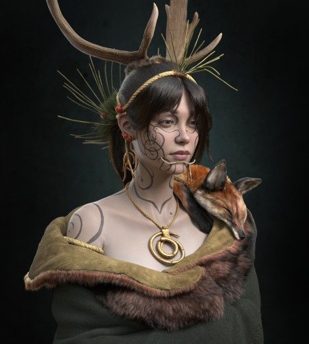
Tattoos on 3D characters tend to often look very fake and “projected”. At first glance, it can seem that a tattoo is a layer on top of the skin, and only has a black color (unless it’s colored). But in reality, tattoos are scars, and the pigment is under the skin. This means that once a tattoo is healed, you no longer see the outer layer of the pigment within the skin, and the underlying ink that is visible, is even deeper under the skin. It becomes more blurred out because of this, so when texturing tattoos, it’s important to remember that it shouldn’t just be a layer on top of your skin layer with a clean and sharp projection.

A close-up picture of a face tattoo; you can see how blurry the ink underneath the skin is.
You want to reduce the opacity and blur out the tattoos quite a bit. Hand painting helps because you naturally produce variation in the opacity and sharpness of the tattoo with your own brush strokes, leaving areas where the skin is more visible and where the ink is deeper. Tattoo artists are not machines, and when they are tattooing someone, imperfections are bound to be made, so you want to reflect that in your texturing work as well.

When it comes to color, you also want to make sure not to saturate the hues too much, because again, the ink is under the skin, and eventually the color of the skin tone will overlap the colors of the tattoo and make the saturation feel more muted and faded.
Clothes
Before I begin any clothing work, I like to do some preparation in the form of collecting references and researching to get the best understanding of the materials and how the garment is structured. This step helps me be able to understand what kind of 2D patterns I will have to create in Marvelous Designer later on, and how those patterns will be sewed together. This is probably the hardest part when it comes to learning how to create clothing inside Marvelous since the actual program itself is quite simple and easy to understand.

Sometimes it can be hard to find references of how the 2D patterns should look like, but once you have made a few garments, you start to build up your own visual library and can somewhat guess how the patterns should be constructed just by looking at garments and finding stitching lines on the references. A great way to get into Marvelous Designer is by first learning how to make basic clothing such as shirts, simple jackets, pants, jeans, etc. Once you memorize the patterns of that type of garment, you can pretty much make anything else with a lot more confidence since those basic garments always work great as a starting point once you have to make a more complex garment.
Once the initial patterns of the garment are laid down, I like to make sure that the silhouette and the major folds look the way I want to. This process usually involves me “tailoring” the initial patterns to match the body type better, and so that I get more/less volume in areas where I need to. For me, it is also important that I stay at the initial particle distance of 20 and don’t start to add details and fancy stitching lines during this stage. This is because eventually, the simulation inside the software can start to get heavy (especially when you start adding more and more patterns, and increasing the density of the geometry), and when it does, it can be frustrating to make any bigger changes to the garment.

Roughly how far I took the jacket before starting to add more detail and increasing the geometry.
My advice is to stay at low geo density as long as possible, and only start to gradually increase the density once you are 100% confident that the garment is sitting well on the character, and that the big folds are the way you want them to be. Only then would I start to add details and I only increase the geometry right before I finalize the clothing, and export it to ZBrush for a sculpting pass. Another tip is if you have a lot of different layers of clothing, split them up into different files right before you start increasing the amount of geometry, and doing the final simulation. As long as you have the big shapes and forms overlapping on the different layers of garments, you don’t need to simulate everything together with a very low particle distance. This helps increase performance and reduces the chance of getting nasty simulation artifacts that can be a pain to fix.
Patience and no rushing is key when it comes to Marvelous Designer. I had to learn it the hard way.
Presentation
For the presentation of the character, I chose Marmoset Toolbag, mainly because it gave me the ability to focus on achieving as realistic presentation as possible, without having to worry about the technicalities of setting up a good rendering scene and shaders. I do enjoy working in game engines like Unreal Engine 4 sometimes, but I do that mainly when I’m trying to improve or learn something more technical.
When it came to choosing what kind of lighting I wanted to have for this particular character, I wanted to present it in multiple scenarios that could showcase the realism of the character in various ways, and also portray the kind of emotion and feeling I felt from looking at the reference – clear, bold, and confrontational. How do you portray that with lighting? Well, my thought process was to make the lighting natural, subtle use of rim lights, no unnatural colors, and not too much shadowing.
The main setup presents it in a clear and neutral light, to help show the model as if it was photographed in a studio. This setup was also the one where I spent most of my time adjusting the lights to get the feeling I wanted on the character.

The other lighting scenarios were meant to present the character in a more natural way to prove that the textures and shaders work well in any environment scenario. The colors of the lights were sampled directly from the HDRI images, and the only thing that I adjusted on those lights was the size (in order to get soft shadowing).

Challenges
The biggest challenge during this project was definitely the accuracy and patience required in getting all the elements of the character just right. Having an iterative process and not being afraid to take a step back in order to move two steps forward definitely helped. This requires quite a lot of patience but asking and receiving feedback from my mentors helped me get a new perspective every time I felt that there was nothing more I could push further. This is crucial because these last small steps and adjustments that get squeezed out of you is what in the end makes you wrap a project in a good way, and also level up your skills.
At some point, you become comfortable in being able to reach a certain level of quality and consistency in your work. What makes you push your work further is either surrounding yourself with great, more experienced people with different perspectives or having a really good mentor. That is why I decided to be part of this mentorship, and it’s something I will keep doing in the future to keep pushing my work.


