Pacific Northwest Forest: The Craft of Realism
Kat Gray did a breakdown of her environment project Pacific Northwest Forest made within CGMA course Vegetation and Plants for Games led by Jeremy Huxley: blockout, trees & foliage, textures, lighting, and more.
Introduction
My name is Kat Gray, and I’m an Environment Artist at IllFonic. I graduated from the University of Southern California in the Interactive Media & Games program in May and have been taking CGMA courses in my free time since. I started in 3D early in University, after having loved art and tech since I was a kid. I was super lucky to have worked on a couple of great student projects in school where I could flex my muscles as a game artist, and I fell in love with creating environments and worlds that would capture people’s imaginations.
Pacific Northwest Forest: Recreating a Piece of Home
Reference & Inspiration
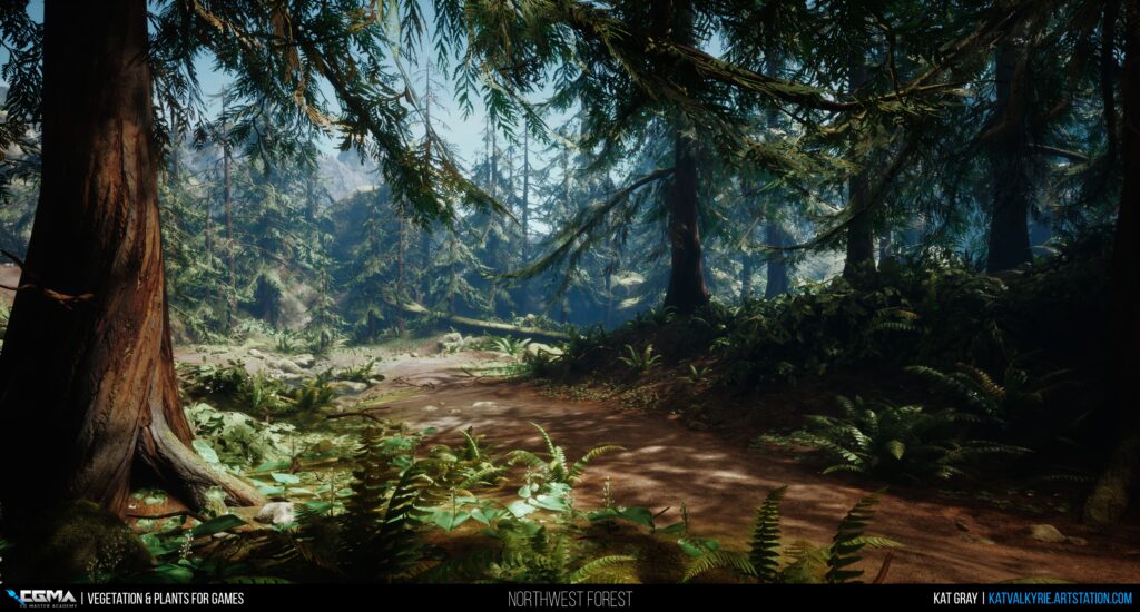
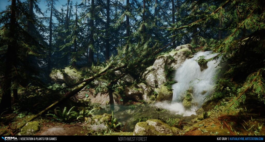
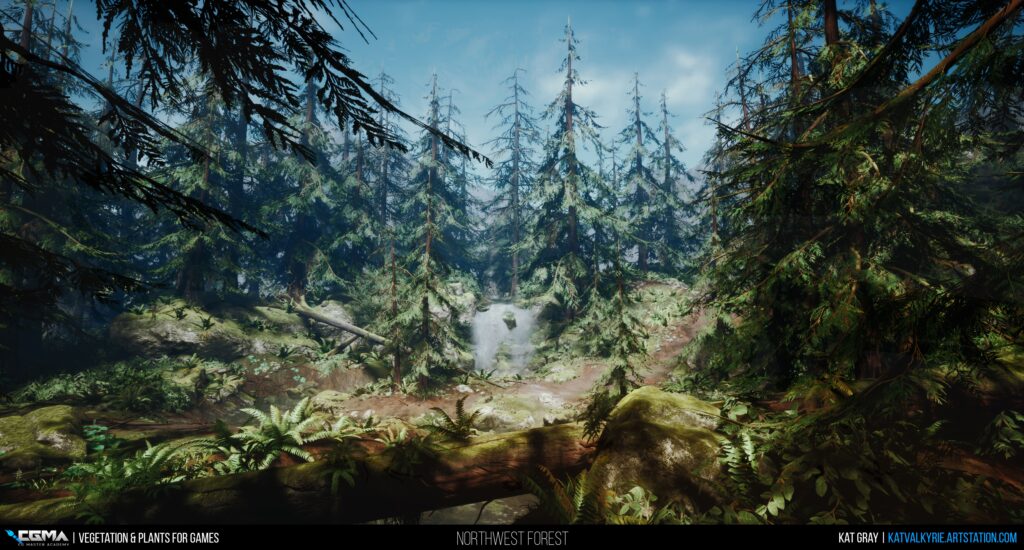
My Pacific Northwest Forest is a scene that I created for Jeremy Huxley’s Vegetation and Plants for Games course through CGMA. I’m originally from the Seattle area, so after several years in Los Angeles for school, I wanted to recreate a lush, green, and mossy piece of home that I could carry around in my back pocket. I definitely took inspiration from memories of one of my favorite childhood locations, Farrel McWhirter Park, and the forest and creek that encompassed the majority of the trails—but I didn’t try to specifically recreate anything 1:1, knowing that I probably wouldn’t have the time to get it as perfect as I wanted.
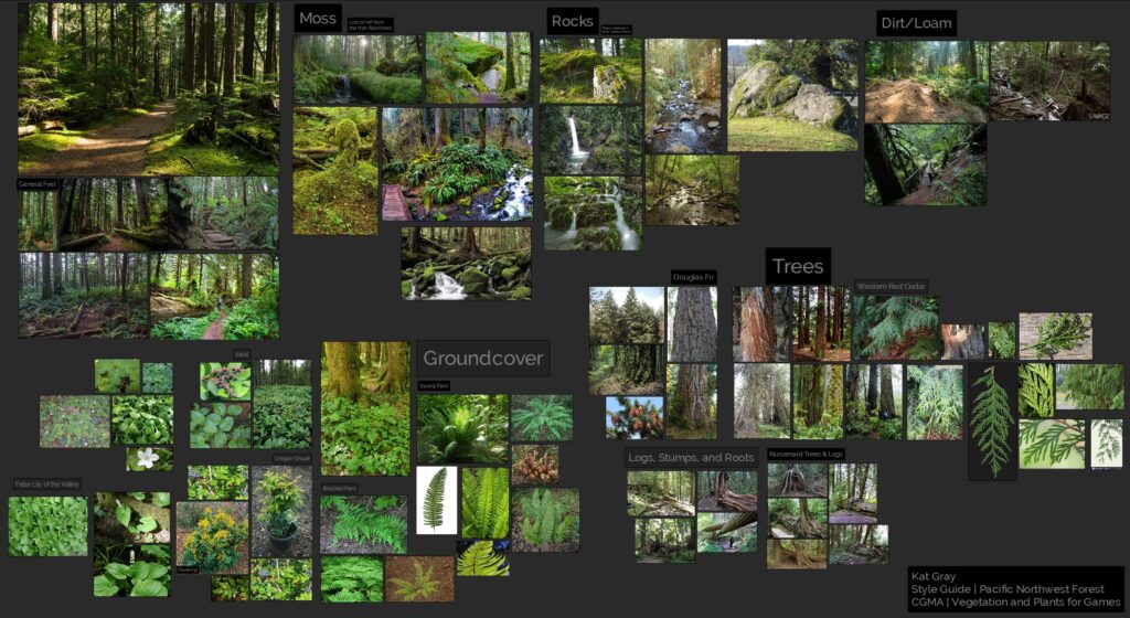
I did want to be accurate to the plants I remembered from growing up, so I did a lot of reference gathering and research around common trees and groundcover like Western Red Cedar, Sword Ferns, and Salal. My mom was a fantastic resource in this, as she’s an avid gardener and lover of native plants, and I think this project really helped her understand what ‘weird’ thing I was doing over here with computers. It also meant I got lots of nice additional photos of plants from our backyard to work from, and not just shots I could find on the web, so bonus!
Blockout
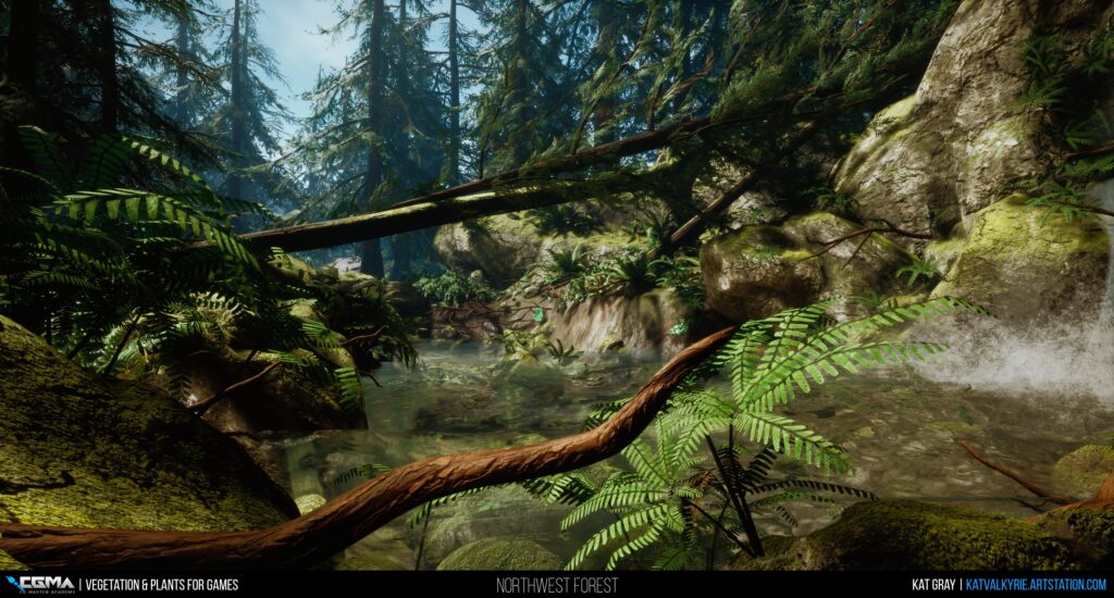
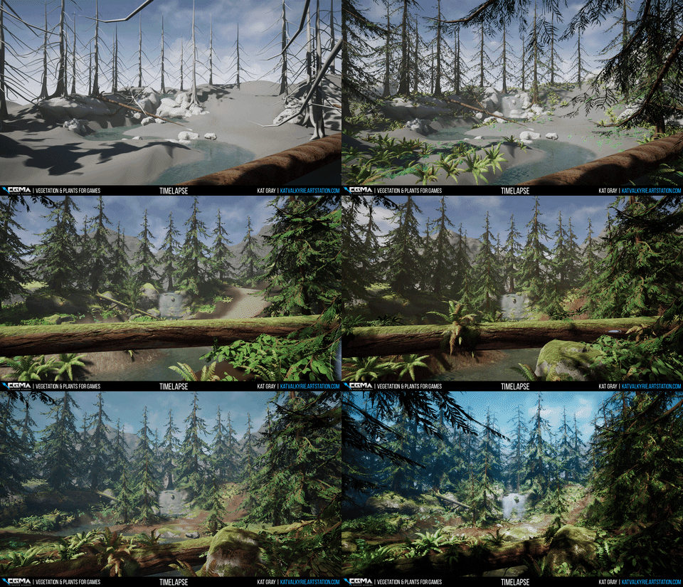
The class starts out with basic blockouts of your trees and rocks — and I immediately had an issue. For the most part, noticeable rocks and boulders aren’t really a thing in the environment I was trying to recreate. When you can see them they’re almost framing rivers and are blanketed almost completely in moss. In other areas, they’re sort of visually replaced as focal points by stumps, snags, and fallen trees. So I knew that in order to make this work I needed to incorporate a stream, which ended up being a fun — and focal — addition for my scene.
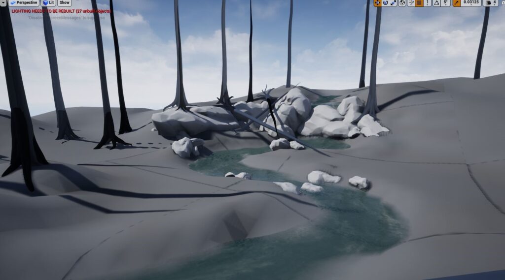
Even in some of my early thought processes about the layout, I wanted to create an environment that worked in any direction. Many of my previous projects had been very focused on recreating an illustration from a single point of view or had design constraints preventing free exploration, and I wanted to see if I could make a space that was interesting — not everywhere — but in all the right places. I had recently visited Redwood National Park, and I wanted to play as much as possible with trees growing on rocks, and plants growing on trees, as it helps a lot to make an environment really feel like an ecosystem and not a static location. So even in this early draft, I wanted to set up the foundations of some fallen logs from some old storms, and how they could shelter parts of the stream which would then allow new growth.
Rocks
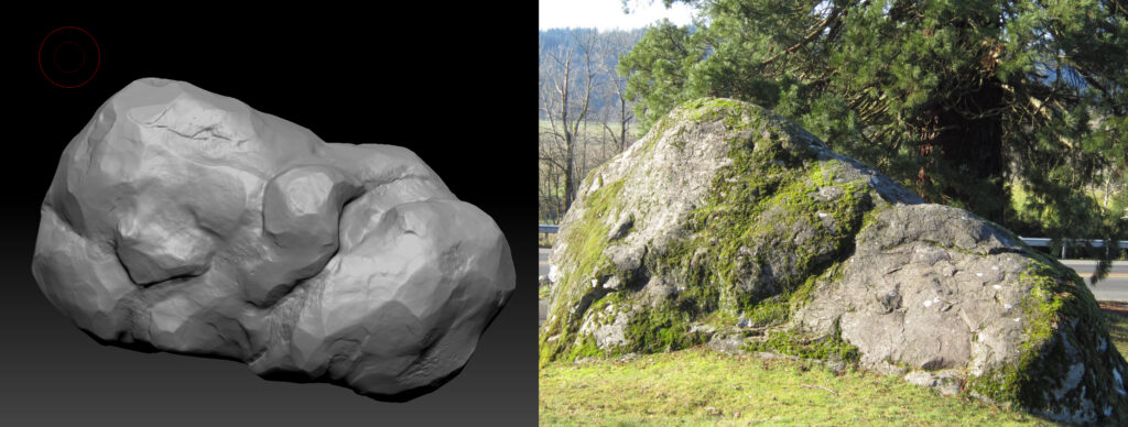
I worked off reference for my boulder asset, but even then, I had to balance readability and simplicity, with the fact that many of the rocks you see in the Pacific Northwest are very soft and rounded, especially with moss. It’s definitely a challenge for these types of stones to feel overly bloated compared to more conventional sharp and pointy glacier-carved rocks. But I think I did a fairly decent job, given it was my second or third rock sculpt ever. Looking back though, I think this, out of everything I created for the scene I most want to redo.
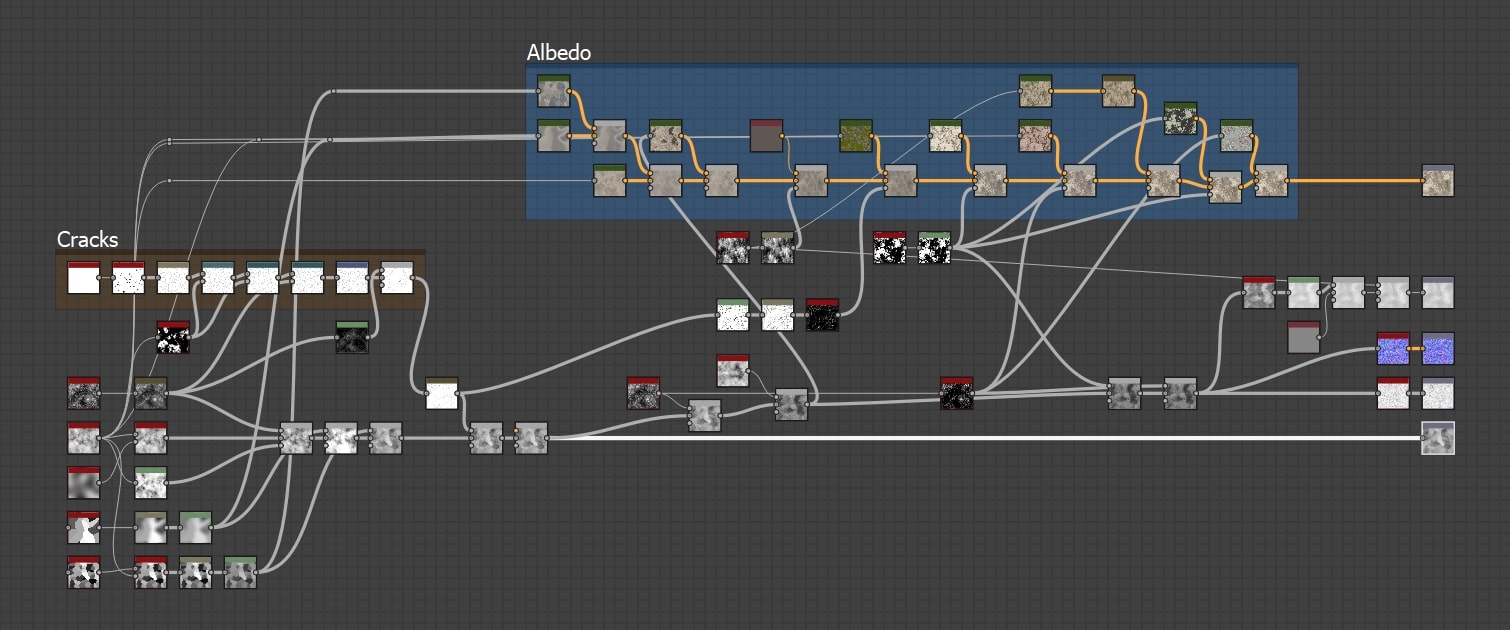
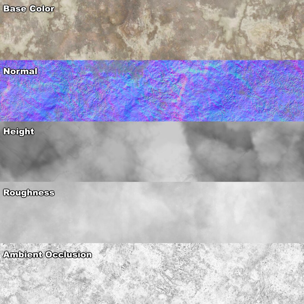
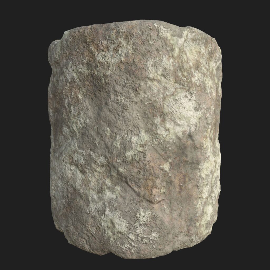
I kept it pretty simple for my base rock texture since I knew a lot of it would be covered either by foliage or by moss, and the rock itself is far from the star of the show in the scene. When working on materials in Designer, I like to start with large shapes and work my way to more detailed noise for the height. Only after the final height I go and add the Albedo/Roughness/etc. For the rock, I first concentrated on getting on getting a large flake effect that I noticed in my reference for the boulder, which I achieved by blending a few variations of slope-blurred cell nodes, with Clouds 2 and BnW Spots 1 for detail noise. I created subtle cracks with another Cells node that I ran edge detect on and warped and multiplied on top of the base height.
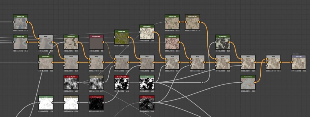
Here’s the creation of the Base Color. I start by sampling the reference photo with the Gradient Map node and a few variations of the height I created earlier and then blending them. Probably my favorite part of creating rock textures is adding lichen, which I do really simply here by using various grunges as masks, sometimes with directional blurs, focusing on the larger cream splotches as well as places where the lichen is more pinkish. On more recent projects I’ve worked on I’ve put more into making unique lichen, without relying on the included Designer grunges but for this project, it worked well enough.
Moss
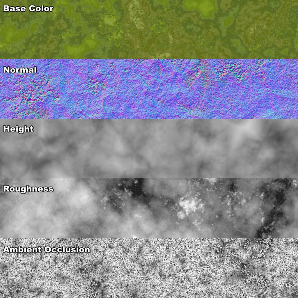
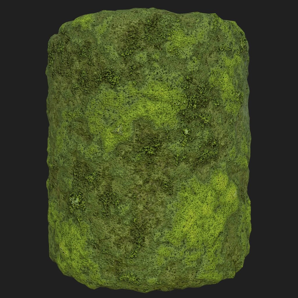
My moss is almost embarrassingly simple, but I’m actually really happy with how it turned out. I started with a blended (Add, 0.65) BnW Spots 2 & Crystal 1, and then blended (Max, 0.75) a slope-blurred Clouds 2 with that to get a fluffy, clumpy grouping that looked like my reference photos. I used BnW Spots 1 to get more individual details blended (Max, 0.8) back in over the main forms. After that, I mostly ran a few levels nodes, and color picked my reference image for the Base Color. I will say AO is a big factor in this looking good, so that’s something I had to keep in mind when creating the overall scene and material set up for terrain and other objects this would get applied to, such as rocks and trees.
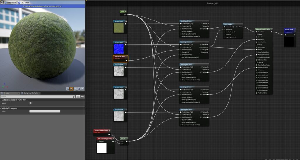
To make the moss have a Fresnel effect in Unreal, I utilized the Fuzzy Shading node that I set up in a material function along with making sure the moss was World Aligned since it would be a part of a couple of other materials I used — notably on my trees & rocks. Mind Games Interactive has a great setup video in UE4 for both of those topics here and shows how to set up dynamic moss on just about any object.
Trees
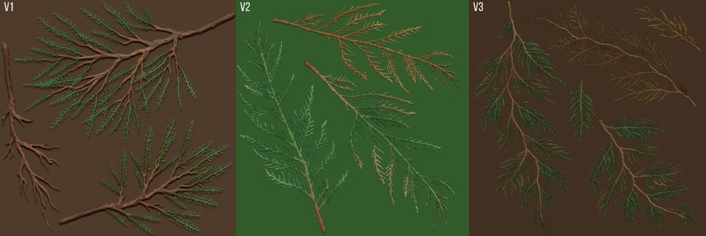
Jeremy’s class was my first experience creating trees and foliage, so it there was definitely a learning curve both in terms of process, optimization, and in getting things to look the way I wanted. I went through three iterations of my Cedar canopy texture before I found something that worked for me. With version 1 I didn’t pay enough attention to my reference so it didn’t look like a cedar at all, and the needles mipped away to nothing in my scene anyways. I paid more attention to detail when I sculpted version 2 and focused on the shape of cedar needles, and how the branches all seemed to form a ‘J’ shape, instead of just dropping straight down. It looked great — but I went too micro, and when I assembled my branches and then the whole tree, I found the polycount was almost 200k. Alright, yikes. Back to the drawing board again.
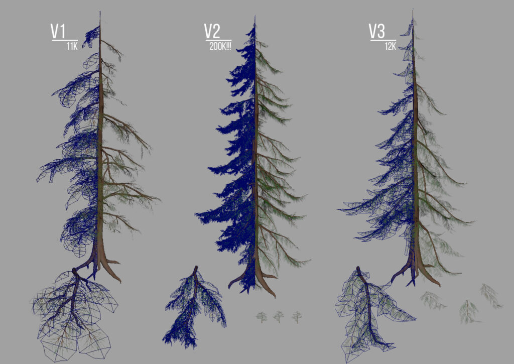
Luckily with version 3, I didn’t have to start completely from scratch, and I could combine the lower level subtools I had created for v2 into larger branch groupings on my cards which I was happy with in the end. The trees themselves I create from a handful of branches that I assemble, paying close attention to silhouette, imperfections, and shape breakout — no trees are perfect! I ended up having to fudge the padding a bit in UE4 to get the needle clusters to not disappear quite so much, and had to fiddle with the LOD settings too (creating proper LODs probably would have been the smarter move, but it wasn’t a focus of the class, there was already a lot to do in 6 weeks, and I had redone the tree twice already, so I was running a bit behind schedule).

When I was polishing the scene I ended up reworking Cedar V1 into a passable Fir canopy texture, so I could add some visual breakup to all the similar looking trees, which had gotten noticeably repetitive.
Bark
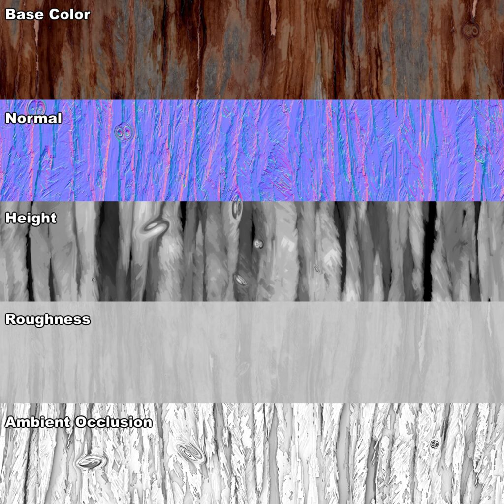
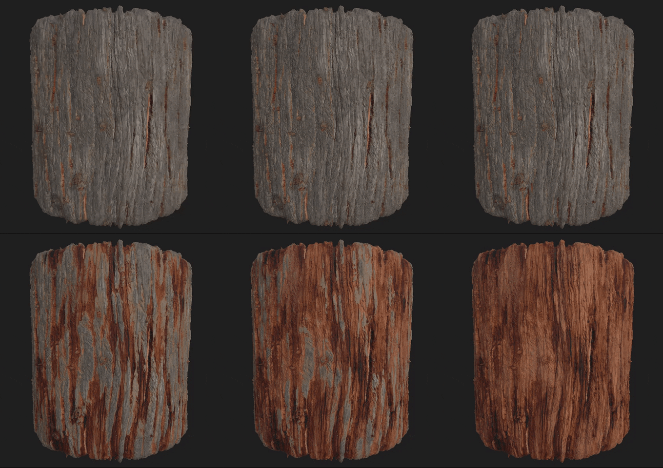
For my cedar bark, I ended up taking inspiration from a really nice Cypress Bark tutorial by Peter Sekula since it was similarly thin and stringy to what I needed for my cedars. His walkthrough is pretty thorough, so I definitely recommend checking it out. I mostly used it for creating the base height shapes, and I went a bit rogue after that as I wanted to follow my reference as closely as I could.
Something I wanted with my bark was a controllable height depth so I could vary between old, silvered outer bark, and the new red bark underneath. These I created as two textures I could height blend them via vertex paint in UE4 for more asset variation.

Plants & Foliage
My favorite part of the class was creating the foliage for my scene, and in addition to the trees, I created textures for Salal, Western Sword Fern, Maidenhair Fern, False Lily of the Valley, Miner’s Lettuce, Sorrel, and some generic weeds, moss, and grasses.
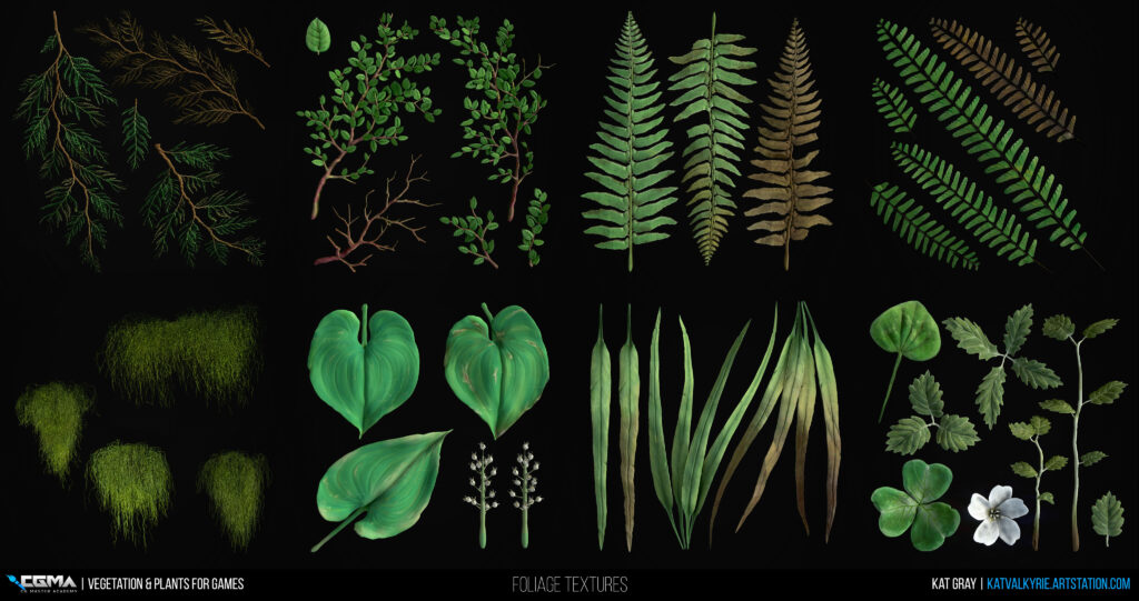
I sculpted my plants in ZBrush, almost always starting from a sphere, that I would dynamesh. From there I would use the deformation menu to quickly elongate my shape for a stem/branch or the move brushes to sculpt out the general shapes of whatever I was working on. The deformation menu is also great for helping block out quick tapering or curls in leaves before the main sculpting process with Bend/SBend, Skew/SSkew, & Curl. After that, my favorite brushes for general plant sculpting are Trim Dynamic, Dam Standard, Orb’s Extreme Polish, Pinch, and Crumple.
Once the base sculpt is finished I like to do a quick polypaint to get colors generally where I want them, followed by adding a whole bunch of variations using the Masking menu & Mask by Cavity/Smoothness/PeaksAndValleys. I don’t really have a proper method to this, I mostly just experiment with the settings and paint with low-Intensity RGB until I get the variation and colors I’m looking for. I generally eyeball the colors and adjust them later if I’m too far off the mark in tone. If I make dead variations I go with Color Spray, MRGB, and the Crumple brush to break up the sculpt both in normals and color.
From here I lay out my subtools using a plane to keep the view locked a certain way when I export. I use the Grabdoc feature to get snapshots of my Albedo, Normal, and Height that I can take into Substance Designer to author PBR maps.
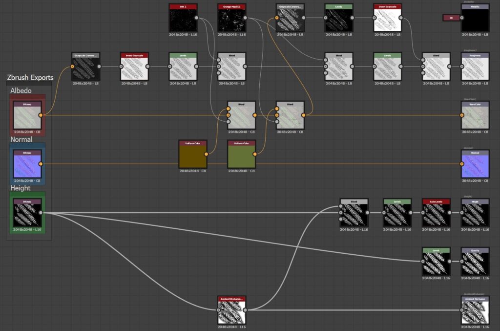
I have a pretty simple setup that I use to add a bit of additional grunge/damage to the plants that otherwise would be tedious to hand paint every time. I also create Roughness, Opacity, and AO based on information from the imported bitmaps from ZBrush. Depending on the plant I sometimes add a bit extra detail here, but this is the general setup. It’s easy to swap out the input textures, so making variations is super fast.
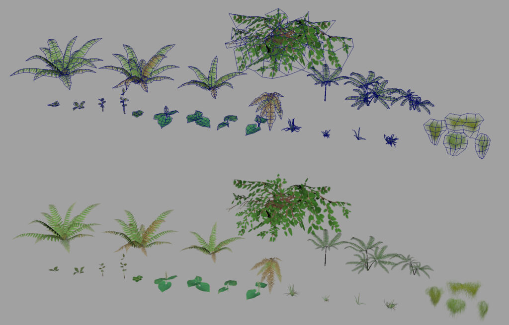
After the textures are finished, I go into Maya and place them on planes. With preserve UVs on, I use the Multi-cut Tool & Edge loops to create UV shells that match the plant’s layout. Much bending and tweaking with soft selection later, I have some nicely curved leaves and a few variations of each plant. I also create vertex colors with a simple black > green gradient along the lines of each leaf that will serve as the wind information I’ll be adding in UE4.
In Unreal, I have a Foliage Master Material that’s set up for the usual textures, as well as having options for Base Color Tint, Subsurface Tint, Color Variation, Opacity, Normal Intensity, and Wind Speed/Intensity. I create instances of this material for each plant and just plug in the appropriate textures. A node I’ve found super useful is SpeedTreeColorVariation, which tints instances of the mesh it’s on for a more realistic color distribution for foliage. I try not to have the value for this set any higher than 0.1, as you’ll end up with some crazy colors instead of shades of green.
Terrain Textures
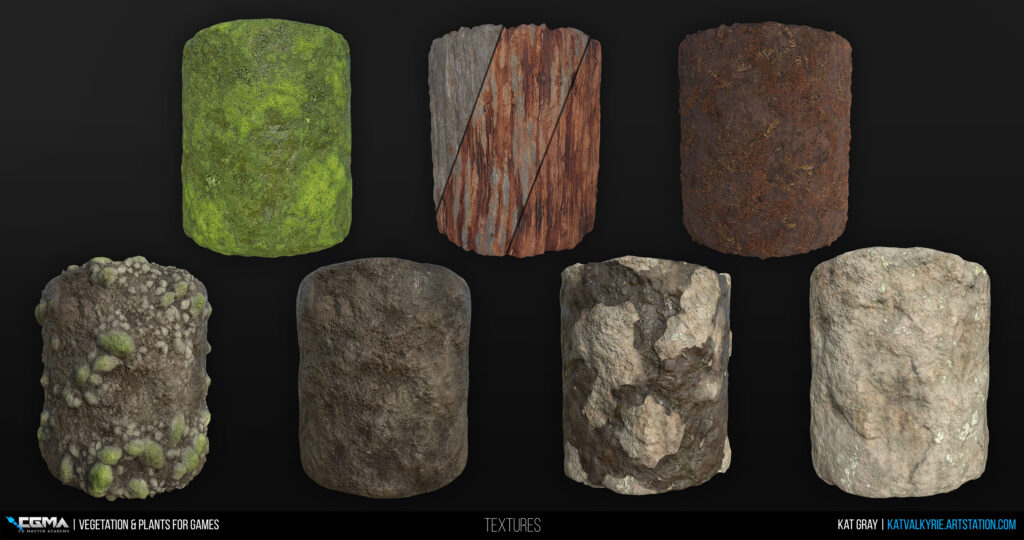
There’s a lot going on in this scene, even just on the ground, so I created textures for dirt, mud, river rocks, a larger broken up stone for where there was more pedestrian traffic along the trail, and loam with leaves & debris. I also ended up using the moss texture for some parts of the terrain to further the ‘everything is lush, green, & mossy’ look and tie in the rocks a bit better in some areas.
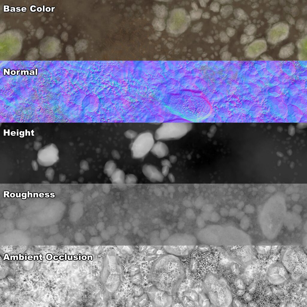
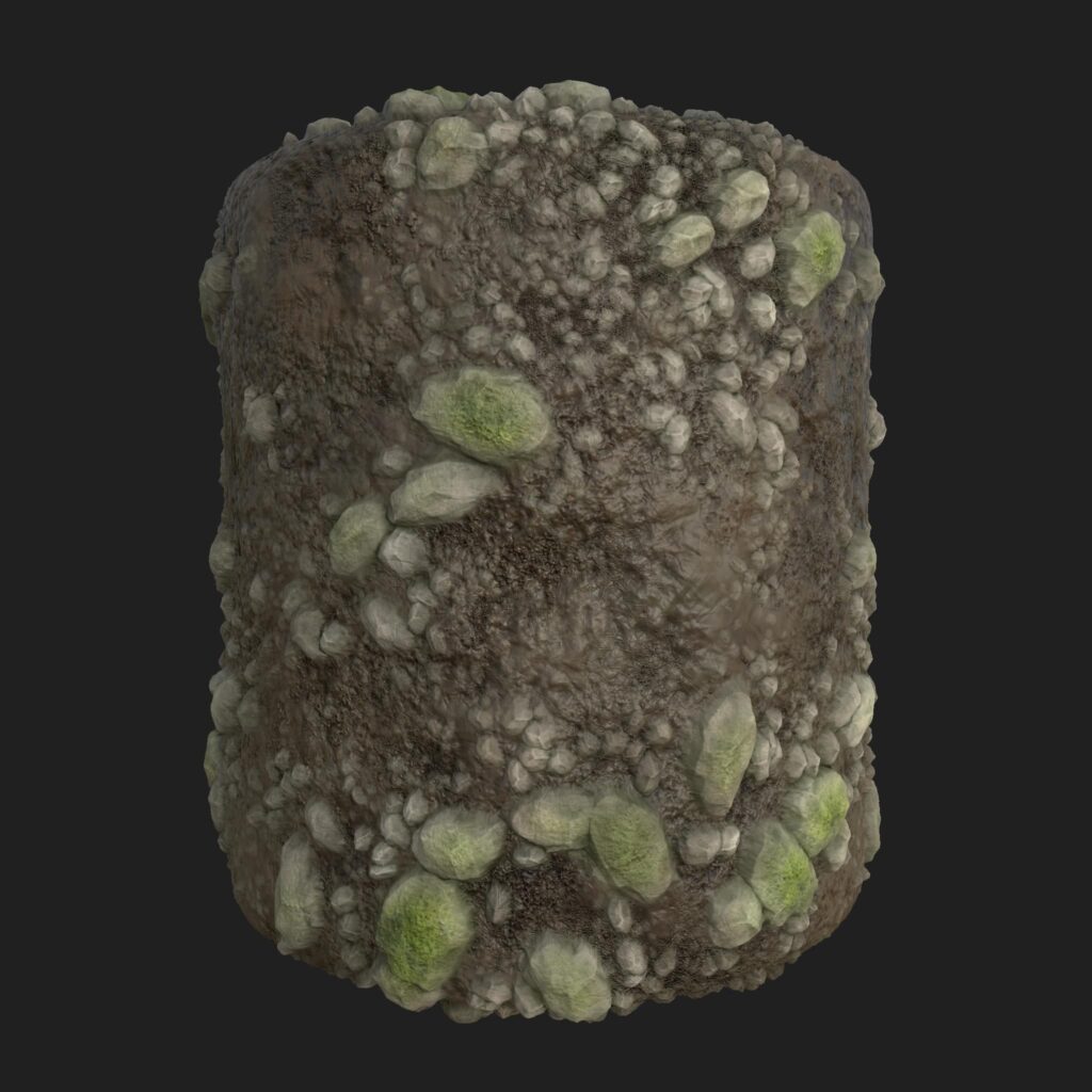
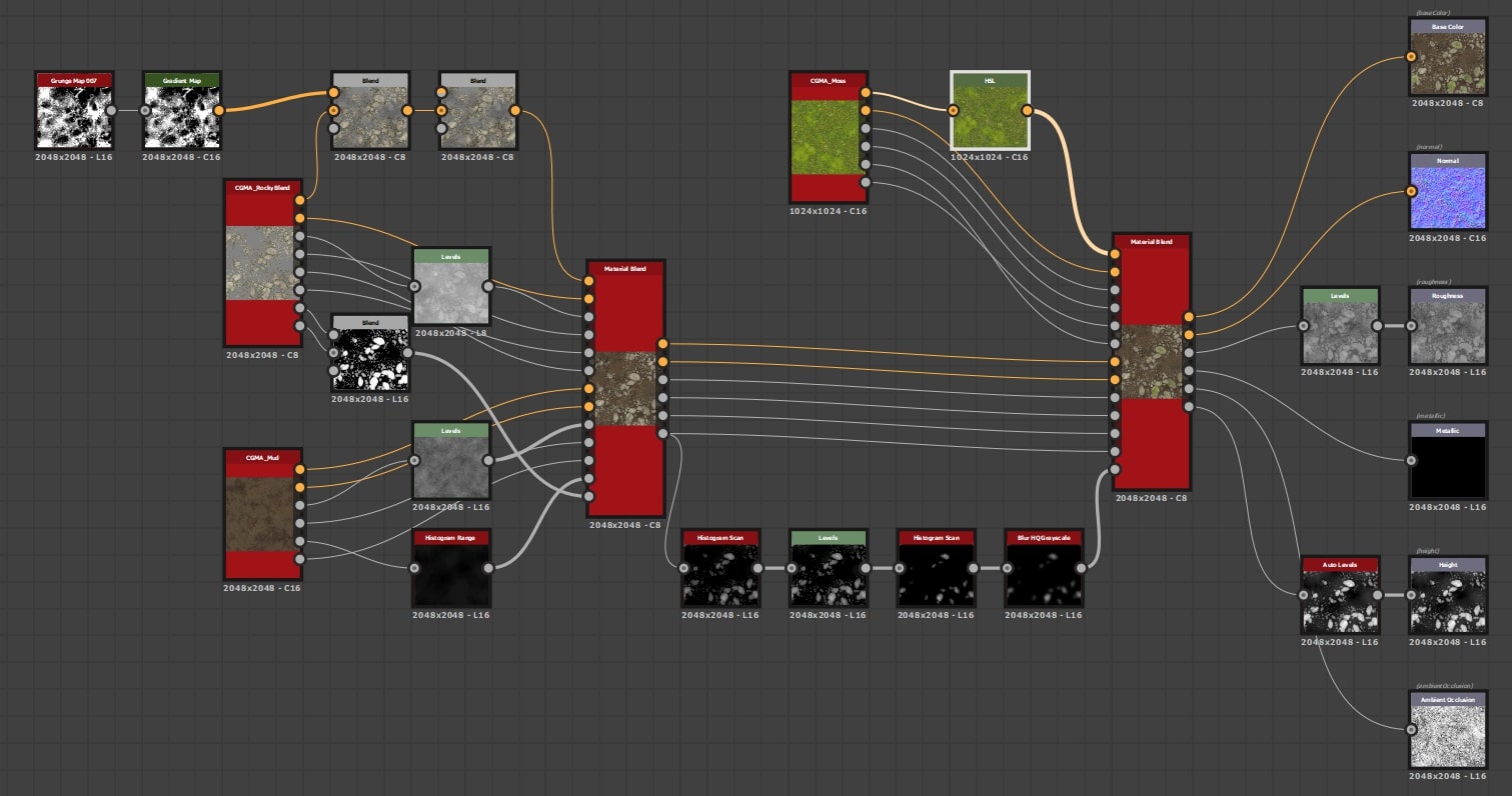
One of my favorite textures to work on was this riverside stones texture, with clumpings of rocks, and moss. Over the last few projects I’ve usually needed something like this, so I have a base with nice rock and scattering set up, that I can plop on top of whatever base material my scene needs—in this case, mud. That setup graph is pretty messy, and I really need to rework it, so I won’t show it here, but if you’re interested in some nice clumping techniques for smaller rocks that I utilized, check out Daniel Thiger’s fantastic tutorial series on Substance Designer (particularly Part 1: Pattern Creation & Natural Scattering). I like to use this material blending technique to create materials that flow nicely between each other in engine, and utilize other graphs that I’ve made without having to create too many additional bespoke textures, and it makes swapping versions out easy.


I used a similar technique for the loam material, just using the foliage textures/heightmaps I’d created earlier, and blended them all into each other and on top of the dirt material I had. This one got a bit messy, and I could probably have a cleaner normal map, but I think it turned out alright, especially as it mostly lives under trees and plants.
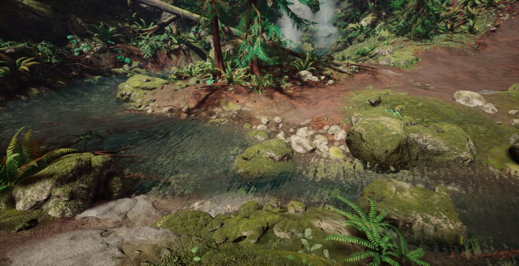
In Unreal, I set up a height-based blend material for the terrain using the Layer Blend node. This way I was able to combine the six ground materials I had set up so that they filled in the cracks between each other’s heights first when painting. Other than that, there’s not anything else really special with that material’s setup.
Populating the Scene
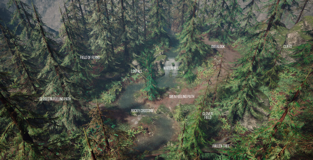
Generally, by the time I start populating, I have a rough blockout of where important assets like paths, streams, rocks, and trees are placed, but it’s important to me that I have points of interest that draw the viewer around the scene. No one wants a 3D space that’s only interesting from one angle. I try to vary the feeling of each area so it’s memorable compared to the other areas, and clump some assets so mentally you think, “oh, that’s the area filled with clovers” or “this is where the logs pile up”. If all your plants are evenly distributed everywhere, nothing stands out. You can also be informed by the real-world, such as that Maidenhair Ferns are usually found by water, or that rocks would pileup around the outer edges of stream curves because of the current. This sort of thing helps your scene feel more natural.
Pretty much everything in my scene is placed using UE4’s foliage tool. It’s a great way to scatter everything from small rocks and branches to trees & plants, There are all sorts of settings that allow you to control density, tilt, depth, size, and what angle surfaces you can spawn on, which gives you a lot of control over your placement.
Lighting & Finishing Touches
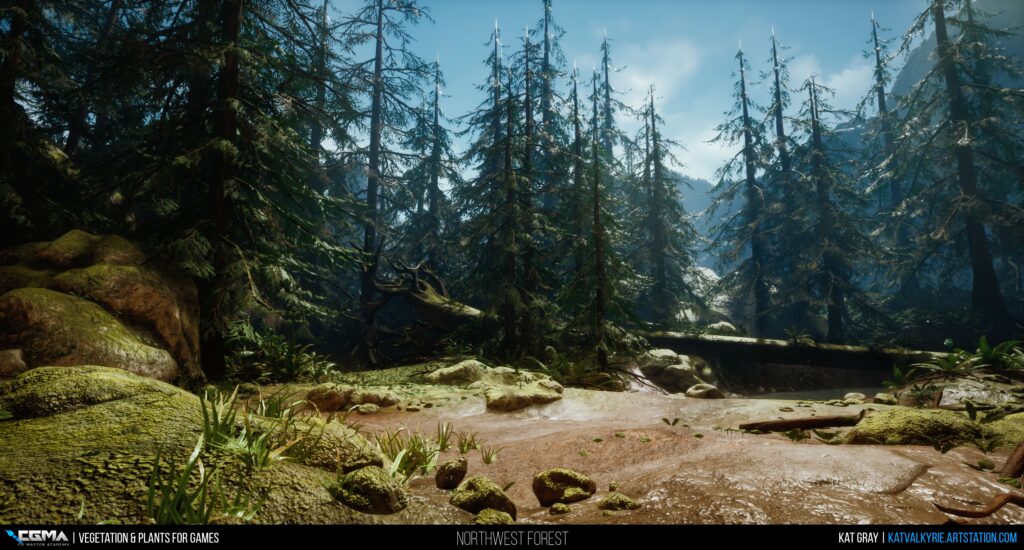
I’m going to be the first to admit that I’m not an expert at lighting. I mostly just fiddle with settings until I get something I like. For this scene, I wanted to work with the idea of being on an early morning hike, with the mist still in the air, and light just filtering over the mountains. Exponential Height Fog is great for that sort of mood. I also added played around with some LUTs before I settled on a bluish tone that makes me think sorta vintage, and ties back into being a memory of home.
Final Thoughts
I had a fantastic time taking Jeremy’s course, and I think I had my biggest growth spurt as a 3D artist during that time. I know I definitely didn’t want it to end when the 6 weeks were up. I feel so lucky to have gotten to study under some awesome industry mentors through CGMA and see the process that they use at their studios, as well as getting to interact with other students via forums and during Q&As.
Thank you to CGMA & 80.lv for letting me talk a bit about my process. It was seeing other writeups here of people’s experience taking CGMA courses that made me want to take them myself, so I’m super excited to have had the chance to be able to give a bit back to this community.


