Lighthouse Production Guide: Substance Tools Workflow
Lauren McKenzie did a breakdown on the recent lighthouse project that she worked on during the Organic World Building in UE4 course at CGMA, talked about her approach to creating organic materials in Substance tools, and shared some tips on how to make a nice scene in a short period of time.
The Career
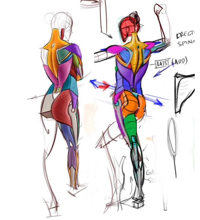
It has been a while, about a year since our last interview! Since then, I’ve been busy at work on The Elder Scrolls Online as an Environment Artist. In my free time, I’ve taken another CGMA class (Anatomy for Production) and done plenty of study on my own. I’ve been working hard to get my Substance Designer skills up to snuff, taking huge inspiration from Daniel Thiger, Javier Perez, and many others. My biggest learning experiences this year have probably been with Designer, stemming from this Lighthouse project. I’ve kind of been avoiding the software, but once I forced myself into it, I found it very fun and powerful. There’s a huge learning curve, but I feel like I’m finally starting to get the hang of it. You just have to power through until it will suddenly click with you.


About the World Building in the UE4 course at CGMA
I am an Environment Artist at work, which for the most part just means that I make individual assets. And while making individual trees, rocks, or whatever is great, I was really hoping that this class would help me understand how to better orient my models from a World Building perspective. Seeing how easy/difficult it is to use pieces together altered a lot of how I build pieces. It’s not all about making the most beautiful pine tree in the world, but about making sure they can all blend well together to form an overall impression of a forest. So mostly, I joined this class with the hopes of getting a new perspective on how to use my work.
Gathering the Reference
I have a Pinterest board filled with ideas that I want to build someday. I wanted to build a scene that could feel huge, without actually needing to create an extreme amount of assets. The scope is something I struggle with, I always try to tackle projects that are too big for me. I knew if I did a scene with an ocean, that will severely cut down the space I need to build, while still keeping the sense of scale I wanted to go for.
I found an image of a lighthouse perched out on a rock, and found myself really inspired by it. Working a lighthouse seems like a lonely job anyway, but to be even more isolated like that? It had really strong emotional connotations for me. I created a reference board full of images to inspire me. I photoshopped a few of them together to make an image that was sort of what I was hoping to create. While it’s not a real place, I wanted to make sure that it felt realistic.


Modeling
I definitely relied more on Maya than ZBrush for this class. It sort of fought my instincts, being a Biome artist I like to make everything flowy and organic in ZBrush, but here I needed things like the lighthouse and bridge to be much more hard surface. I started with a pretty in-depth blockout (which ended up changing a LOT) from Maya. Some of the assets needed high-poly baking from there, and others had trim sheets or tiling textures applied. I used a lot of Substance Painter and Designer and even worked with Alchemist for the first time.
After making the initial materials, I started on rocks to make the terrain look more natural. Adding the vegetation makes the whole scene feel more alive, trees add depth to the distance especially with fog between them. I created separate root structures to add to the bases of random trees to help them feel more unique. The bridge was one of the last pieces that I made for the scene – just a little bit of storytelling to give it that last piece of interest that I thought it needed. After that, it was just lighting and post effects. I think a lighting change can be the most fun thing to work on, it can dramatically alter a mood or make a piece feel more polished.


Working on the Materials
In Substance Painter, I think the trick is to make as much use of the generators as you can before you get into hand-painting. I love filling in some of the highlights and shadows first, getting a solid base going before I even think about the smaller parts.
Substance Designer is pretty similar – always start with your big shapes before moving into smaller ones. For me, I think the most important thing in a material is its roughness. If you can tell what material is without any color, it means that your material will be successful. Getting it right in grayscale is the most important step.
I think the most interesting material in this lighthouse scene, though, is the ocean material. There are actually three layers to it. I knew that I would only be making still renders from this project, but the whole thing is relatively accurately animated, with smooth water flowing into heavier and heavier foam depending on the vertex paint in Unreal Engine.


Adding the Details
The lighthouse was one of the first things that I built! It’s mostly larger shapes since you only really ever see it from a distance. I tried to keep all of my camera angles to places that a human could realistically reach to view the scene from. I went about making the lighthouse all wrong, though. It was one of the larger learning points from this class. Using my infinite Biome Artist wisdom, I made a low poly of the lighthouse, and then took it into ZBrush to sculpt all the details on. And it looked great in ZBrush! But baking it down, the lighthouse looked super fuzzy, the details were not transferring well at all. So for the first time in my life, I made a trim sheet of textures. Basically, all the textures are just in strips that tile across the lighthouse.
By contrast, the bridge was one of the last things that I built. I built just a couple of pieces: a bridge segment, a gnarled bridge segment, and a concrete block with some chunks taken out of it. Moving those around, I was able to position the pieces to give the feel of a larger bridge that’s been torn away from the rock by a storm or something.


Substance Alchemist Workflow
There were 4 materials that I made in Alchemist! There were clover material, dirt, grassy weeds, and sand with rocks. All of these were made from photos I took around my house – in the yard, the garden, and the sandbox, and then turned into materials with the magic of Alchemist. I was amazed by how fast the process was. Each material only took around an hour to make, including cleanup and tweaking. From there, it was easy to make variants that were needed to smoothly blend them together and to make a vertex blending shader in Unreal.


Lighting
Lighting was one of the last things I did for this scene! Initially, I wanted the scene to be done in blues and greens, to make the red lighthouse really pop. But towards the end, I found I really liked the harmony of a red/orange sky with the red lighthouse.
The sky itself was pretty simple – I just had a Sky Sphere and a SkyLight. Unreal makes it easy to adjust the time of day realistically, and from there it’s just small tweaks to get the lighting exactly how you want it – sunbeams falling towards the camera angle in certain shots, shadows leading the eye to help with composition.
For the fog, I had both an Atmospheric Fog and ExponentialHeightFog. Layering them allowed me to have a little more depth and variation to get them how I wanted. While it probably would have been more realistic to have the fog an orange color as well, I felt like the crisp blue helped boost some contrast and provide more visual interest.
The Biggest Challenges
My biggest challenge was probably the time crunch. Ten weeks is lightning fast for a whole environment! Especially with my responsibilities at work, it got difficult to juggle both. I found myself trying to work smarter instead of harder – make my assets easier to reuse. Instead of building a bunch of different trees with unique roots and canopies, I just built one tree that looked different from different angles and sunk it into the ground variably. After that, I would go through and add separate root systems that could be placed at the base of the trunk to make them seem more unique. While these sorts of methods aren’t ideal in an actual game, for a mostly static portfolio image, it worked just fine. My next step is to keep learning more! I’m going to be taking the UE4 Modular Environment class at the end of January, so transitioning to more manmade assets should be a fun new challenge!
Lauren McKenzie, Environment Artist
INTERVIEW CONDUCTED BY ELLIE HARISOVA
For more information on CG Master Academy and the Organic World Building in UE4 course, please visit the CGMA website, or email [email protected].


