Vasilisa the Brave
Marta Szu takes inspiration from a beloved children’s story and works to build the world through techniques she learned in Environment Sketching for Production.
Introduction
Hello, my name is Marta, and I’m an illustrator from Poland. My background is mostly as a character designer and children’s book illustrator. This is my first course at CGMA and the first one to tackle backgrounds. I enjoyed it very much.
Start of the Project
I chose the fairy tale of Vasilisa the Brave, as it was one of my favorites as a child. I really liked stories about girl heroes and witches, and in this story, the witch isn’t shown as ultimately evil. But the main reason it was my favorite story was because of the illustrations. To this day I adore the art of Ivan Biblin. The story had every element needed for the assignments of the course- a hero, a setting, and a villain, so my project was decided.

I needed to find the right references― I had never approached the topic of gathering references too seriously, and I’m really glad I could learn the importance of it during this course. At this point, I had no idea where I was going― but I was determined to finish my assignments and not dwell on seeking elusive perfection. My mind went straight for Russian orthodox folklore elements, like the roots of the story.

Architecture from that time has everything― from grandiose gold churches with onion domes to simple homes decorated by folklore art. I liked looking for bigger and smaller details to use, even if I wouldn’t use them now, they would be a part of my inspirational library later on. The thumbnailing was quick and loose, but you can see I’m a bit stiff with the compositions, a bit afraid, and unsure what I am doing― but still, I had tons of fun thinking about what purpose each place had for my hero.

I didn’t exactly know what the environment and style of the city/story should look like. Instead, I focused on the moments. In the thumbnail where Vasilisa is on the roof I imagined she would sing about her daily life, expressing her need to be in the city/having freedom.
After the feedback, it was clear my compositions needed to be more readable, with better line quality and flow. We also discussed the difference between creating a storytelling image and one that can be used as a layout for production. Our teacher, Patrick, also suggested I could push the storytelling itself, not to base my story on the traditional Russian roots of it. An idea to implement Hindu elements came to mind and off I went to search for another batch of references.

Assets Creation

The main issues were my use of proportions- which were really too proper― they needed more “stylization”. After some great feedback from the teacher, I understood the idea. Now I know that for me, whenever I feel stuck with drawing the big picture I can start by drawing small assets that will be used in the scene. That will also help me to understand the story I want to tell. Later on, I implemented them in the market scene.
Market Scene
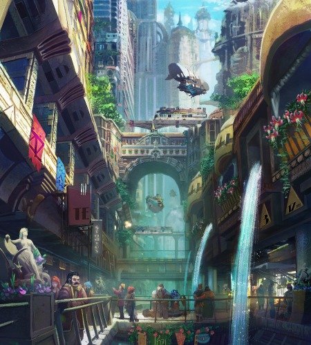
For my first environment scene, I decided to work on the market scene from my thumbnails. There was no market in the original story, but I liked the idea of expanding the universe. Putting more characters in the picture, with their own agenda, helped the storytelling part a lot. The market picture has a lot of flaws, but I like it the most. I don’t consider it finished and I know I will be coming back to it after the course.


I made a lot of mistakes but also it is the image I worked the most on and that I learned so much from the feedback. It went through a lot of changes; we flipped the original thumbnail, added more characters, tried to control the number of details between foreground and background, and enhanced the focal point.

I learned that I need to be aware of the invisible flow of the composition I create. I wanted the viewer to be engaged and interested in the story presented in the scene; that I want them to see the story elements in the right order (thus creating the flow), not in a chaotic way. After the feedback, I saw many tools I could use to achieve that- changing proportions, negative space, planning light, and shadow paths.
Creating an Organic Environment


Organic environments have more dynamic lines than man-made objects, that is why drawing them freely is so essential. I knew my story would take me to the forest, so I explored some ideas based on gathered references. The first one was about when our heroine meets one of the riders, The second was more about trying to explore more hostile nature (implement maybe some crows as witch helpers). The third was made from a suggestion from the feedback about expanding the story more, thus maybe the forest was inside a magical cave, hidden from the world. The idea was interesting, trying to draw different kinds of nature; rocks instead of trees.

I put my heroine in the scene so I would have a benchmark for all other objects in the scene. The feedback I received was about how important it is to understand the structure of the objects you are drawing. Most of my references were compositions of big scale or big trees. I forgot to take inspiration from smaller details so I could implement more variety of flora, and smaller details in the foreground thus changing some rhythm in lines and creating more interesting scenes. I also needed to add more details around the focal point to strengthen it. I learned a lot by creating this piece.


Villain’s Lair
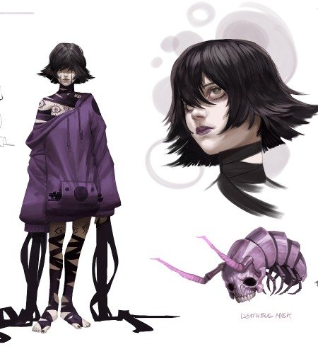
The assignment here was to create an interior for the villain― in two different lighting settings. I gathered references but I felt like I needed to sketch the characters to be able to “feel” the mood of the interior― as I come from a character designer’s background it helped me at the beginning to explore ideas. It took me longer to see that I can treat the space just as I treat the characters; scenes have personalities too. I wanted the Baba Yaga’s Hut to be something different, to show her as intriguing as I saw her, but also hint a bit of a danger in the scene. I decided I wanted two black dogs guarding her house in her absence. I felt the connection of different characters in scenes creates an interesting dynamic, which played well with the market scene.

After choosing the final composition, it was clear that the room needed an upgrade. We emphasized the tent feeling, added the characters, and decided to cut down on the number of dogs. The chair as the centerpiece of the illustration went on the podium which made it more visible, and we as a viewer felt that it’s the chair of someone important. Working on the day scene — it was obvious the light will be coming from above, so I corrected the areas of light and shade Patrick explained to me how to simplify forms to read the light and shade better.

Last but not least I tried to add some more cool items, grouping them and creating spaces for the eye to go, to indicate this is a witch’s place. In the composition, Vasilisa is checking the room for the presence of the witch, and at the same time the dog notices her – it was a dynamic that I wanted to show in the background. After that the piece needed to be polished more, with the technique that our teacher suggested, adding subtle textures to the carpet, removing tangents, etc…

Final Thoughts

Post-course Illustration
I really didn’t dwell on my mistakes, I celebrated them- because my growth during the course was based on learning from them. For the first time, I had someone so experienced giving me good feedback and expanding my art view. I didn’t have many opportunities while I was in school, that is why I cherish this opportunity so much.
The course helped me make creative decisions on my own which is a very needed skill. It also showed me how to create a plan (just like the pipeline in a studio) for creating a storytelling project, from gathering references to the finished illustrations. I’m still doing my Vasilisa project on the side because I had so much fun with the project here. I really recommend the course, I bet you will be awesome.
You find more artwork from Marta here:


