CZ Scorpion Evo 3: Building Guns in 3D
Nebojsa Nikodijevic did a breakdown on his awesome project that he worked on during the Weapons and Props for Games course at CGMA and shared his workflow in Maya and Substance Painter.
Introduction
Hi everyone, my name is Nebojsa Nikodijevic and I’m a freelance 3D Artist from Novi Sad, Serbia.
My journey into the industry began around 5 years ago at Crater Studio in Belgrade. I was mostly modeling at that time and while working on commercials or movies can be appealing to many, I really wanted to be in the video game industry. Soon, I landed a job at Eipix where I was involved in making a myriad of HOPA titles. It’s not something that I actually strived for, but it was a compromise for a degree of stability. Plus, I had the time to hone my skills at home. Eventually, after I got good enough, I found myself at Digital Arrow. There, I worked primarily on Aquanox: Deep Descent, but my team and I also did environment art for Wreckfest. A couple of years later I took a chance to venture into freelance and since then I’ve been working on Beyond A Steel Sky.
Being a fan of FPS games, I was always interested in hard-surface and weapons, in general. This led me to enroll in CGMA’s Weapons and Props for Games course. Here I had an opportunity to go through the complete process of creating a game-ready weapon under professional support.
The Reference
I took an interest in CZ Scorpion Evo 3 because it’s a very customizable, lightweight firearm that was designed to be ambidextrous for use. My goal was to recreate the A1 variant, which stands for the “army” and features four fire modes. As for additional details, I made Aimpoint Micro T-1 optic, iron sights and a front hand stop. I did end up making a bit more challenging magazine because the usual one looked too plain.
The Most Important Step in the Production
The most important step that comes before modeling is research. Reference pictures are a must-have. I arrange mine in a particular order, noting each part that I would work on. If needed, I add more along the way. Pureref has been my main image gathering tool for a long time and I can’t recommend it enough.
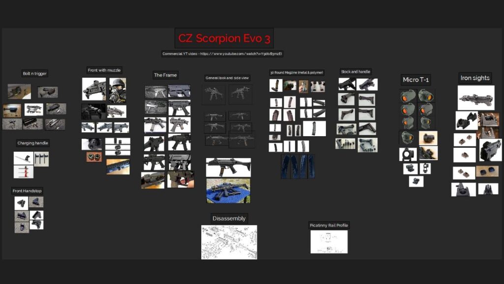
Watching videos also helped a lot. I looked for those that were showing disassembly, as well as a performance at the shooting range. I wanted to understand how this weapon works in a nutshell. This also made me grasp some design choices that the manufacturers had put in it. Weapons should convey interesting forms and look attractive, but all can be for naught if a sense of functionality isn’t established. It’s enough to understand why this is important if one just takes a look at a weapon showcase of today’s high-quality FPS games.
My software of choice is Maya. I place reference pictures in my scenes by activating the free image plane from Maya’s creation tab. Basically, it places an image projection plane in the center of your scene and when you add an image, it adjusts its size according to it. I started my blockout mesh based on the side view picture. I find it useful to begin with cylindrical shapes as they are pretty much size-definite, so I started with a muzzle and the bullet. For keeping my scale in check, I usually add a human model to the scene. If complete precision is required, blueprints often show the exact size of each part of the gun in inches.
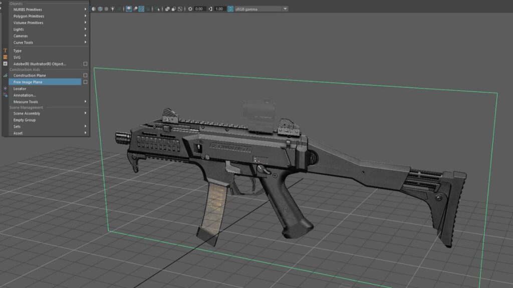
While there really weren’t any new modeling techniques for me to find out about, I was given a couple of precious pieces of advice. The first one was not to be lazy with the blockouts, because they must be used within reason. In a bigger studio environment, there would be people from other departments who would want to test the blockout mesh at one point in production. Using booleans is fine if you remember to clean up after them. It’s good to keep this in mind, even as a freelancer. The second piece of advice was not to be too cheap with the edge count on cylindrical shapes. It’s better to have more than less and it’s always easier to remove than to add later.
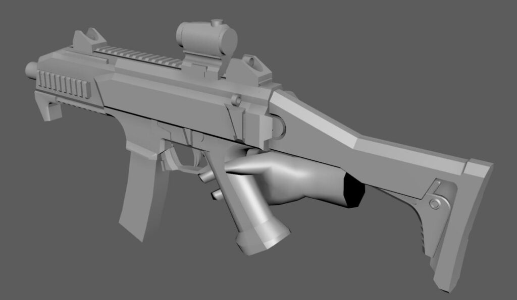
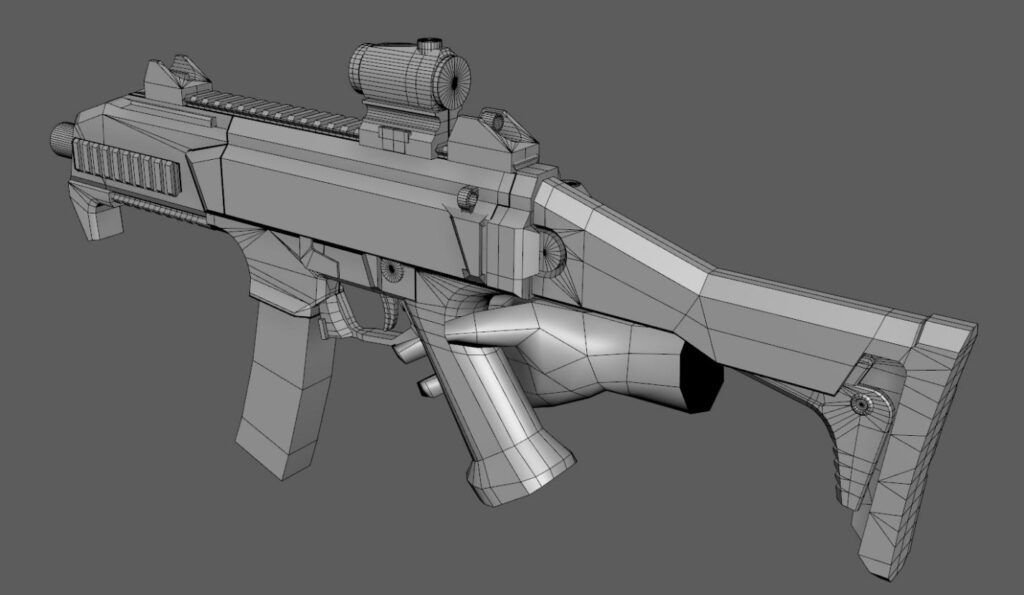
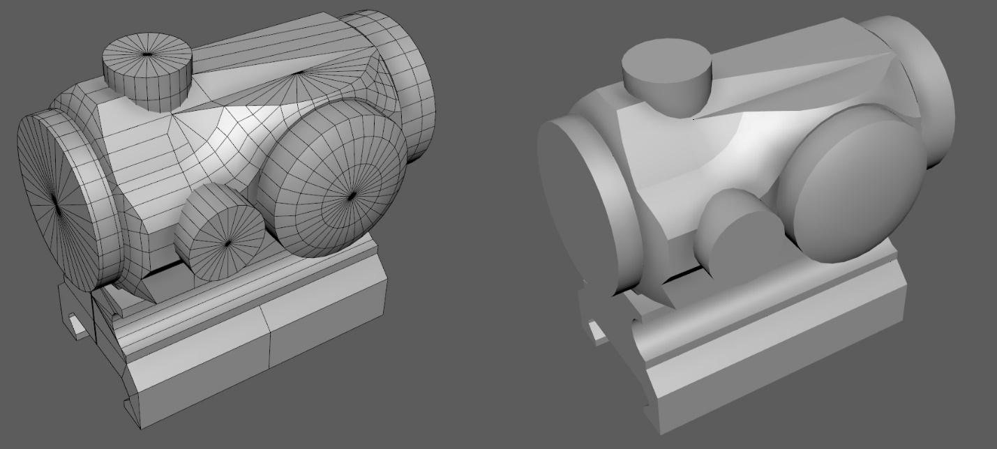
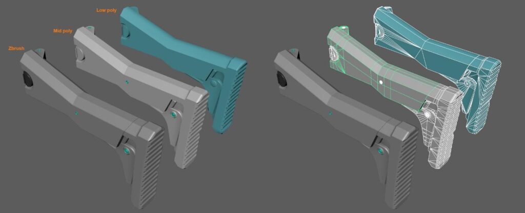
After the initial blockout, I added more complexity, essentially making a mid poly version of the gun. I also made some floating meshes. All parts should now fit almost perfectly. You’ll get a sense of achievement if you can trace larger contour lines along with the gun, and it just feels right, like looking at the real thing.
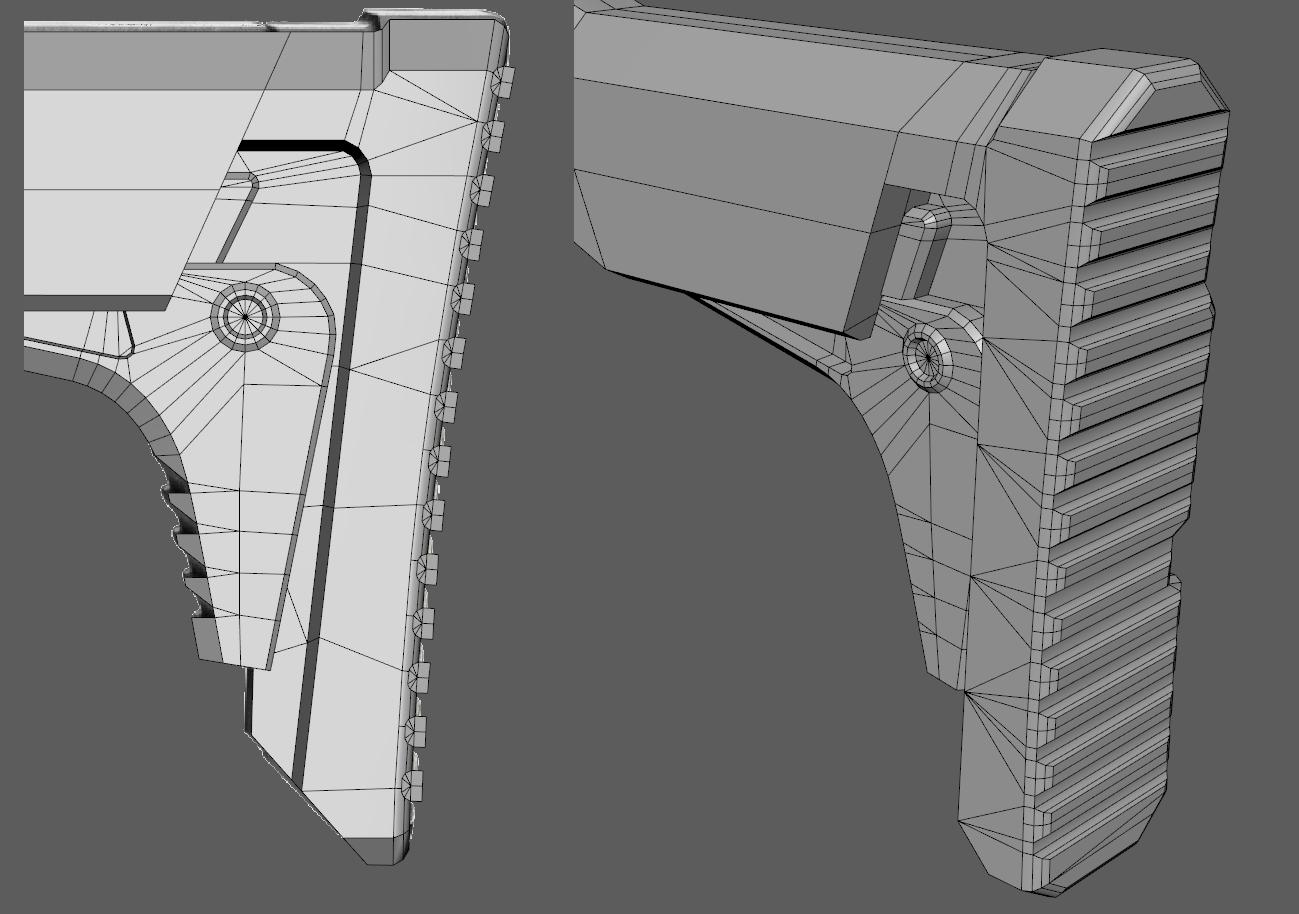
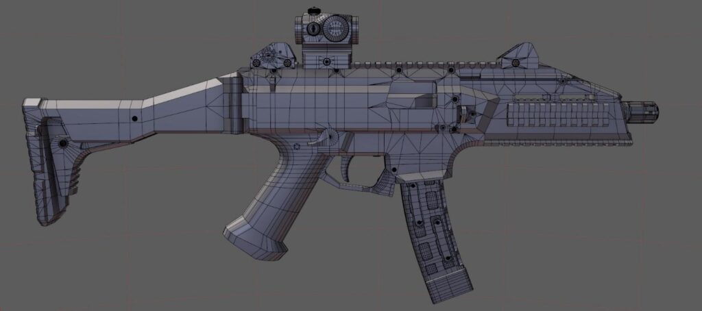
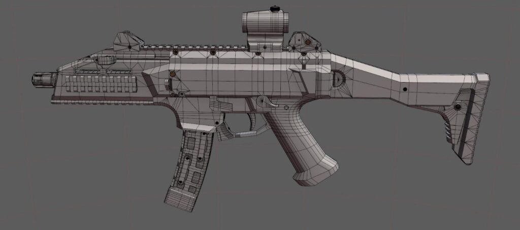
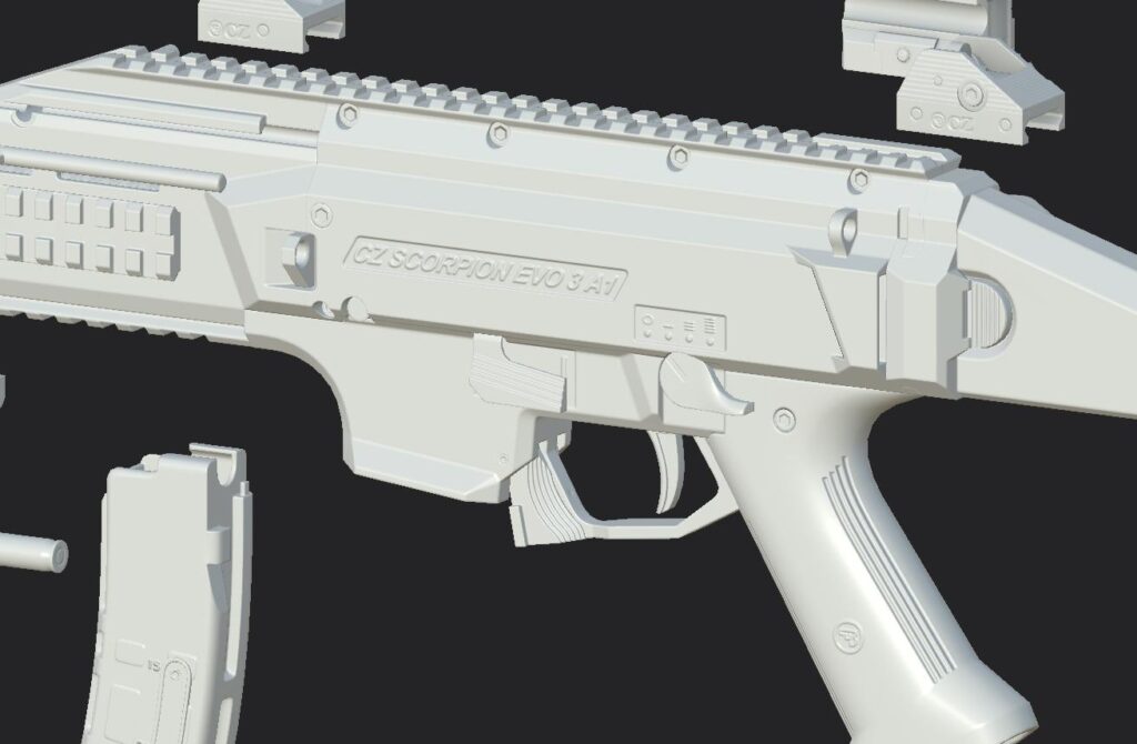
To create the high poly, I used the creasing technique and dynamesh in ZBrush. First, I made UV’s based on hard edges in Maya and packed them all quickly. Then, I transferred my meshes to ZBrush and made polygroups from them. Here’s a tip, objects shouldn’t have any ngons before importing them into ZBrush as holes will form on those faces.
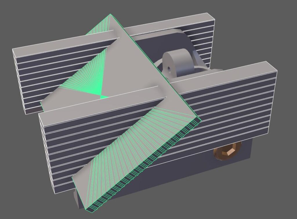
After I had all my objects imported, I used crease polygroups and I divided each object until I was satisfied with its look. Rounded shapes are my priority here and they had to be smooth enough. Finally, I used dynamesh. I made some meshes to act as cutters for intricate details and now was the time to use them as Booleans. Before polishing I made a layer and a morph target for most of my objects. It’s easy to revert back this way if things get too blobby and morph brush is especially handy. I also masked some parts to polish them a bit less if I was losing too much of the overall shape. Because dynamesh is scale-dependent, I choose to make more subtools for each major part of the gun. I saved often, as a Zbrush project file. That way I kept everything intact for the long run. With my high poly done, I decimated each object and sent it back to Maya.
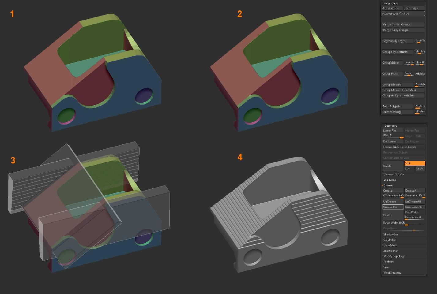
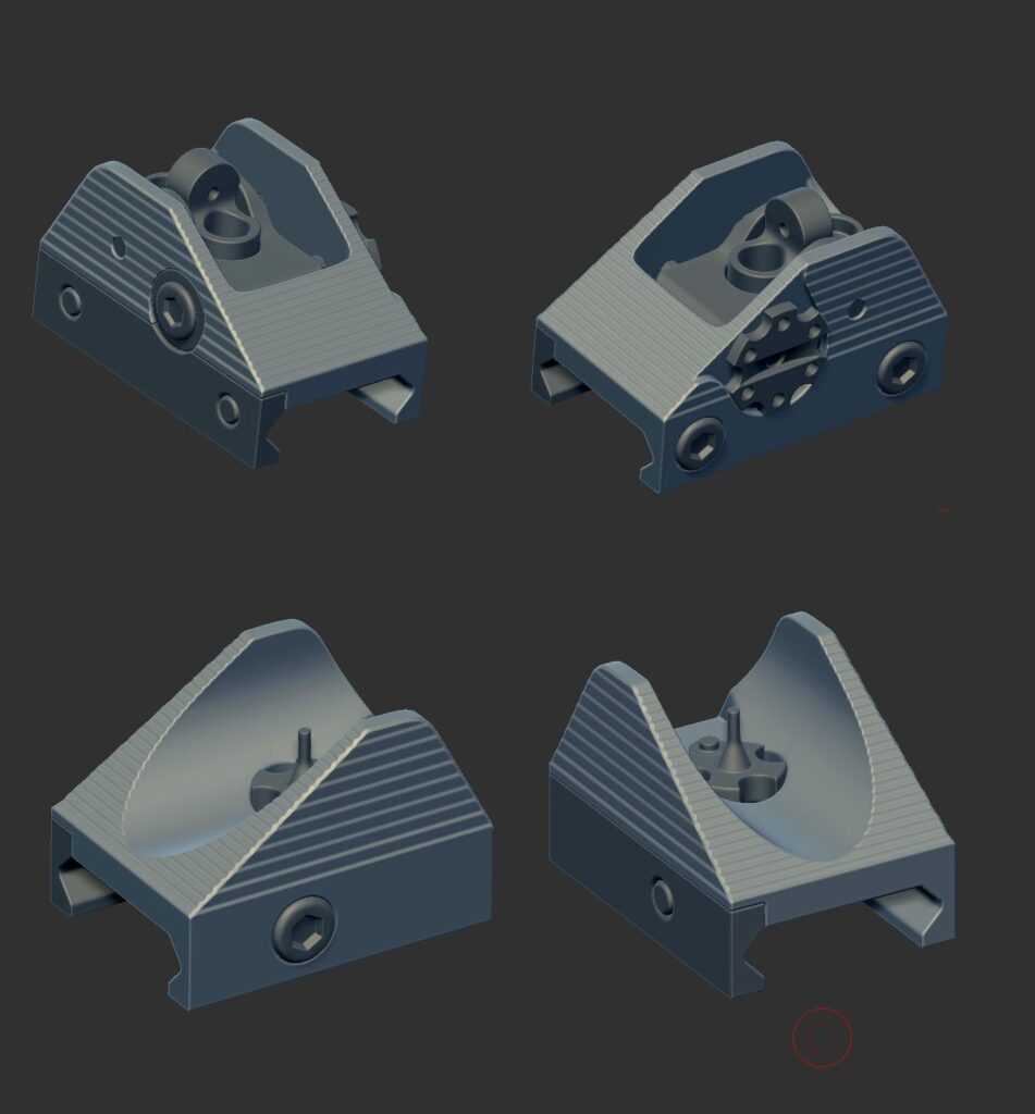
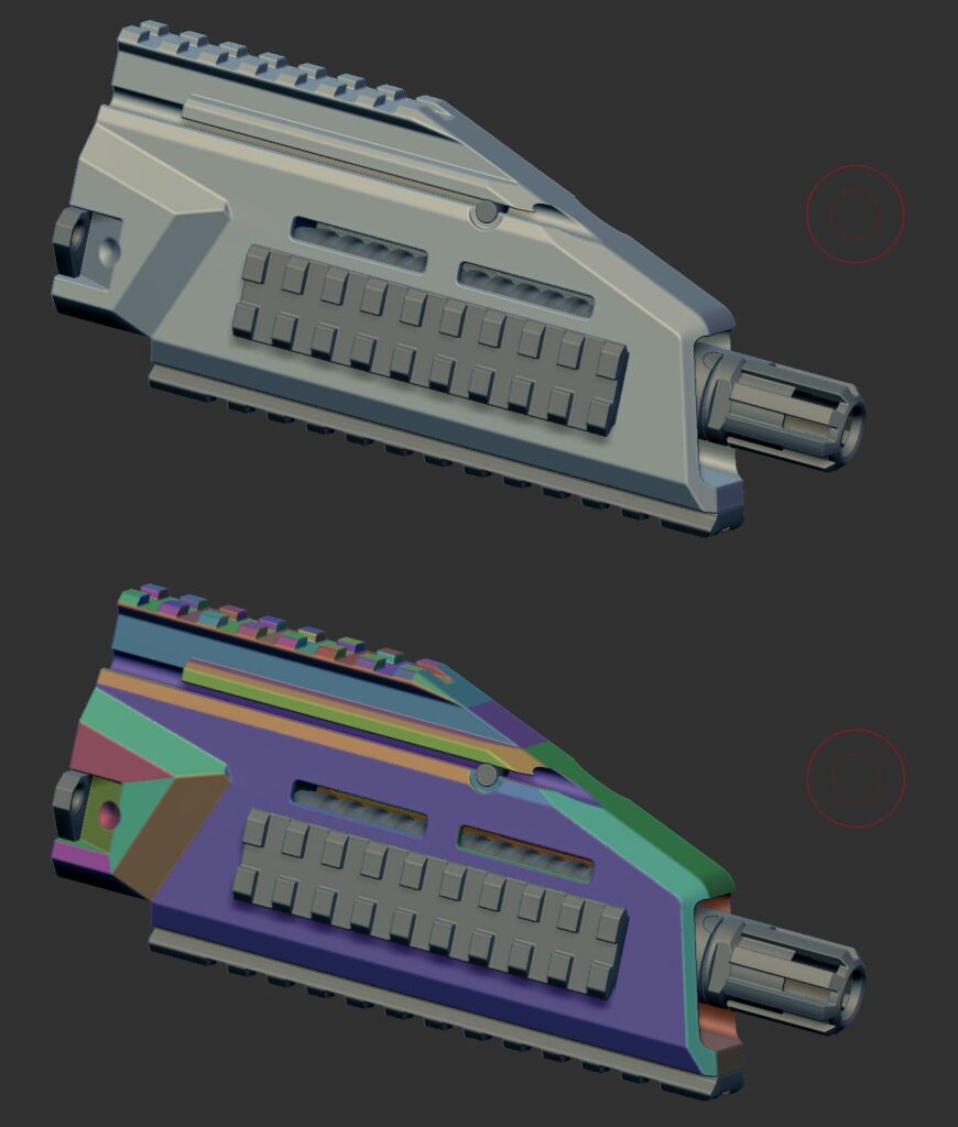
The aim of the high poly isn’t to make things look too sharp, like in real life, but a tad bit exaggerated and rounded. This way the weapon will be smooth, even if viewed from a small distance.
Creating low poly was a breeze. All I needed was to adjust the edge count of the mid poly mesh. I had to organize every bigger part of the gun in its own layer though because looking at too many meshes on the screen makes you prone to mistakes. Additionally, I might end up with a ngon face here and there, but there is a cool thing from Maya’s bonus tools that converts those faces into quads. I use it to wrap things up quickly, but since I don’t want any bad surprises, like extremely long thin triangles, I do a final checkup.
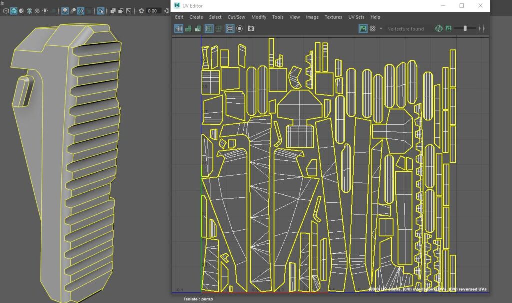
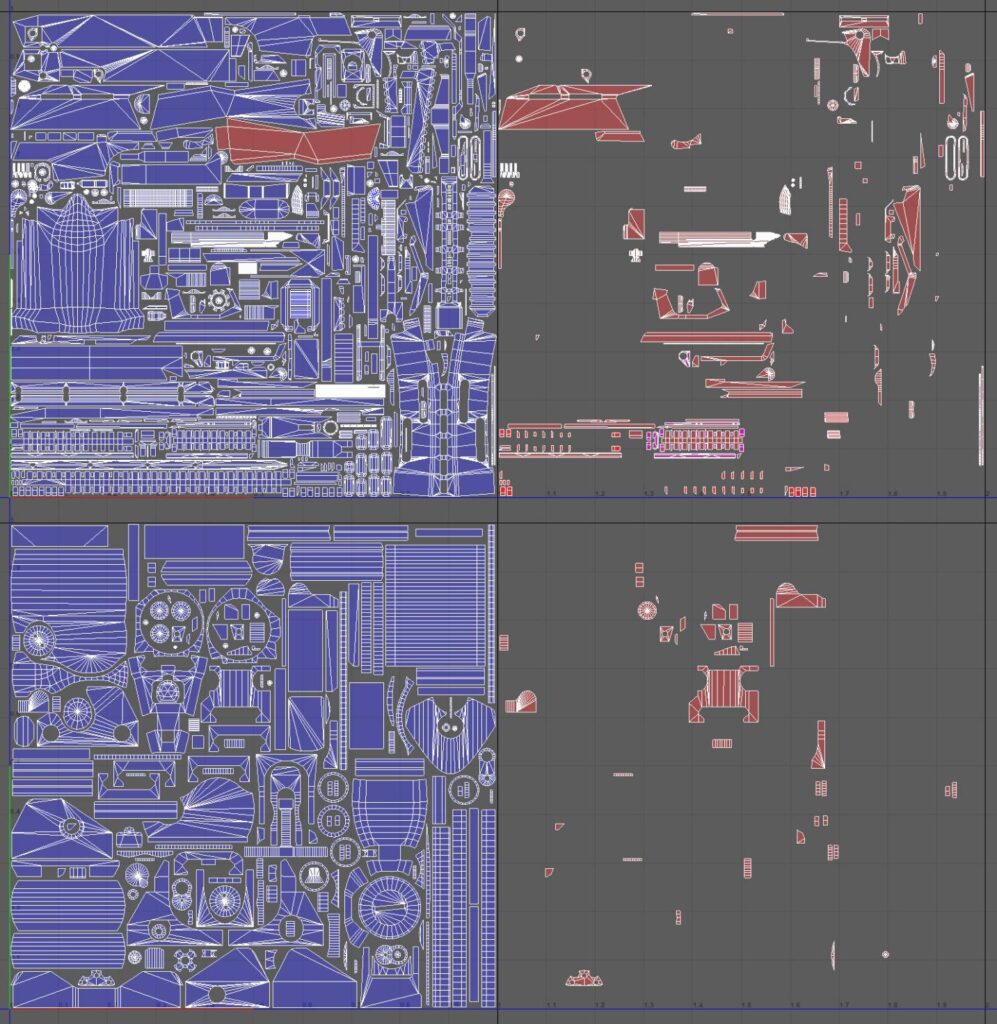
I used to create UV’s with Nightshade, but the new UV editor in Maya is virtually identical. I had all the tools that I had used before at my disposal. The project, cut, and unfold until it is done. I deleted faces that could be mirrored to save on texture space and downscaled islands whose faces would rarely be seen. Laying out UV’s was something that I did manually. The best way to progress is to challenge oneself and that’s why I did it by hand. There are many tools that are able to quicken this process, and you can also do a good pack in Maya by tinkering with the options in the Layout menu, like pack UV’s without changing their scale. Lastly, I checked that all my islands are fairly straight. When I was finished, I selected all the faces that were to be mirrored (you can also do that from the UV editor) and duplicated them on the other side. In order for baking to work properly, their UV’s had to be moved by 1 step, usually to the right side. Lastly, I merged corresponding objects and their vertices. I had two UV’s maps in the end, one for the main gun and magazine, the other for attachments.
The Workflow in Substance Painter
This was the first time that I had used Marmoset Toolbag for baking and was very pleased with the results. It was fast, easy enough, and the fact that I could change the cage size of every mesh individually proved to be essential. Usually, I bake three maps here: Normal, Ambient Occlusion, and ID’s. I’d advise people to always triangulate before baking. If not, triangulation might differ when it’s sent to Substance or Unreal, and there is a chance of shading errors appearing on the normal map.
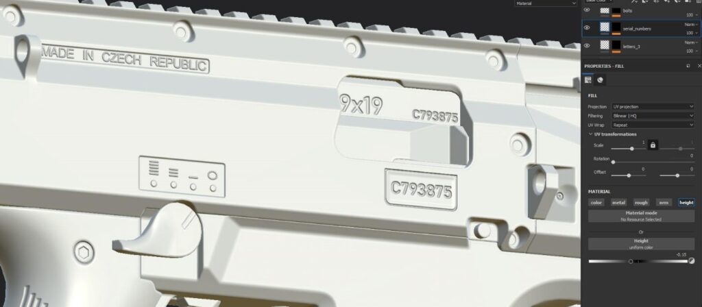
Substance Painter has already been my program of choice for quite some time, and I’ve happily used it ever since. To begin with, I transfer all my meshes and previously baked maps into a new project file. I always start by using fill layers with masks, changing only the height value in order to project unmodeled details like text and fire mode.
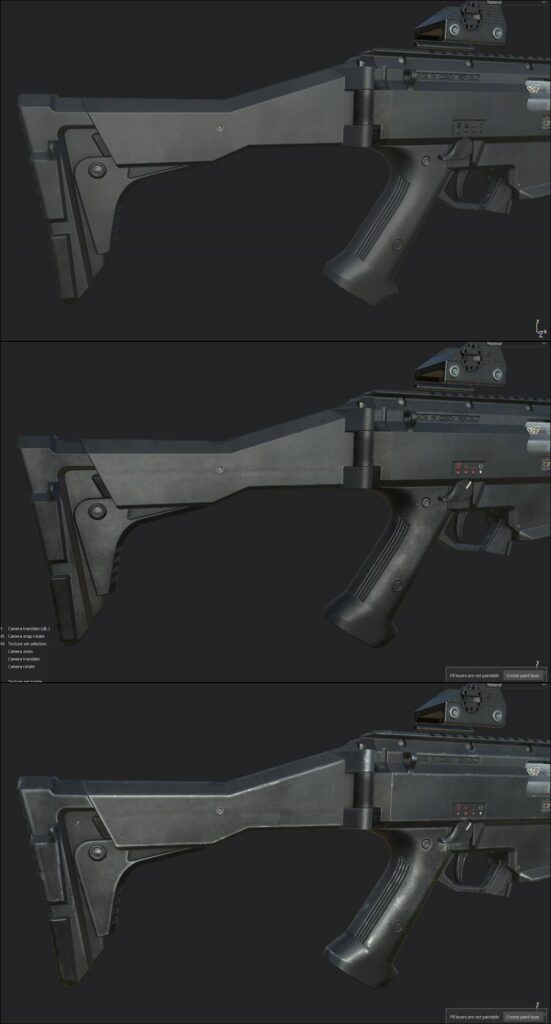
Keeping things organized is the key, so I separate my materials based on the previously baked ID map. Starting with a fill layer, again, I adjust roughness and color values until I’m satisfied with the initial look on one of the materials that I focus on first. Then, I gradually begin to add variations and surface imperfections, by using grunge maps and masks. With the base material done, I would go on ahead with the detailing. For example, those tiny granular bumps for polymer were reduced in places where holster wear usually occurs. I added some edge wear with Smart Masks, removing where it felt excessive by using brushes. After that, I added small dents and generated dirt that appears around crevices. To see if I’m going in the right direction, I tried different light settings while keeping tab on my reference images. I’m not entirely sure why a rough line on the stock appears, possibly because of the way it is produced in the factory, but I thought it was a unique and cool detail to recreate so I hand-painted it. It’s good to hunt for details like those that can make the weapon stand out.
Rendering
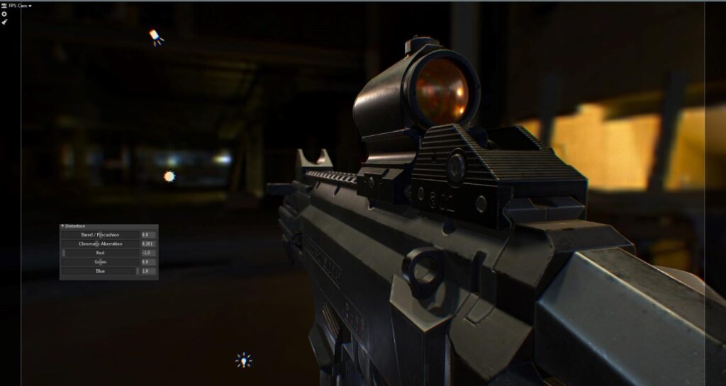
I picked one cool looking HDRI map to work with in Marmoset Toolbag and made a directional light to act as my main light source. Then, I had to build upon it by adding fill and rim lights, basically a three-point light system. I also tend to drop a spotlight to distinguish certain parts. Depending on the purpose of the render, I try to keep my main light source most impactful. Usually, it’s not good to have too many lights, but making a good render does require a bit of experimentation. Try using a bit of some distortion effects, like chromatic aberration. It’s important to keep a balance though, to think about realism. Presentation is of equal value as everything else in the making. My advice is not to rush it and to try until you’re completely satisfied with the look. Happy accidents are also a factor at this point.
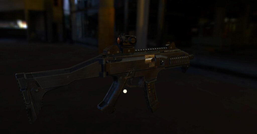
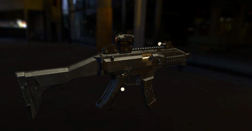
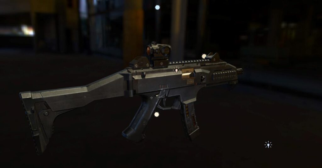
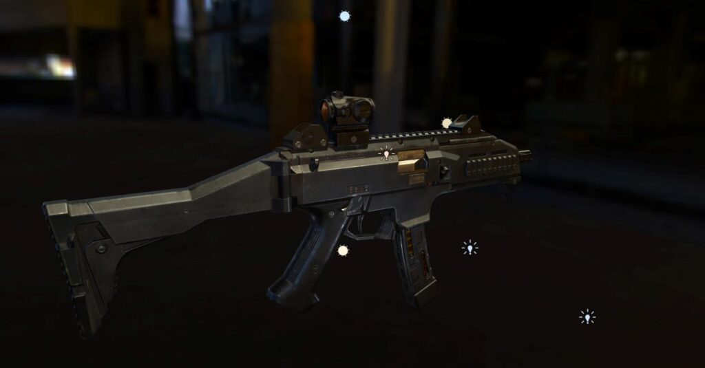
I had a rough idea in mind for my render shots, and I wanted to show every significant part of my gun. First, I focused on creating a render of a first-person view and then a couple for the complete weapon. After that, I picked some specific angles, like the side one which features Micro T and sights. I made a separate render for attachments and did the same with the magazine. Additionally, I wanted to make a cool gif or a video of the camera moving along the gun. Marmoset Toolbag gives you the freedom to create it, but you can also make a png sequence to edit in Photoshop or After Effects later.
About the CGMA Course
I was able to learn quite a lot from this course. Everything in it was nicely covered and thoroughly explained with good example materials. It’s worth having an experienced instructor to support your progress and its way faster than to trudge alone, especially if you don’t have the time on your hands. I did have a few challenges along the way that I had to overcome. CZ Evo 3 is almost entirely made out of polymer and largely covered in dark color. I didn’t want to end up with a bland or unvaried texture, that was a tough one to figure out. Last but not the least was to pack UV’s and retain enough texture space, took a couple of tries to truly nail it. All in all, practice makes us better.I’m into sci-fi, so I guess spaceships, robots, guns or something along those lines is what I would want to do next. I’m not shy to try different things though, as long as it’s exciting!


