Creating a Revendreth-Inspired Scene in Maya and Photoshop
Pat Klisiewicz did a breakdown of his scene inspired by Revendreth, made during the CGMA course, shared his modeling workflow in Maya, discussed the texturing process in Photoshop, and explained his lighting set-up in Marmoset Toolbag to recreate the game’s atmosphere.


Introduction
Hi, My name is Pat Klisiewicz, I am currently a 3D artist working in the video games industry. In this article, I hope to share the things I learned whilst undertaking the CGMA Stylized Assets for Games class.
About the Course
I was always interested in drawing, fantasy art, and video games, especially, the Warcraft RTS series and Zelda. I always loved digital painting and in 2017, I discovered ZBrush which showed me how amazing and fun 3D art can be.
After experimenting with different software and styles, I loved how Stylized Hand Painted assets combined my love for painting and 3d modeling. It was the perfect fusion of illustrative skills and 3D.
I signed up for the class when I received an email that the class had been renewed and would be taught by Ashleigh Warner, I think going into the class I didn’t expect to learn any skills in terms of software, but more the workflow and artistic approach to creating assets, how I can improve my textures, values, topology, etc.
Inspiration and Reference
Ashleigh was very clear that we should be aiming our Portfolio pieces at the studios we would like to work at so the inspiration for this piece was World of Warcraft. At the time not a whole lot was known about one of the new zones, other than a few pieces of art that could be found online. I thought it would be interesting to apply my vision of what I would like to see in the next expansion.
I will usually use PureRef to organize my images. I find a lot of the time whilst working on a piece I will always be browsing Artstation, Instagram, or Pinterest and constantly pulling images off the web that inspire me to use as a reference.
I always try to first find a reference to the general atmosphere and feel. Then find a reference for the smaller elements in the scene, in this case, the atmosphere was set with the concepts for in-game Revendreth that were available online at the time. I then looked for references to stone arches, thrones, stone, gargoyles, etc.

I think when doing initial concepts I do not use a large amount of reference, I think it is important for me to get my broad ideas down on the page. Here for example I started with silhouette designs of the throne which I knew was going to be the hero “prop” for this scene. Before moving into some thumbnail sketches, I then took a blockout and created a base for a paintover, from which I painted my original concept and did some experimentation of other colour variants.

Modeling
This assignment for the class was the largest and was broken down into 5 weeks.
- Week 1: Concepts
- Week 2: Tiling Ground Textures
- Week 3: Tree / Foliage
- Week 4: Hero Props
- Week 5: Details
My modeling approach in Maya was following along with the plan set out in these weeks and slowly working large to medium to small, then slowly adding detail to build up the scene. I started with the base ground, tree, wall/window, floor, and column as I had established in my concept, and when I was comfortable with how things were looking, I built up the smaller details.

The geometry for this type of stylized hand-painted artwork is quite basic as can be seen in the wireframe images. The goal here is to use the painted diffuse textures to build up detail and depth. When modeling, for example, the column, I started with a really basic shape, and as I needed extra edge loops and geometry to match my texture and give it extra depth.

TIP: I use instanced objects and symmetry/mirror to speed up the workflow!
Photoshop Workflow
In order to achieve the 2D look, I used a Diffuse only workflow, meaning that the only map used for this piece is a diffuse (Colour Information) as opposed to PBR workflow which involves using several map types such as normal/roughness/specular, etc. For this piece, my workflow was almost exclusively using Photoshop, but also some initial setup in 3DCoat. To get a good base for me to start painting my textures onto, I bake an Ambient Occlusion Map, Curvature Map, and a top-down gradient. This can be done in any baking software such as Marmoset or xNormal. It is not necessary, but I do find it speeds up the process considerably.


I think the trick to getting highlights on stylized textures like this is remembering how something is positioned in the scene, and generally imagining a top-down light source, so any faces or edges facing up will catch a highlight and vice-versa. I would normally paint in the flat values and then using my curvature map as a guide paint in the edge highlights.
Creating textures that have a stylized but rich feel, I think, comes down to using color variation through the piece. Adding tints of greens, blues, and purples can really bring the textures to life and give them the colorful, comic book vibrance that many hand-painted games such as World of Warcraft have.
Working on the Details
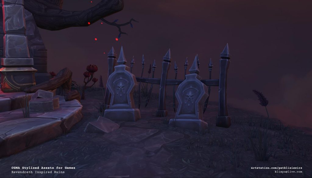
The lanterns are probably one of the funniest parts of this to work on, I started with a basic primitive rectangular box, divided it into 4 sections, I experimented with only painting a quarter of the lantern and just having the same UV texture on all 4 sections, but this was very obviously repeating and looked lazy. So I decided to paint half of the lantern, and mirror the geometry as seen below, this way, I could get more variety into the overall texture.

The entire texture for these lanterns and every other prop is the same workflow as mentioned before, I exported the model into 3D Coat, baked my Ambient Occlusion, Curvature, and Top-Down Gradient. It is then just a matter of painting in detail including things like the skull or other decoration elements, I will also switch back and forth between Maya and PS to make sure the values and colors all match throughout the scene.
Lighting
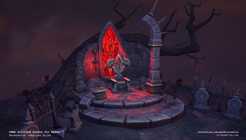
For the lighting, I used Marmoset Toolbag 3. I started with the basic HDRI in Marmoset of a late sunset environment with an orangish horizon and purple clouds.

I kept my original textures very neutral in terms of colors, I thought about the textures as if there was no lighting, and they were lit by a simple top-down neutral light with no color. This way, I could have more control over the overall final atmosphere of the piece with the lighting and HDRI setup inside the Marmoset Toolbag.
My general theory behind lighting this piece was to have it quite dim and grim as it would be in Revendreth. I used the bright pop of red light from the window to attract the viewer’s eye towards the center and throne and then adding in the light rays to guide the eye down to the throne. Anything else I wanted to pull out and draw attention to. I used a spot or omni light with a slight color to add visual interest.
Biggest Challenges
I think the biggest challenges that came with this project was the timeframe, and getting the look of Revendreth right with very little material about the zone having been released at the time. This was a personal representation but I did want to try and get it as close as possible using only the concept art available. I also made sure before posting my final portfolio pieces to go back and polish everything to a level I was happy with and make all of the changes from Ashleigh’s feedback.
I spent time after this class polishing all of my portfolio pieces to a level I was happy with before posting them to my Artstation for the world to see!


