Efreet: Creating a Stylized Character in ZBrush and Maya
Ramy Lam did a breakdown of the project Efreet, a stylized 3D character made primarily with ZBrush and Maya and rendered in Marmoset Toolbag.
Introduction
Hello, my name is Ramy Lam and I am a 3D character artist from Las Vegas. I went to school to learn about game art and design but ended up taking a long break after so I am largely self-taught. I joined the CGMA class Character Creation for Games to learn new techniques and help solidify my workflow. There are a ton of resources online to help you learn and practice, but nothing beats having a mentor who can guide you and give you useful feedback. Patrick Yeung was the instructor and I loved his work on Apex and wanted to learn how someone in the industry would approach a stylized character today.


Efreet: Goals and Concept
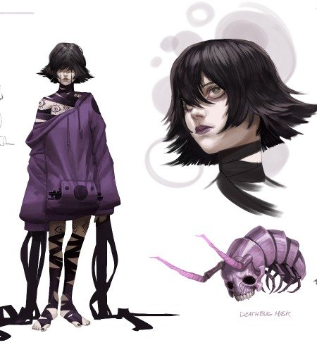
I keep a folder of cool/interesting concepts and art I want to create and model so when I signed up for the class I already had an idea of what I wanted to go for. I wanted to work on skin, cloth, and metal for this project, so I went with a Tiefling concept by Angel Huerta. I wanted to create her in a style somewhere between Apex and Overwatch, so not too anatomically exaggerated in style but still stylized. The cloth was a bit tough as well and I went through several passes in order to get the right balance of wrinkles and style.
Angel Huerta’s concept art:


Blockout
Starting with the blockout in ZBrush, I keep as many parts of the sculpt separate as possible so I have greater control over them. This applies to the body as well; separating the limbs and major landmarks individually. Usually, for the head, I start sculpting from a sphere but Patrick’s approach separates all the facial features as well. In this phase, he’s just worried about the proportions and tries to do as little sculpting as possible. I thought it was a really interesting approach so decided to give it a try.
In this phase, the most important thing I pay attention to is the proportions. I referenced a lot of anatomy books and resources to make sure everything looks right, and then I go in with the stylized changes and exaggerations. If I’m not happy with the proportions now, then it could become a huge pain in the future if I decide to change the proportions and have to adjust all the subtools to accommodate the changes. I also make sure I’m not “cheating” with the excuse of stylization. That is, being sloppy and ignoring correct anatomy. I think the best stylization comes from a better understanding of anatomy; knowing what and how to exaggerate to get the best possible outcome.


After I’m happy with the proportions, I begin merging the body parts and limbs together and dynamesh them into one mesh. I usually just do a quick ZRemesh to save time, rather than completely rebuilding the geometry so it’s perfect. I still try to keep them separated as much as possible so it’s easier to manage and I can pump up the subdivision levels without worrying too much about performance. For example, I keep the head separate from the torso and arms since she has a neckpiece covering the transition. Since her legs are covered completely I leave them as spheres and just keep it for reference to double-check my proportions and clothes every now and then.
Head and Horns
For the face, I referenced Hamel Patel, a model. I didn’t want to do an exact likeness but she had a lot of the facial features and direction I wanted to go in. The face went through many iterations, but eventually, I was able to get it where I wanted. I usually get frustrated easily here when sculpting the face because it’s not easy nailing the look I want, but I have to remind myself that it’s a work-in-progress, and you need to keep working on it, double-checking anatomy, proportions, and the reference to make it shine. These are things that get easier with time and experience, and the only way to get better is to sculpt and practice more!

The horns were made in Maya real quick so I would have good topology for sculpting, but you can achieve similar results using the Curve Tube brush then adjusting the Curve Modifiers under Stroke. Using the ZModeler I crease the edge loop where the horns change direction and set the Crease level to 3 under Tool > Geometry > Crease. This gives me a defined edge, but not too hard. I want the horns a bit blunt to show the wear of time. I use Crease quite a bit to get nice clean edges.

The horns were originally a lot more simplified, but Patrick pushed me to add more detail, and I ended up defining the grooves in the horns a lot more. I wanted them a bit more worn down in the front and closer to the tip to indicate the wear and tear over time, and to showcase some of the battles she’s gone through since I imagined her as a sort of traveling mercenary or bodyguard.


Clothes
For the clothes, I wanted some nice, defined folds, but not too many. I try to keep in mind what kind of material I want the fabrics to be made of and how they fold in real life. I also make sure they crease and fold to the body sensibly, such as near the joints like the crook of the elbow. The black portions of her sleeves are softer and silk-like so naturally, they have more wrinkles and folds. Her cloak and pants are a bit thicker so I try to reflect that when sculpting. The leather wraps on her calves are bound tightly, but besides at the knee and near the ankle, they don’t deform much so the wrinkles are less pronounced. Instead, I try to slightly emphasize the pull of the material around the buckles.


Armor
I usually create the armor blockout in Maya for more control, but sometimes I start in ZBrush if it’s more organic. In this case, I created the pauldrons and greaves in Maya and the chest and hip armor in ZBrush. In Maya, it’s just good, old poly-modeling, where I can control the symmetry more easily. In ZBrush, for the more organic parts, I create a zsphere and adjust it to the character’s body, then mask out the armor shape. I Extract with a thickness of 0 to get a single-sided mesh, adjust the shape if needed, ZRemesh to my desired poly count, QMesh using the ZModeler, then finally crease the edges for a nice, clean look. This gives me a solid base to work with.


Eventually, I take it to Maya to clean up the topology and add more detailed parts. A lot of the pieces are just box modeled with clean topology, then brought into ZBrush and once again Creased. For some armor pieces, like the hips, I just use pieces of the base geometry to create the panels and simply Qmesh and Crease again.


Skin Detailing
I saved the skin detailing for last because I’ve never done this level of detail before, so this was a very new experience for me. I used Rafael Souza’s ZBrush skin textures to slowly layer the pores and wrinkles with Patrick’s help and direction. Rafael’s textures are meticulously separated by facial area so they’re very easy to use and approach. I separated the lips, base layer of pores, and bigger pores and wrinkles using Layers so I could control and adjust the strength of the textures. I left the details a bit strong since I could adjust the baked normals easily and turn them down later if needed.

Retopology and Unwrapping
I used Maya’s Quad Draw to retopologize everything. It’s very intuitive and straight-forward. I like using Headus UVLayout to unwrap because it’s very fast and will automatically scale everything to each other and fit them together. Then I bring it back to Maya to optimize and scale things up that I want to have more detail. I also learned the importance of maximizing your UV space for games since they have a limited budget for textures.


Texturing
This was also my first time using Substance Painter to texture. Before that, I had used dDo and nDo but Quixel had stopped supporting them a while back. The power of Substance is amazing and the results you can get are incredible. It was a bit overwhelming, but Patrick showed me several ways to approach certain surfaces like cloth, metal, and skin. I like the randomness that Substance can generate, letting you focus on the details. Since my character has red skin it was a lot more difficult to approach, but I just followed the basic color zones and adjusted the hue and saturation as needed. As Patrick said, even if the character is a fantasy creature, it’s still based on real life.

Lighting and Presentation
To render, I used Marmoset Toolbag since the goal was to create a game-ready character. I usually like to pose my characters in a relaxed default pose and an action pose. One of my art teachers once told me, “a good frame can make a bad painting better, and a bad frame can make a good painting worse.” It stuck with me and I always make sure I display my work in a way I can be proud of. After all, why go through all that work just to make a boring or bad presentation? I don’t think you need to know advanced rigging as a character artist, but some basic knowledge goes a long way in giving your character some personality instead of a basic A or T pose. Even just having them lean to the side with their hand on their hip or hunched over gripping their fists ready for action can add a lot of personality and attitude.
I use Maya’s HumanIK rig to pose my characters since it makes the process faster and gives you some decent control options for posing and animation. For lighting, I started with the basic 3-point light set-up. Drawing inspiration from the concept art, I placed a warm orange light and cool blue light for rim lights as well. Smaller omni lights were placed near her face to emphasize it more and to bring up the rim light around the head a bit. For the action pose, she’s winding up a special attack so I turned down the sky and main light and added an omni light with the shape adjusted to the weapon for the main light since it’s the focus. Another smaller omni light is placed above her head to get some shine on her hair for contrast. The special FX are just planes with an alpha and the emissive pumped up.


Conclusion
I learned a ton of stuff thanks to this class and looking back at this project now, I can still see areas I could improve on. Getting feedback not just from my mentor but also from my classmates was also invaluable. Being able to see the ways other artists approach things is also very enlightening and can open you up to new techniques you wouldn’t have thought up by yourself.
I feel my biggest challenges were with anatomy and texturing, but Patrick helped me throughout the entire process and reminded me to start with a strong base and foundation, then slowly build up. Overall, this class was awesome and I’m eager to apply what I learned to future projects!


