The Rostrodon
Ryan McCowan takes us through the design process for his ornithoid creation in Creature Design for Film and Games.
Introduction
I was born and raised in Charleston, West Virginia. I was a unique, creative kid and was always interested in animals, insects, and almost anything related to nature. I started drawing when I was around 5 years old after watching my older brother sketch and doodle and I decided to try it myself. That set everything in motion.
I drew all throughout elementary and high school designing characters and creatures like three-headed dragons or giant fish monsters for comics and stories I’d write. Creature design is what I’ve always been most drawn to (yeah it’s a pun, I know). It’s still the direction I’m heading in and I want to improve my skills, expand my knowledge, and find employment as a creature concept artist. There was no reason for me to not take this class. I’m determined to bring out my full potential.
Sketching the Idea
The early weeks were fun because there was little pressure. It took me a while to adapt to the 1-3 minute time constraint since I usually don’t draw that quickly and loosely, but it was enjoyable to let my ideas flow and freely explore a variety of shapes, forms, and proportions. I gathered references for eagles, horses, lions, and even dinosaur skeletons for more unique features.
I started off with a specific idea in mind that I hoped to develop throughout the course. My idea was for a fantasy creature design (a gryphon-like animal), but the direction Bobby wanted us to take was for an alien creature – something with a completely different tone and feel to it. I tried my hardest to figure a way for my original design to work for this course, but I soon realized there was no way around it and I’d have to go with a different design and expand on one of my other thumbnail sketches.

My first few sketches were the least difficult since they fit with my original design idea. I was content with my initial thumbnails, but after having to change direction with my concept, it became more difficult to continue exploring and diversifying the ideas. Some uninspired and bad sketches came from this, but what would eventually become my final iteration also emerged.
Refining the Design
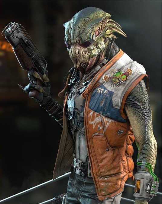
The Rostrodon, my completed design, was the result of using bird, dinosaur, and human characteristics from my references and applying them to a simultaneously marine and terrestrial alien. I imagined an animal that spent most of its time in the water but would occasionally travel on land for food and nesting purposes. The name Rostrodon, meaning “Toothed Beak,” is a reference to the prongs on the sides of the alien’s beak that it uses to capture prey.

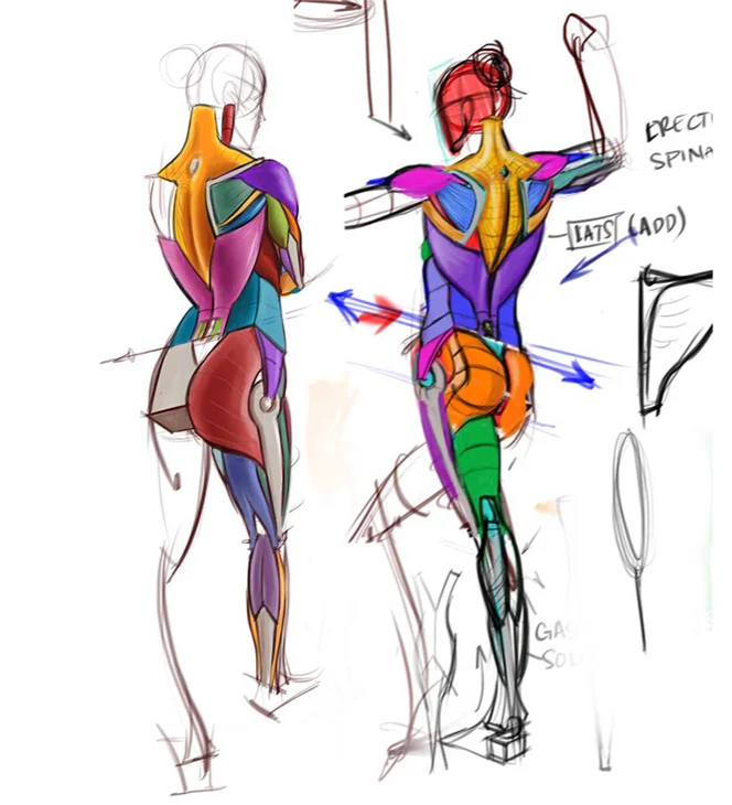
The most difficult part of designing the final version was figuring out the Rostrodon’s anatomy – muscle structure to be specific. This is something I struggle with even when designing other creatures. Muscle anatomy can be fun when you finally figure it out, but piecing individual muscle shapes together is tough. It’s especially difficult imagining how those forms would look from different perspectives. Something that helped me through this was “comparative anatomy” or referencing the anatomy of different species to better understand that of another organism. Most living creatures share the same bone and muscle groups. They just differ in shape and size. Because of the Rostrodon’s proportions and overall posture, I decided to reference human and gorilla anatomy mostly for the upper body and torso areas.

I received mostly positive feedback for the Rostrodon’s first draft, but I was instructed to make a few changes that would make more sense anatomically. The original neck and shoulders were thinner and smaller, but in order for the creature to be able to hold its head up, walk with the posture it had, and be a strong swimmer its muscle structure in the chest area and above would need to be more fortified.
Another major change that was suggested to me was that the webbing between the Rostrodon’s arms and sides seemed unnecessary and that I should get rid of it. I thought the webbing was an interesting feature and added a bit more personality to the design so I decided to keep it but lessen the amount of space it took up along the sides of the torso. A few hours were spent making these adjustments in addition to other changes to the tail, beak, hands, and ankle joint before finally arriving at the finished design.

Final Thoughts
At this point, I haven’t continued the Rostrodon’s design. I’ve considered applying some new ideas to it or maybe fully redesigning it. For now, there are other creatures I’m currently working on, but the door’s open for me to go back and develop newer iterations after I’ve continued to study and improve.
This class provided me with more insight into what goes into the creative process from start to finish – from thumbnails to finished design. The first few steps, exploring ideas through quick sketches, I think are potentially the most important. You can start off with a plan to design something specific, but you might end up discovering and choosing something even cooler or more interesting. There are so many concepts you can develop and expand on that you never even thought you’d imagine or create. That’s something I want to do more of. Before going directly for one idea I have and staying with only that, I want to do some more exploring and have more fun with it. It might lead to a different idea that I prefer over the original.
I was essentially given a map to navigate the steps of design from beginning to end. One thing that helped me navigate this map more easily, for this specific course, was having at least a familiarity with anatomy and form. It made the process of exploring proportions, gestures, and other shapes easier. There’s absolutely more for me to learn and practice in that area, but it gave me some room to place a little more effort into different details and characteristics I could play around with.
For any future students interested in taking this course, I’ll forward the same advice that the other artists and I were given – the more you put into the work throughout these weeks, the more you get out of it. The more effort you exert on brainstorming, drawing, studying, and creativity, the more you will be rewarded with the outcome. It’s all worth it.
I’ve loved my experiences with CGMA. This is the perfect type of course for me. It’s concise and not too lengthy. We’re given tools and guided through a specific process that we can continue to practice and utilize in future design processes.
To see more from Ryan check out his links below:
ArtStation: https://www.artstation.com/ryanm
Instagram –https://www.instagram.com/rymccowandraws/


