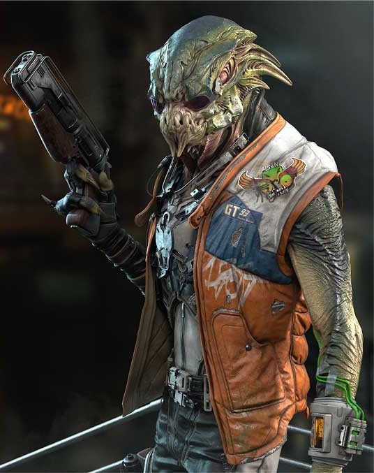
The Warlock
VFX artist Samantha Combaluzier branches out into character design, taking us through the process of how she crafted her spell-slinging Warlock over 8 weeks in Marco Nelor’s Character Design for Film & Games course.
Introduction
Good day everyone! I’m Samantha Combaluzier. I grew up in the South of France near the Mediterranean sea. I have worked in the VFX industry for around 10 years and I had the privilege to work on various films and TV series (Fantastic Beast, Game Of Thrones, etc.). My artistic background comes from graphic design, illustration, conception, and 3D. Creativity is a fuel that needs some guidance and CGMA has helped me improve my artistic skills and techniques. I chose the Character Design for Film & Games course with Marco Nelor because I wanted to achieve a more realistic look in my art and speed-up my process.
Research & Development
The first pass of research and development is important to familiarize yourself with your subject. Marco acted as an Art Director and gave us quite a few character descriptions to pick from. I selected the “Warlock” as I wanted to depict a magical male character with the power of lightning (or something else) in his hands. As an imaginative backstory, he is a Warlock who worships the Thunder Wolf as his deity. His prop is inspired by the Vajra: a weapon of the Indian Vedic rain and thunder-deity Indra. The research helped me to figure out the character’s essence.


Developing some silhouettes was key to help visualize the his iconic figure and presence. I was inspired by werewolves, shaman designs, medieval armours, and magicians. The goal is to create something that feels right for you. The first sketches and doodles were just to work the materials altogether (from the research) as well as experiment with variations. Thinking of the story behind your character will ground him in some sort of reality. And the research phase is extremely important to nurture your designs and find the right shapes.

Narrowing Down the Selection
Afterward, we narrowed down with Marco the silhouettes, focusing only on the costume design this time. There was still space for development and detailing; it was really a matter of selecting the most interesting sketch, and I totally agreed with Marco’s insightful comments, as we were evaluating the potential of each silhouette. The development of shapes was quite promising and it was easier to imagine the character this way. Then, we selected three possibilities to create a gesture from.

Head Explorations
As we continued to work on the Warlock, another pass of research was done only for his Head. I wanted his face to resemble and share some facial properties of a wolf. With this approach, he was going to wear those distinctive attributes: long hair, big ears, a well-furnished beard (fur), and clever eyes. Among all the references, five actors were the most influential in the design development.

Playing with different facial features was very interesting and fun. The idea was not to copy an existing character face but to use it as inspiration to reach a design that felt right. I started with a serious expression and then softened it, and gave it more definition.

With Marco, we selected three versions and placed each face over a rough sketch of the shoulder pads. I finally chose version B with the eyes of C and polished a final version. The salt and pepper hair look was a design choice because it reminded me of a wolf bicolour fur.


Character Through Gesture and Color
Finding a gesture for him was a challenge, so I had to pose in order to feel what kind of presence he should portrait. Drawing him with this physical awareness made him more realistic. In his action pose, he is not wasting any movement or energy since he is like an older wolf that knows what he is doing and waiting for the right moment to pounce.

Then, it was time to test a few colour palettes over the black and white sketch. I used overlays and colour layer effect in Photoshop to test some colour palettes over the detailed black and white render.

Final Glamour Shot
For the final design, it was a journey to paint and to push the final rendering as far as possible. Most of the modifications were painted in black and white before applying colors. It was a very dynamic back and forth with Marco to make sure I learned from my mistakes and improve on them. I followed and re-painted all the design elements that were off, and I used a few photos for texture and detail.

The biggest challenge for me was the armor and cape, but Marco gave me detailed advice to help me finalize the look. In general, I had to redefine some of the key elements of the character to give him more readability. The armor was implemented with the “Thunder Wolf” theme as you can see from the shoulders pads. From the original designs until the last steps, the improvement was huge, thank you, Marco.


Conclusion
The piece ended up very well for the Warlock and I’m very pleased with the result. The dynamic and flow of the character work because he seems alive. I learned a lot by exploring various possibilities, sketching, rendering, and how to push the quality up into the final work. I want to thank CGMA for being such a wonderful resource for artists and teaching us how to improve. I had the chance to learn from their fantastic teachers and I enjoyed their wisdom. Thank you CGMA!


