Walk This Way: Learning the Fundamentals of 2D Animation
Seiji Lim shares how Foundations in Modern 2D Animation helped him look at his work through a professional lens and design with animation in mind.
Introduction
Hi, I’m Seiji from London, UK. I’m currently a freelance artist and my goal is to work in the Animation/Film/Videogame industry. I’ve previously worked as a Character Artist at Disney Consumer Products and have a B.A. in Animation Production.
I was familiar with the basics of 2D animation because I have a degree in Hand drawn/Traditional Animation. However, I had no experience in Digital Animation. I’d tried for years to get to grips with Flash (Adobe Animate) in order to digitally animate and had found the software learning curve frustrating. I’d found Brent Noll via his YouTube channel (BaM Animation) and found his delivery style jam-packed with actionable tips and process breakdowns without any fluff. I thought it’d be a great opportunity to learn from him directly and get some professional, personalized feedback.
Learning the Fundamentals
The first two weeks were a great foundation for me to apply the traditional principles to a new digital program. Initially, I found the program somewhat counterintuitive, however, Brent’s lectures broke things down in a clear, concise, and practical manner. The assignments hit the ‘goldilocks’ sweet spot of being engaging enough to feel satisfying skill progression, but not so challenging as to become overwhelming.


Clean-up was my weakest area so it was great to see an industry pros method of tackling it. Brent drew ‘through’ forms and then erased back, something Adobe Animate is particularly suited for (because lines are vector-based, specific areas can quickly and easily be selected and deleted). This was a great way to keep lines smooth and flowing vs being overly timid and sketchy. It was also reassuring to hear tracing from the model sheets is an acceptable practice in animation to keep characters on model.
Character Design for Animation

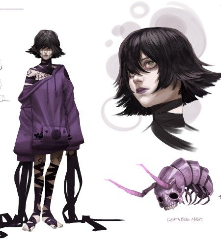
I approached this character design by keeping in mind the 3D form. To this end, the design is largely symmetrical, the colour palette is simple, and there aren’t too many details on the forms. It was attempting to strike a balance between making it efficient to animate whilst not looking too plain. In completing the turnaround, revisions were made to make sure all the forms lined up correctly and in perspective, e.g. the hands and feet. Brent’s explanation of the Photoshop Timeline helped highlight any inconsistencies when the form was seen from multiple directions.


I wanted the character’s walk cycle to be confident without being arrogant (moving with a purpose/sense of direction). I opted for the 3⁄4 walk cycle because it would give me an opportunity to learn how to add a slight rotation. A prop (bindle) was added to give some secondary motion. Easing was important to reinforce the momentum/rhythm and weight of certain parts (eg. The arms swings decelerating at the front and back most poses).
Lip Syncing and Symbols

Lip syncing was one of the skills I wanted to learn most and because I believe it’s one of Flash’s (Adobe Animate) strongest tools. The hardest part was breaking down the dialogue into syllables and where each one is stressed and matching it to the corresponding mouth shape. A cool tip was that because light travels faster than sound, subconsciously it looks more ‘correct’ if the frames are slightly ahead of the sound produced. In terms of emotion, I wanted to add an element of storytelling to the line read by having a contrasting transition from one emotional state to another e.g. angry to sad.
Animating a Scene

I chose the longest sequence because I thought it was the most challenging, and I’d get the most out of it in terms of learning. I found the process of inbetweening less difficult than the process of going from rough to clean animation. I had to redo an entire pass because my rough didn’t match up with the correct model sheet proportions. I think the rough animation can be deceptive because it can hide a lot of errors, which are then exposed at the clean stage.
Creating Your Own Animation Loop

The final project was a group walk cycle. I wanted to build upon the single character walk by adding a cast of characters with different personalities, but all linked by the walk cycle fundamentals taught in week 5. I enjoyed including some basic sound design and background effects to attempt to create a more immersive atmosphere/narrative. The overall task was simplified by keeping all the cycles on a profile view. Brent had already done a great job of explaining and demonstrating how symbols worked, so I made extensive use of them here to keep everything organized, much like Photoshop group folders.

Final Thoughts
The final assignment was the most fun but also the most challenging because it put all the skills learned throughout the course together. The key was trying to create something exciting but also achievable within the deadline.
In terms of tips, I’d advise having a hierarchy/priority list for animating parts of a character. e.g. torso/head-legs-arms-secondary action-details vs tackling everything simultaneously. Also, clean-up always took far longer than expected, so I’d allow the majority of time for that. I found if I kept the idea simple in the rough stage, and got onto the clean-up asap, this helped.
I learned an incredible amount from Brent’s course. His way of explaining tools and techniques, and demonstrating how to solve problems really clicked with me. It has influenced my way of creating work in terms of pipeline, file setup, and layered approaches to building projects.
One of the main skills reinforced during this course was seeing and creating everything through an industry/ TV animation lens, so it was not only more professional-looking, but more efficient to create. Previously I’d spend too much time on planning and not enough on the execution phase. Finally having the learning segmented into targeted, digestible weekly chunks with industry level, personalized feedback vs scattershot learning took my learning further, faster than I ever would have been able to on my own.
Thank you CGMA and Brent!
Instagram: @seijiartwork
Web: www.seijilim.com


