Boarding: Creating a Real-Time Environment in UE4
Shil Bose prepared an extensive breakdown of the UE4 project Boarding made during his studies at CGMA: work with trim sheets, modular elements, and Megascans assets, material and shader setup, GPU lightmass settings, and more.
Introduction
Hi, my name is Shil Bose and I’m a 3D environment artist based in Toronto, Canada.
I’m currently a biomes artist on Far Cry 6 at Ubisoft Toronto, where I’m working with a very talented team to make the vegetation in the game. Previously, I was a hard surface and weapons artist on Starlink: Battle for Atlas. In 2017, I graduated from the Animation program at Seneca College, which was focused heavily on art fundamentals such as figure drawing, storyboarding, and layout/composition, but I chose to major in game art in my final year since I have been in love with video games all my life. Especially in the last decade with how fast game engine technology is evolving, I feel that games have an unparalleled scope for storytelling and artistic expression.
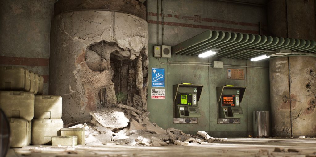
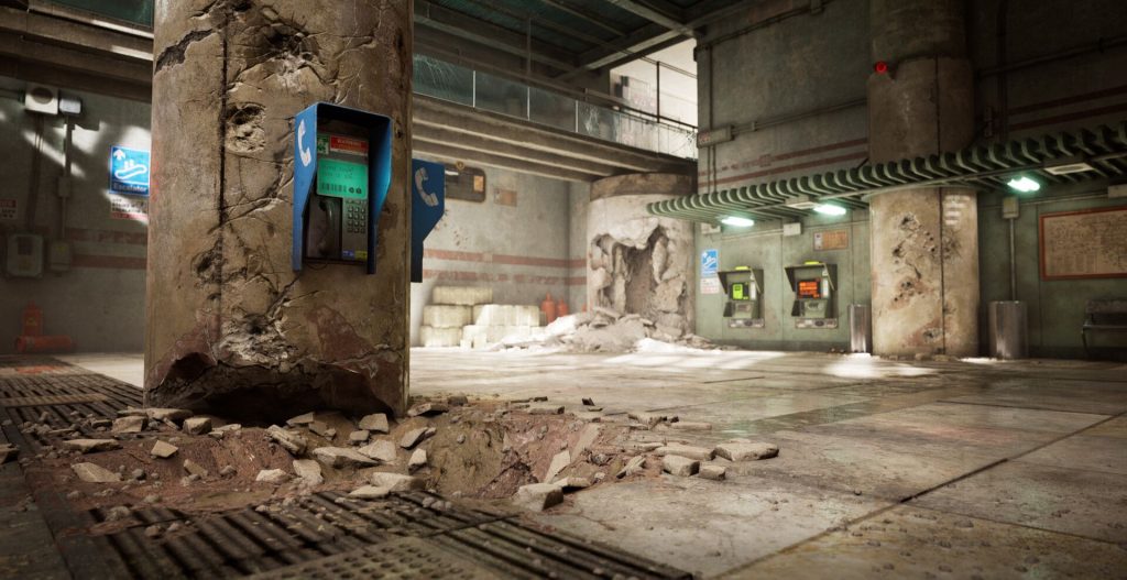
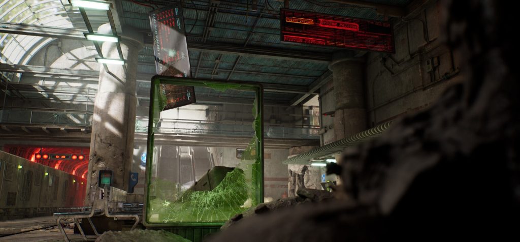
Boarding: Pre-Production/References and Inspiration
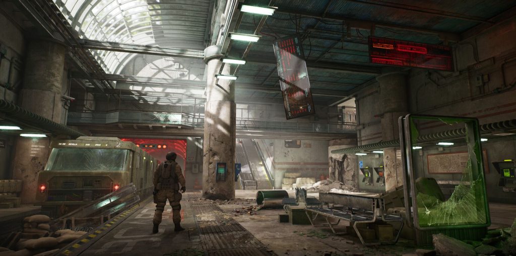
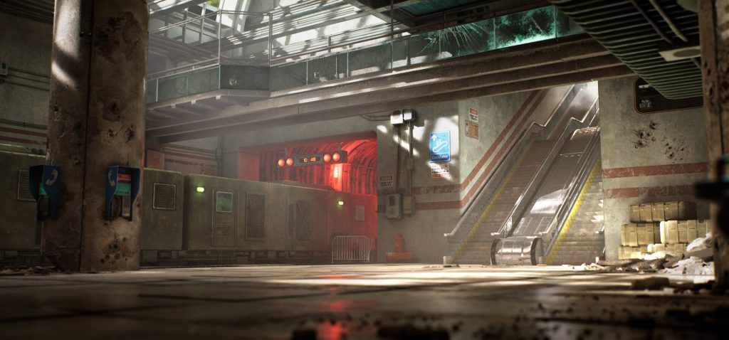
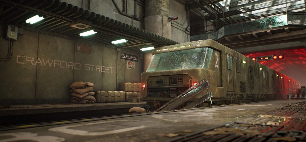
With regard to my scene Boarding, my goal was to build a larger environment with a good balance of macro/micro level detail and a strong cinematic feel. I also wanted it built in a way that is compatible with AAA game production pipeline. This means building with a modular approach, relying heavily on tiling textures/trim sheets, keeping texture sizes reasonable, maintaining texel density, etc. Most of my previous work was with unique baked 0-1 textures which are less useful in larger environments, so Clinton Crumpler’s CGMA course was very useful to me for learning about working efficiently with modular elements and tiling textures. I learned a great deal from him during this project.
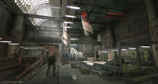
For the concept, I chose the artwork “Boarding” by artist Mike Garn. This piece had everything I was looking for – good composition, a sense of scale, great lighting, while also being perfectly suited for a modular approach.
Since the scene had a lot of damage and destruction, I looked at games that have this kind of environment. Ben Wilson’s work from Wolfenstein: the New Colossus and his GDC talk about their debris/rubble pipeline were excellent references for this.
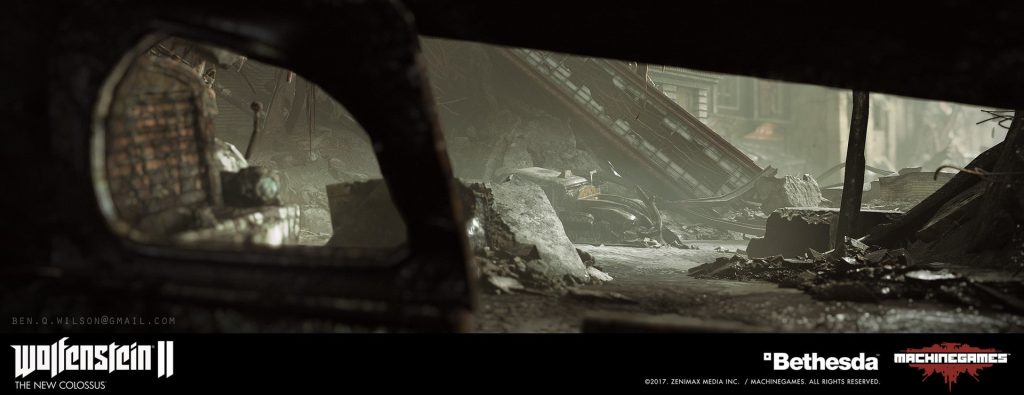
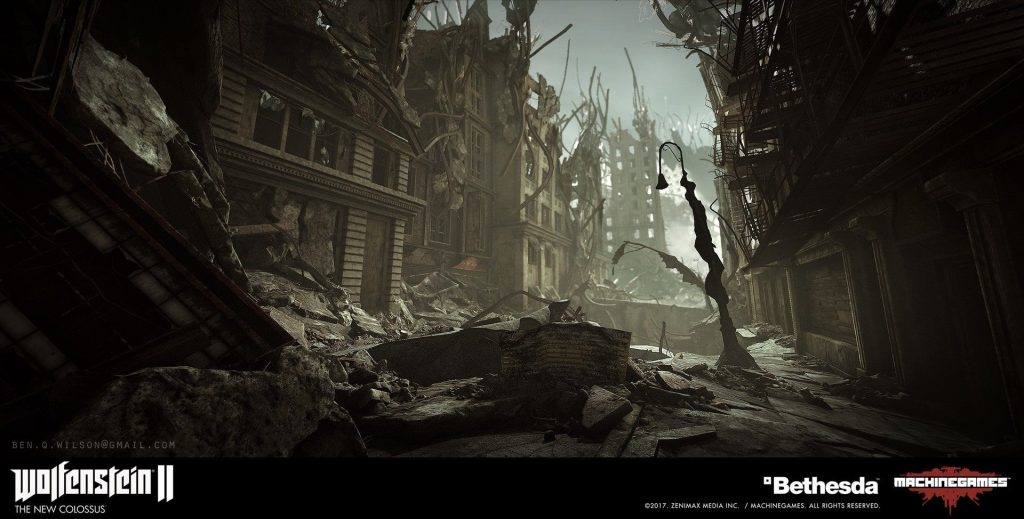
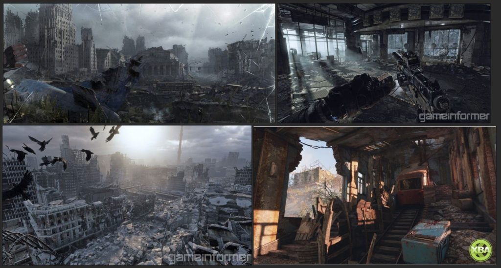
Other great references were Metro: Exodus and the recent Battlefield games since both of these have large scenes of destruction that look very natural.

For the lighting and mood of the scene, I wanted a strong cinematic feel, for which I looked at a few film references. Evanerichards.com is an excellent source for finding these. For example, Dunkirk had some really beautiful lighting and art direction, and these shots demonstrate that cinematic “magic hour” lighting I wanted to achieve.

Some other great references (Bladerunner 2049 and Train to Busan):


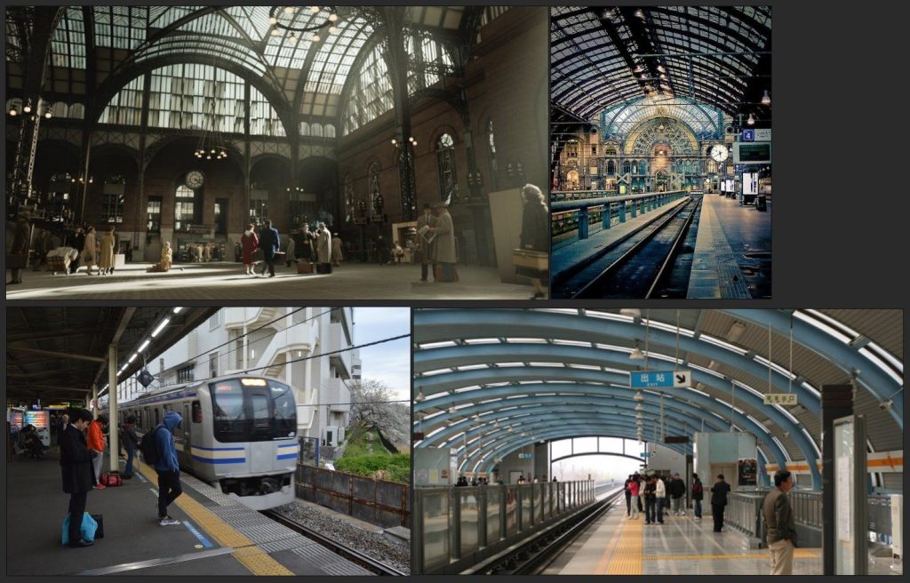
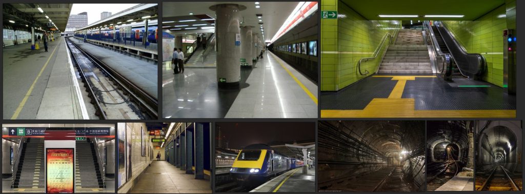
For the structural elements of my scene, it was very helpful to look at photos of train and subway stations. I got a lot of useful reference for the materials from this as well. Pinterest and Flickr are both excellent places to look for photo references like this.
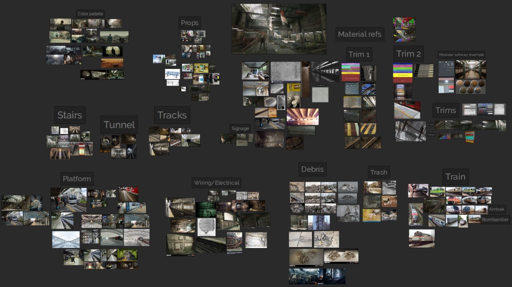
PureRef is a great tool for keeping the references organized and its infinite canvas means I can keep all my refs in one place. It also has the ability to put notes and headings which makes it easy to categorize references.
Production: Blockout
After I picked the concept and gathered a few key references, the first step was to create the blockout. This step is crucial to establish proper scale and proportions in the scene. It is very important to take some time with this because having a solid, well-planned blockout makes life much easier later on in the project. I made a blockout mesh for almost everything in the scene except very small props and smaller debris.
Since this is a modular environment, it was important that all the pieces snap together easily in the engine. To ensure this, the units and grid were set up correctly in 3ds Max to correspond with Unreal Engine units (1 unit = 1 cm) and all the pieces were built on the grid with a pivot location that allows them to be manipulated easily (usually in the bottom right corner).
Another important thing to consider at this point was the size of the structural pieces because too many small pieces are difficult to manage and really big pieces have other issues such as lightmap resolution.
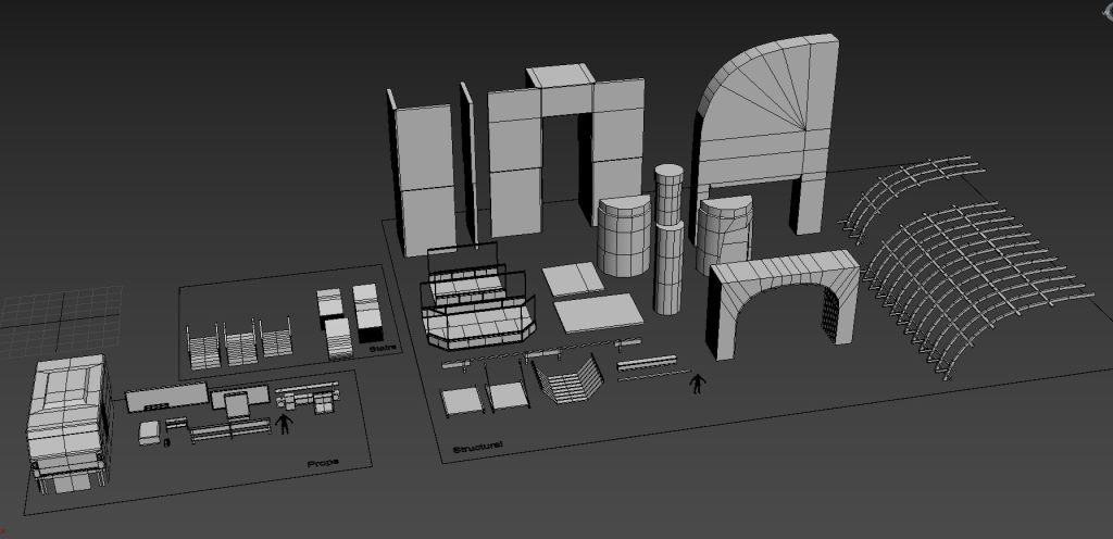
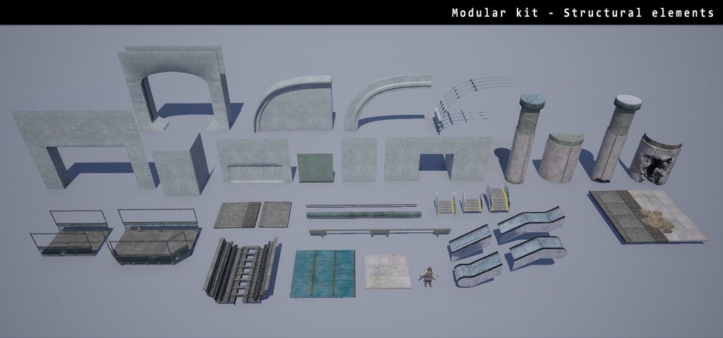
Here are some of the structural elements from my initial blockout. I ended up breaking some of them into smaller pieces later or combining some into bigger chunks, but overall these few pieces make up most of my scene.
As I was building these modular pieces, I would also assemble them inside 3ds Max to ensure I was going in the right direction. Here’s the final assembly of my blockout that I imported into Unreal later. All the pieces are fitted together here and placed on the grid.
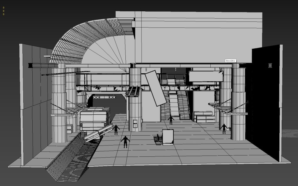
Next, I imported all the modular blockout meshes individually into the Unreal editor and placed them in the level using the blockout assembly from 3ds Max as a guide. At this point, I also established some of the basic lighting to give me an estimate of where the major light sources in the scene will be coming from.
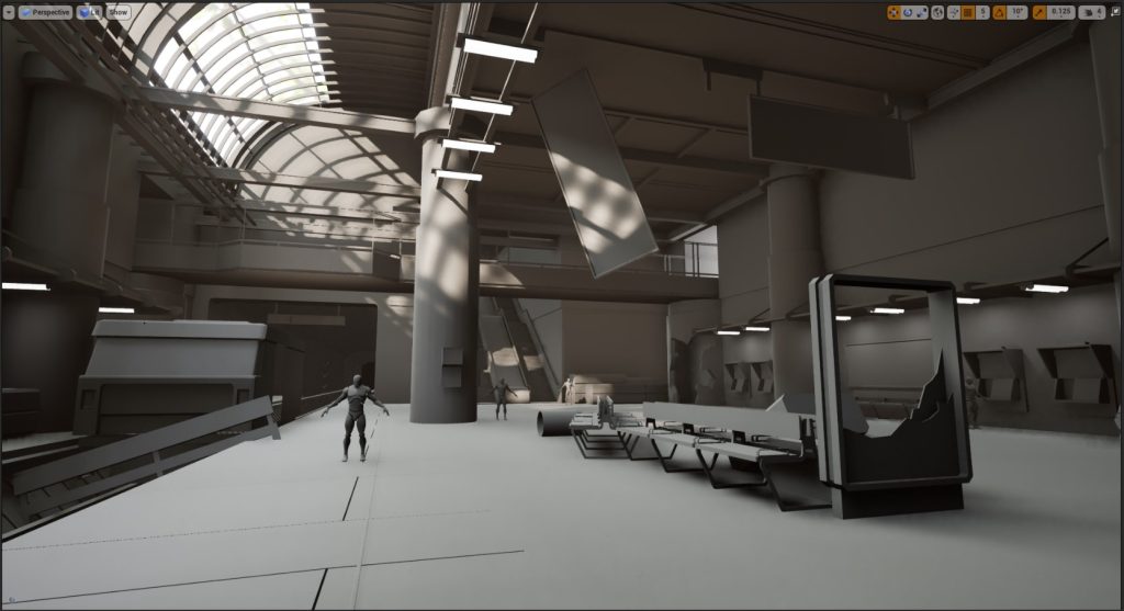
Another thing I found very useful was to bring in some mannequins for scale reference. Dekogon studios has several free models on Cubebrush that I used here.
Planning Textures and Trim Sheets
My first priority was to make the big structural elements like floor, ceiling, pillars, etc. and I started by making tiling textures for these that I could apply to the blockout mesh to visualize it in the editor.
It is also important to figure out what texel density the scene will have so that we know what resolution the textures will be. In my case, I chose to go with 2K texture per 4 meters, which is a density of 512 pixels/m and is commonly used in third person games (Source). It is easy to get tempted to use 4k or 8k textures extensively for personal work, but in actual game production this is not always possible due to limited graphics memory size and disk space restrictions. In my scene, I have used a mixture of 2k, 1k, and 512 textures, with a single 4k texture used for a large destroyed pillar that couldn’t be supported with a smaller texture.
Next, I did some planning on how to break up the different surfaces into tileables, trims, etc. This kept evolving throughout the project, but this was the original planning I did.
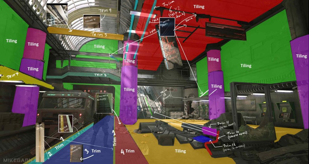
In the end, I had about 9 tiling materials and 2 trim sheets. Most of the tileables were different types of concrete surfaces for the walls, pillars, and platform. Here are some of the concrete materials I used. These were made by mixing a few different Megascans materials in Quixel Mixer. I wanted to keep the base materials clean so that the tiling isn’t too obvious, and then break it up later using vertex painting and decals. These are all 2k textures and tiled a number of times based on the chosen texel density.

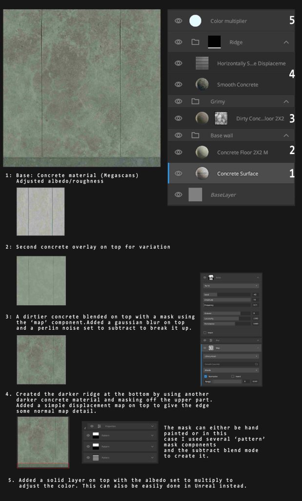
The big advantage of using Mixer is the seamless integration with Megascans bridge and the ability to use the vast library of scans, smart materials, decals, etc. to texture an asset. These tileables made in Mixer are quite simple, here’s a breakdown of one of the wall materials.
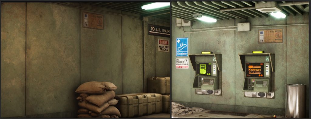
And this is the final result in Unreal with some vertex painting and decals put on top.
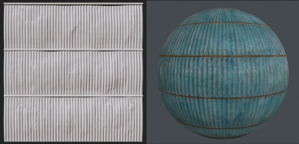
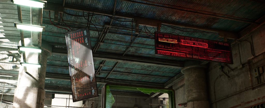
For some of the surfaces, I wasn’t able to get the results I wanted by mixing existing materials, so for these, I did a very quick sculpt in ZBrush, baked it to a plane, and then created the textures in Substance Painter. Here’s the material I used for my ceiling, which was created from a simple ZBrush sculpt.
The next thing to figure out was the trim sheets. These can add a lot of visual detail to the scene without requiring any unique textures and are highly reusable. One of the major things to consider when planning a trim sheet is how wide each trim should be, and this is based on where the trim will be used. Just like tileables, trims also have to maintain the same texel density but these can only be tiled in one direction – so figuring out the width beforehand is important.
It can be difficult to figure out exactly what trims you’ll need right at the beginning, so I started with a few that I knew for sure and left space to add more later.
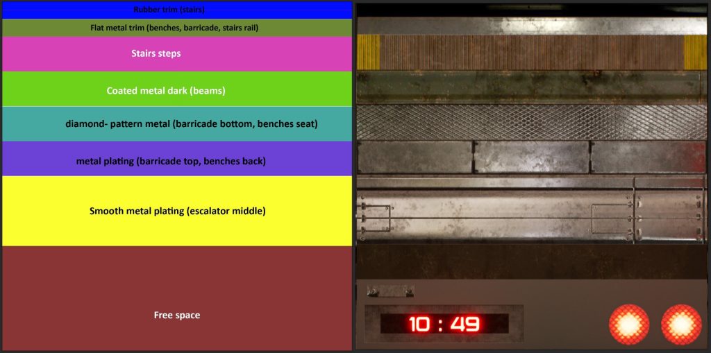
This is one of the 2 trim sheets I used for my scene and the original layout plan for it. I left some free space at the bottom for later, and here I added some specific non-tiling textures for my props. This one trim sheet was incredibly useful, and most of the metallic surfaces, the rafters, benches, stairs, and even some props were made only using this trim sheet and no unique textures.
Modeling Structural Modular Elements
After the initial blockout, I didn’t do a lot of modeling until I had the textures planned out. In fact, many of the smaller props were still graybox models until the final week or two. I tackled the assets in the order of impact they’d have in the scene. This means the big structural elements were the 1st priority, then came the bigger props and pieces that have a major visual impact (e.g.: the shattered glass materials and shader, the large sign boards, etc). However, I left the train for a bit later since it was a complex object, and with something like that it’s easy to get carried away and spend too much time on it.
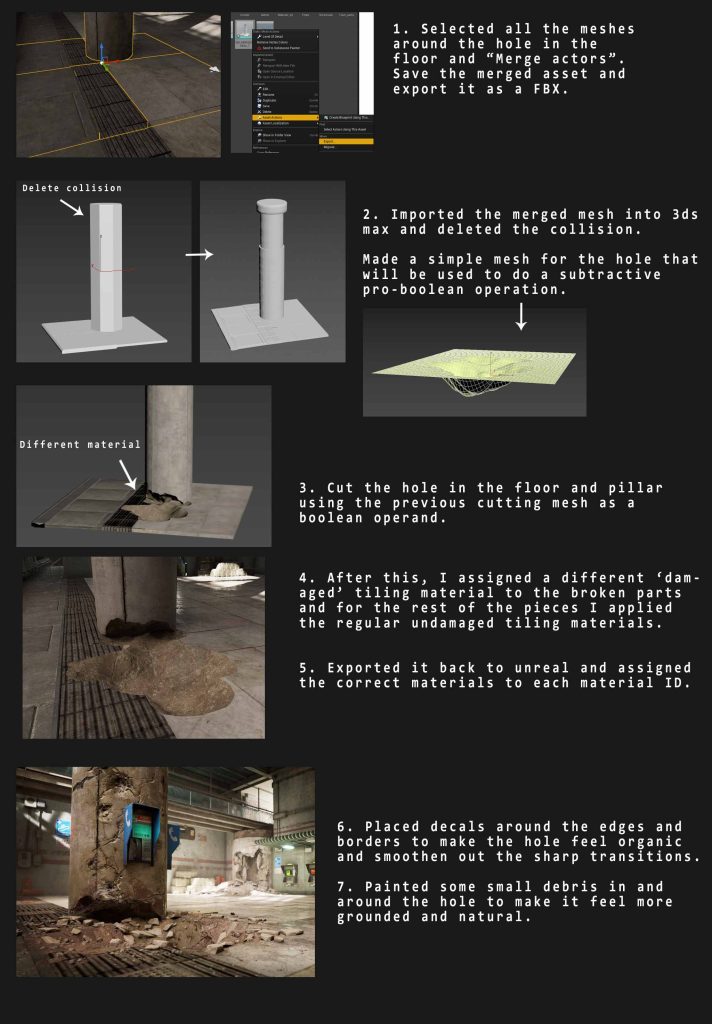
For the structural elements, I started the modeling process once I had some basic textures ready. It was mostly just building on top of the blockout meshes to give them more detail and mapping the UVs correctly to the tiling textures/trims. There were a few elements that were a bit more complex, like this large chunk of the broken floor for example.
Another technique that is very useful while modeling assets using tiling textures is chamfering the edges and using weighted normals. This creates a nice smooth rounded edge that has a similar effect as a baked normal map. This is built into 3ds Max 2021 as the Weighted normals modifier but for older versions, there’s plenty of free scripts that do this.
Here’s an overview of all the modular structures used to build my scene.
Modeling Unique Elements and Props
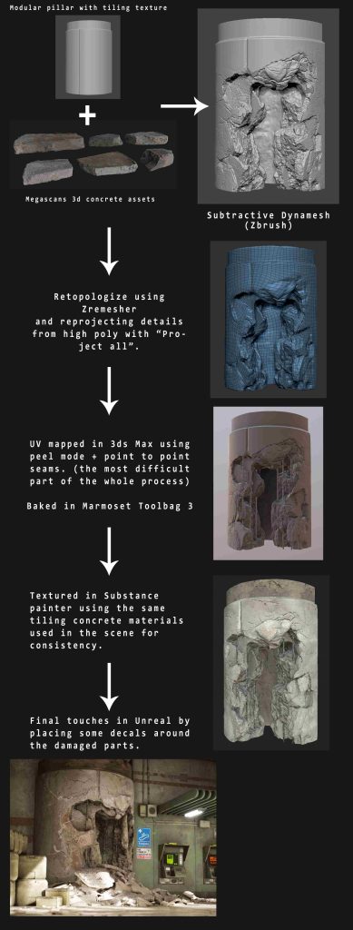
My scene did not require too many unique elements that need custom baked 0-1 textures. But among the few that did, one of the more complex ones was the destroyed pillar. For this and all other props (including the train), I followed a traditional high poly -> low poly workflow. I used Marmoset Toolbag 3 for baking the normal, AO, and curvature maps and then textured them in Substance Painter. For the train, I used multiple 2k texture sets instead of a 4k or 8k texture.
Here I’ve outlined the main steps I used to create the destroyed pillar, which due to its size is actually the only 4k texture I have in my scene (everything else being 2k or lower).
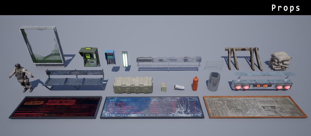
Here are all the props I used in my scene. A few of these are from Megascans with the textures tweaked in Mixer. Some of them like benches, train signal, barricade, etc. don’t have a unique texture and are built using trims only.
Using Megascans Assets
Megascans 3D assets are an incredibly useful resource and make life much easier for 3D artists. However, they are not always optimized to be used directly in a game and need some steps to make them more game-ready. One of my key learnings from this project was how to integrate multiple Megascans assets into my scene without introducing too many different unique textures. There are many reasons to do this –
- For small clutter meshes, trash, debris, etc. this significantly reduces the number of material draw calls required. Draw calls are an important thing to consider while trying to optimize performance and having multiple draw calls for small assets is a big NO!
- I can easily tweak all the textures at once, eg: throwing on some dirt & grime or giving it a certain appearance.
- Having a lot of different materials and sets of texture maps is difficult to manage. Having a single hybrid texture sheet or atlas, with each asset being mapped to a small part of the UV space is a common practice for things such as vegetation, decals, etc.
- A lot of texture memory can be saved by packing multiple Megascans textures into one since the UV packing can be optimized to minimize empty space.
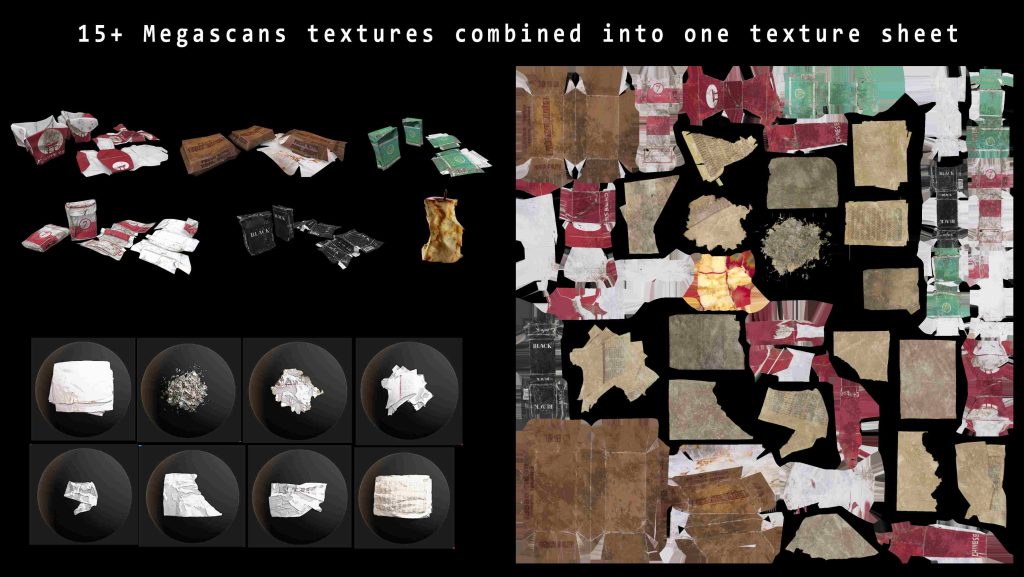
I used this technique for small meshes such as items in the trash and debris, broken glass, etc. The process is relatively simple –
- I brought in all the different assets I wanted to combine into 3ds Max. These would act as the high poly or Source mesh.
- I duplicated them and re-packed all the UV islands into a single 0-1 space. This can be done quickly by throwing on a UVW modifier on all the selected meshes and then doing an auto-pack on the UVs. These meshes with merged UVs would act as low poly or Destination mesh.
- I used Marmoset Toolbag 3 to transfer all the maps from the source to the destination meshes. Marmoset is capable of baking full PBR textures – albedo, roughness, normal maps, etc. from one mesh to another as long as they are in the same world position. The result is the hybrid texture sheet or atlas shown above.
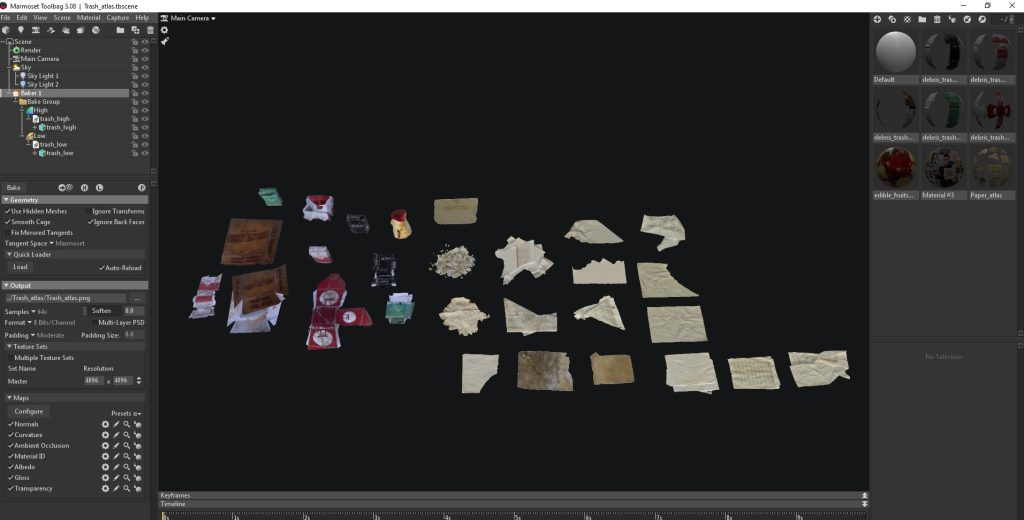
Here’s what the scene setup looks like in Marmoset for baking such an atlas. I have multiple materials set up with the source Megascans textures applied. I’ve turned on all the different maps for baking including albedo, gloss, and transparency (for the paper decals). I like to bake at 4k and then downsample to 2k later for a smoother result.
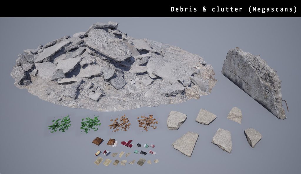
Also, here are some of the debris and clutter meshes I used in my scene. These are all Megascans with multiple textures atlassed into one for small meshes. The larger assets have individual textures that were modified in Mixer by changing color/roughness, adding a dust overlay, etc.
Levels of Quality
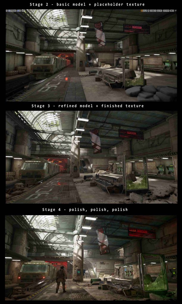
One thing I have found useful in the past and also for this project was to create the assets and textures in stages or levels of quality. I try to bring everything in the scene (except some smaller props) to a certain stage or quality level before I move on to polish specific pieces.
- Stage 1 – Blockout
- Stage 2 – Basic Model With Placeholder Texture
- Stage 3 – Finished Model and Texture, but Not Detailed or Polished
- Stage 4 – Polish
During my project, I went through these stages for all the big elements in my scene in order of importance. So I’d finish the models and basic textures for the structural elements, then do the same for the unique elements, then for props. After this, I’d go back and polish the structural elements first, then the unique elements, props, etc.
I find this very efficient and it keeps me from spending too much time polishing textures in the earlier phases while big parts of the scene are still unfinished. However, it also means that the scene doesn’t really come together until the very end. These screenshots show the progress of my project during the last 3 weeks. This is the time when everything really comes together!
Materials and Shaders
Materials are of course an important part of look development in Unreal Engine. For my project, I ended up with about 5-6 Master materials and one blending material for vertex painting. Most of them were pretty simple, with few adjustments for controlling the albedo tint, normal intensity, roughness, etc.
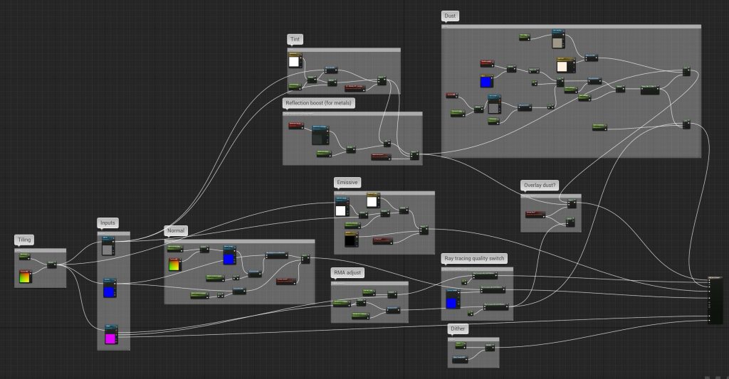
This is one of my main master materials used on all props and some of the structures that don’t require vertex paint. It’s pretty basic, with an option to control the tiling, tint, blend a second normal over the base, add a dust overlay, etc. One extra thing I added was some ray tracing quality switches that make the material cheaper when it is ray traced (e.g. in a ray traced reflection) by flattening the normal, reducing the metallic to 0 and roughness to 1.
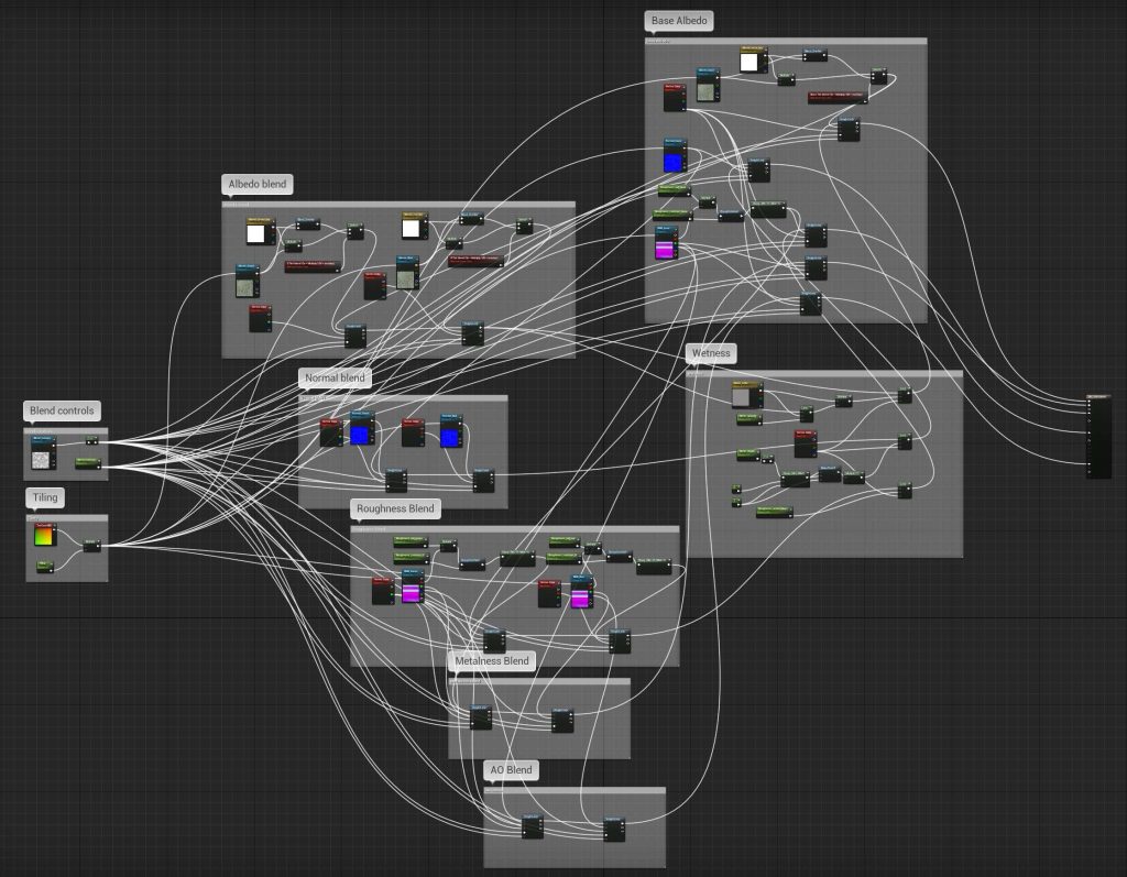
Another example is the blend material I used for vertex painting large surfaces. While this looks complex, it is actually pretty simple and based on the 4-material blend template in UE4 documentation. I didn’t really need to blend 4 materials in any scenario, so for the blue channel, I chose to paint in wetness instead. I’m using a height lerp for everything except the wetness, and instead of using a height map I’m using some blend masks which are just B&W grunge or noise textures.
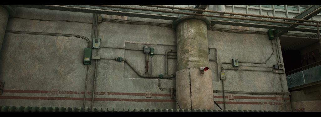
Here’s a screenshot showing how vertex painting can quickly add details to large surfaces, breaking up the repetitiveness of tiling textures.
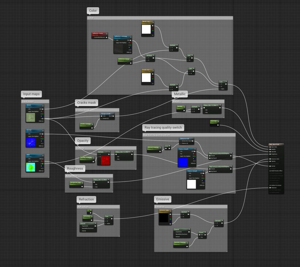
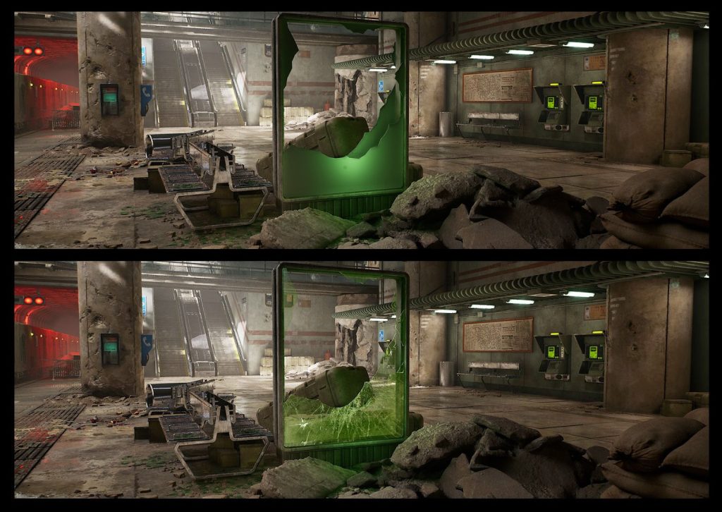
This third example is a glass shader, which is more expensive to render so I used it sparingly. The setup itself is pretty simple. I made a mask for the cracks in Substance Painter that I’m using to drive the opacity and tint of the cracks. I added an emissive and refraction property driven by a Fresnel, which gives a falloff based on camera position and surface normal. Lastly, I also added the same quality switches here to make the ray-traced version of the material cheaper to render. Please note that in the material details panel, the blend mode has to be set to Translucent surface and lighting mode changed to Surface translucency volume in order for this material to render correctly.
The mesh itself is very simple and doesn’t have any baked normal map. I cut out the glass shape on a plane and applied a Shell modifier to give it thickness. Finally, a soft green light placed nearby makes it more believable, since in real life translucent materials absorb some of the energy from light and inject some of its own color into the transmitted light.
Assembling the Scene
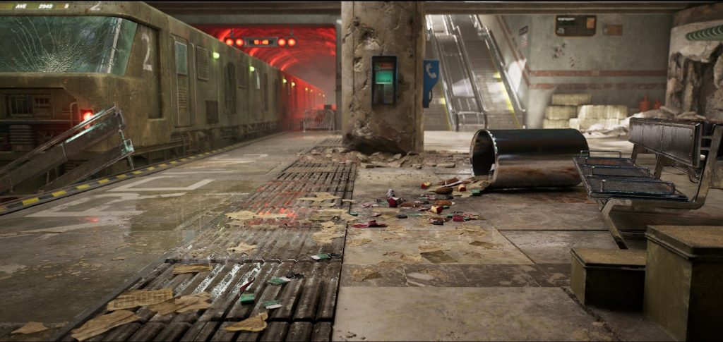
After recreating the modular part of the scene using the blockout mesh as a guide, my main goal was to add interesting detail to the walls, floor, and ceiling since these comprise at least half of the screen space. I started by vertex painting these surfaces to break up the tiling textures.
For adding scatter meshes such as debris, trash, etc. I used the Foliage tool in Unreal. By tweaking the density, min and max scale, distance between meshes, etc. we can quickly scatter a lot of clutter around. The position, rotation, scale, etc. are randomized so it can add a lot of variation quickly without needing to hand place each mesh, and the distribution looks natural.
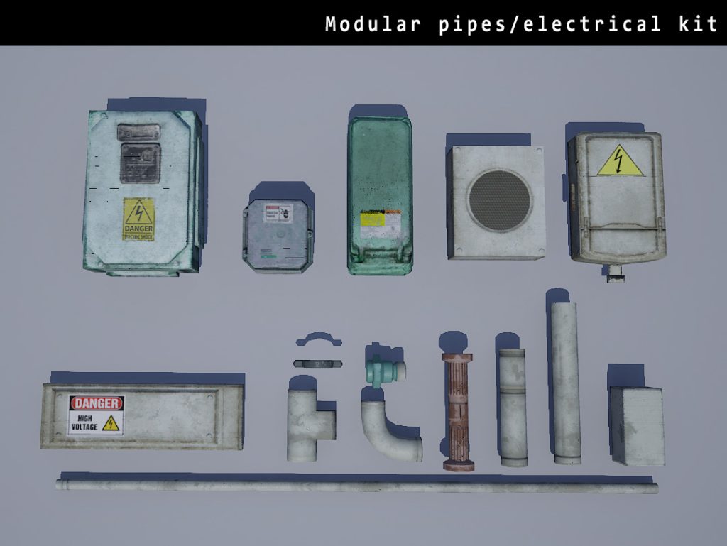
To add details to the walls and ceiling, I created a modular set of pipes and electrical boxes.
Some of these are Megascans and I’ve used the atlassing technique here again to pack them all on one texture sheet. Hand placing the pipes and wires turned out to be quite a challenge, and after struggling with this a while I ended up using splines and a blueprint to place the meshes along the splines. The boxes however had to be hand placed, since my blueprinting knowledge is not advanced enough to do this using code.
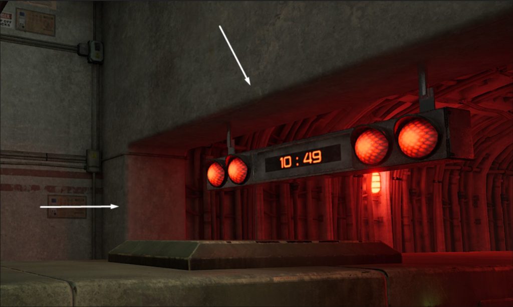
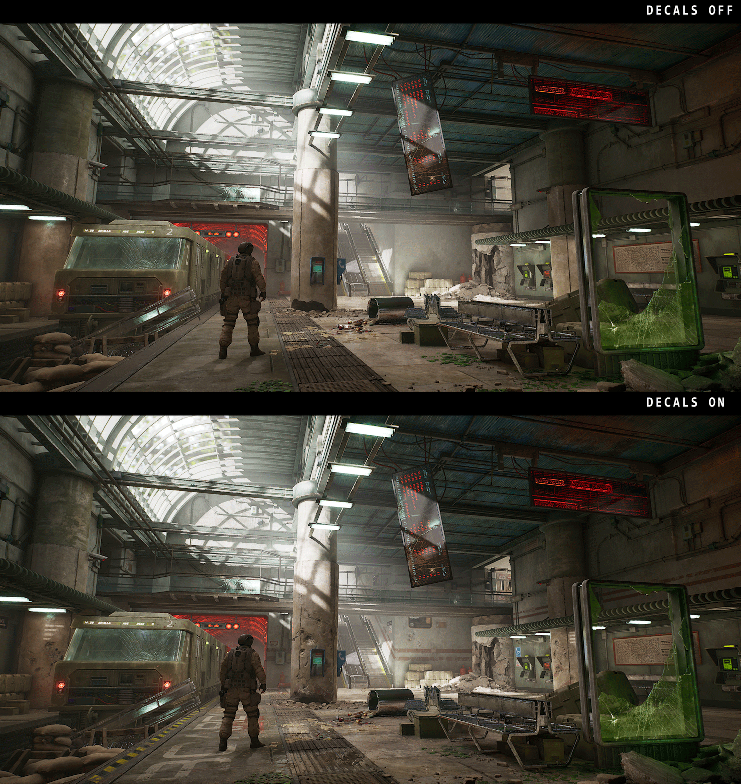
The final touch for adding detail to the scene were decals. I used a combination of dbuffer deferred decals and mesh decals – these are built as part of the mesh but uses a transparent material, and are useful for adding edge details and damage to tiling surfaces.
A huge part of the surface damage, bullet holes, cracks, etc. came from a combination of Megascans and marketplace decals – these use an albedo, opacity, and normal map. The signs, notices, and warnings on the walls are custom-made decals created in Substance Painter. Finally, I have some large grunge decals for the walls/floor/ceiling that are just a B&W alpha mask with the tint controlled from the material properties. Decals have an enormous visual impact on the scene while having little impact on the framerate. They do add to the texture memory, however, so it is better to have a small number of these that are versatile and have a lot of reusability. Here’s my scene with decals turned off/on.
Lighting and Post-Process
Lighting is a great artistic/storytelling tool that can emphasize certain parts of the scene and guide the viewer’s eye. It can also set the tone/mood for the scene quite heavily. I wanted to achieve the warm dull lighting often seen in wartime films, with accents of color to emphasize certain spots. For this, I used a mixture of real-time ray tracing and baked lighting. Just like my assets, I created the lighting in stages – blockout, basic, refined, polished.
For light sources, I have a stationary directional light and skylight along with an emissive skybox set to a bright midday sky HDR. Because the skybox is so bright, the skylight intensity is set very low so it doesn’t wash out the scene. To emphasize the sunlight coming in through certain openings, I also placed some spotlights there. Because most of the scene is just dull concrete surfaces with muted colors, I put vibrant red lights in the tunnel to add some much-needed contrast. I also placed some extra lights near the larger emissive surfaces to enhance the effect.
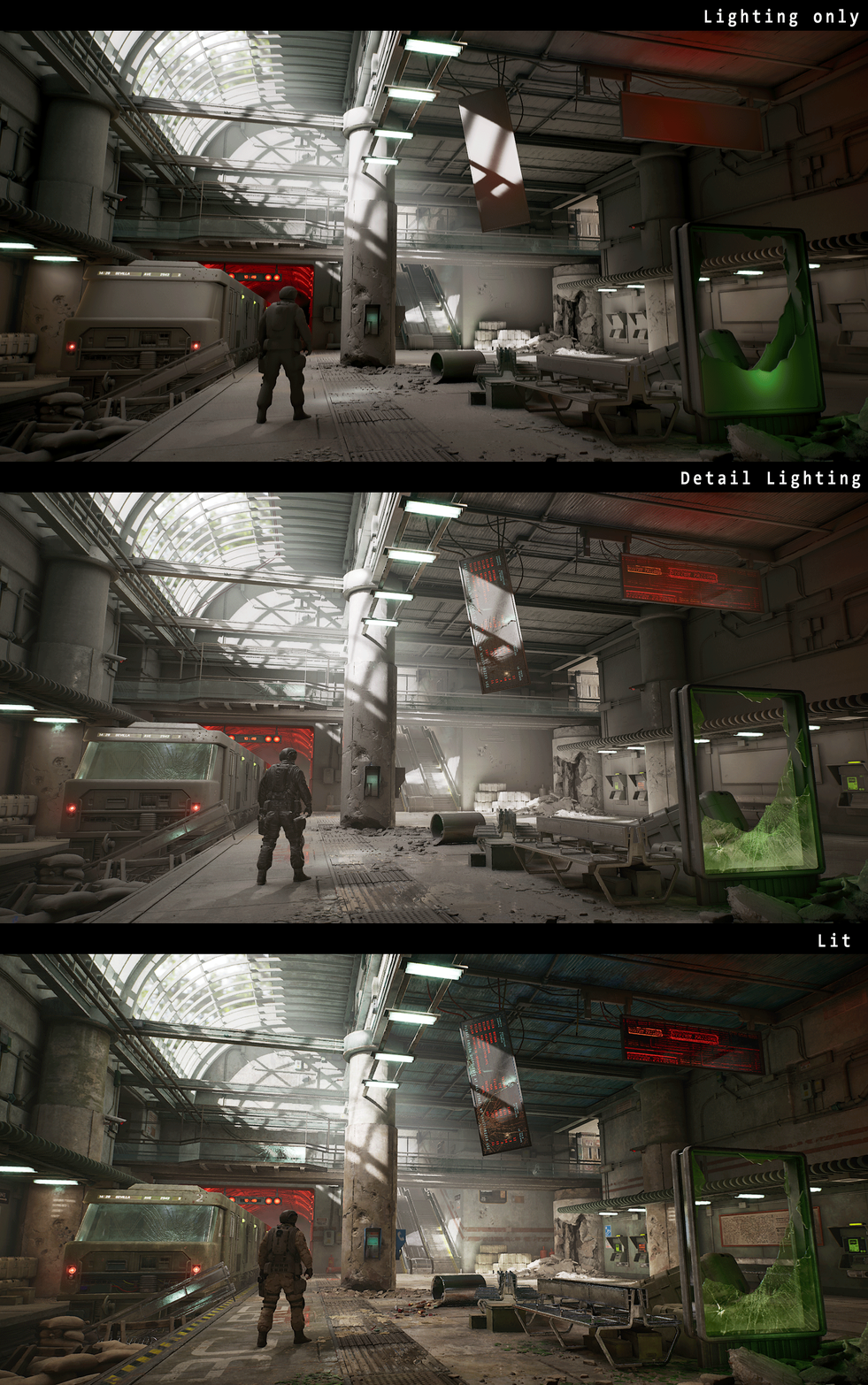
Since my scene is indoors, it needed a lot of indirect bounced lighting or global illumination (GI). I tried several different approaches for this, such as Screen space GI, Ray traced GI, and lightmass baked GI. In the end, I found lightmass to give the best results and performance. Ray traced GI looks great but it absolutely destroyed my framerate. Screen space GI was faster but didn’t feel completely natural. I’ve shown the results I got with different types of GI in this gif here.
For baking lightmaps, I used Luoshuang’s GPULightmass plugin. This allows the GPU to be used for running Lightmass instead of CPU. Since I don’t have a very fast CPU, switching to GPU based baking increased baking speed a lot. However, using this plugin also disables most of the lightmass settings inside Unreal and also the light build quality (preview, medium, high, production) has no effect now. The only lightmass setting that works is the Num Indirect Lighting bounces, which I set at 50 for the final bake.
Instead, to increase the quality of GPU lightmass bake, it has to be set in a config file as an engine variable. All this is explained in Luoshuang’s thread in UE4 forums which I linked above.
Lightmap resolution and Min Lightmap resolution are still very important for getting a good quality bake, this has to be set for all static meshes according to their size.
One last thing about baked lighting I wanted to mention was the Indirect Lighting Intensity. As can be seen in the gif above, this setting makes a big difference to the amount of bounced lighting. This has to be set individually for each light source. After baking, the amount of indirect lighting can also be tweaked in the Global Illumination part of the Post-process volume.
An Exponential height fog is very useful to give a volumetric effect to the light shafts. It’s best to keep it at a very low value (0.01-0.025 range worked best for me). The volumetric scattering intensity can be controlled for each light individually as well. I also used the godray and fog sheet blueprints from the Particle Effects project which is free on the UE4 marketplace.
Post-process is an equally important part for that final look development. Just like the lighting setup, this can drastically alter the overall mood of the scene. Unreal has a default post-process always in effect, which can be overridden by adding a Post-process volume or by tweaking the post-process settings in the Camera and CineCamera actors. Here are some examples of how post-process effects such as bloom, exposure, depth of field, etc. and color grading can hugely affect the final look.
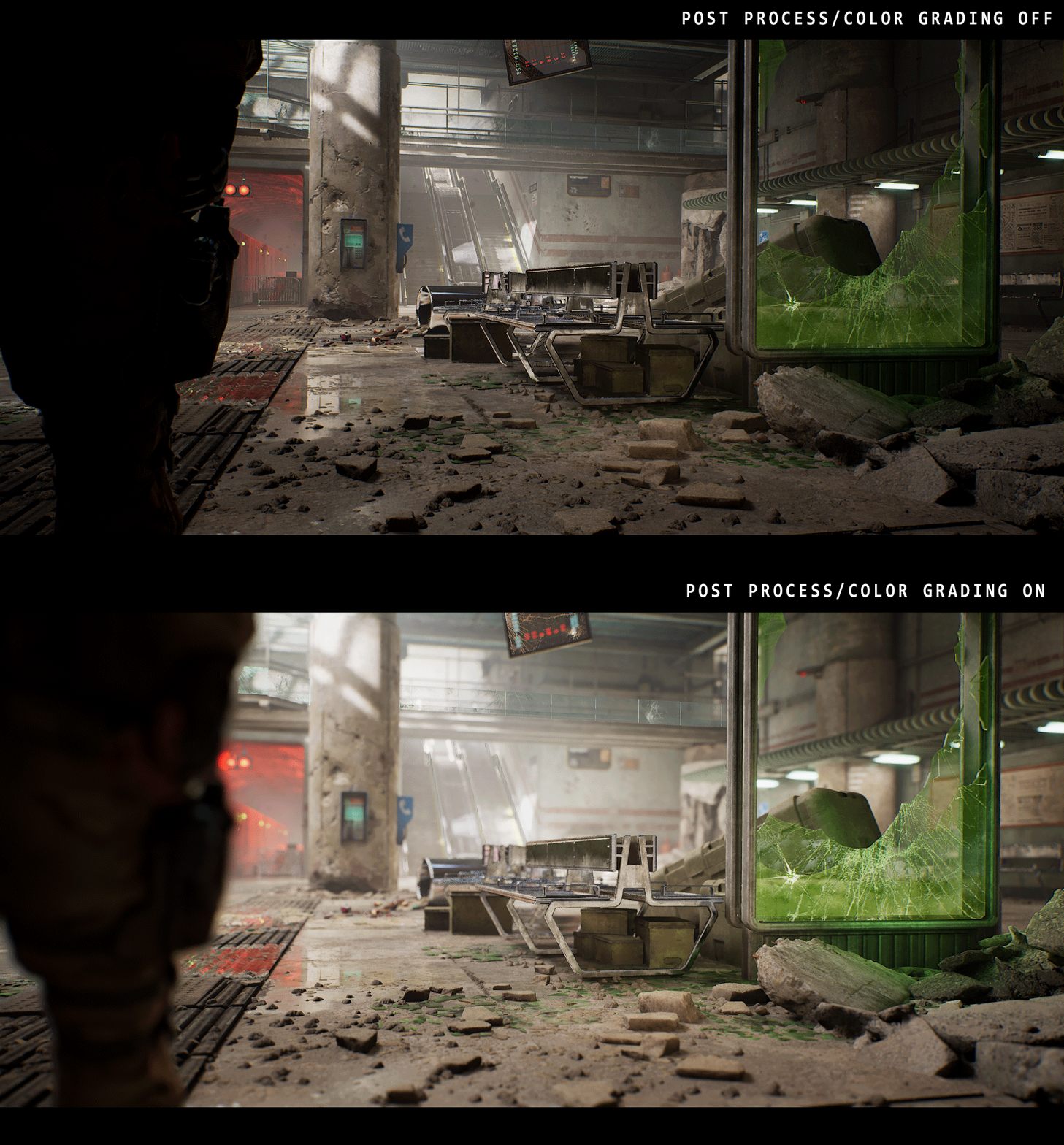
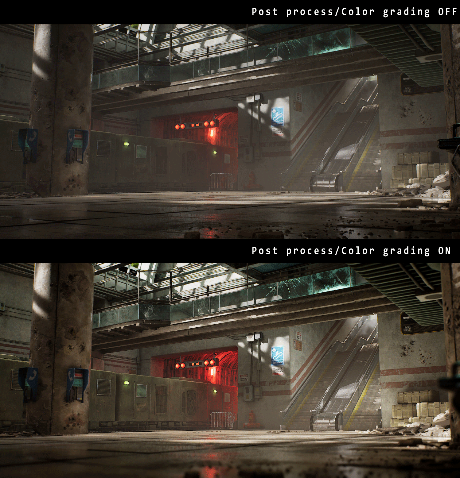
Other post-process effects like chromatic aberration, lens flares, and vignetting are all very useful, but I found that these worked best when kept very subtle since overdoing them makes the scene look very unnatural.
The new Color Grading tools in Unreal are awesome – it allows us to tweak the contrast, saturation, gamma, etc. for shadows, highlights, midtones individually, add a consistent color gain in each of these regions and even has settings to tweak the transitions between highlights->midtones->shadows. Unlike in previous projects where I did this step in Photoshop and imported it as a Post-process LUT (lookup table), this time I did all the color grading in the Post-process volume and camera settings. Joe Garth’s tutorial from the Quixel Rebirth scene was very useful for learning about this color grading system.
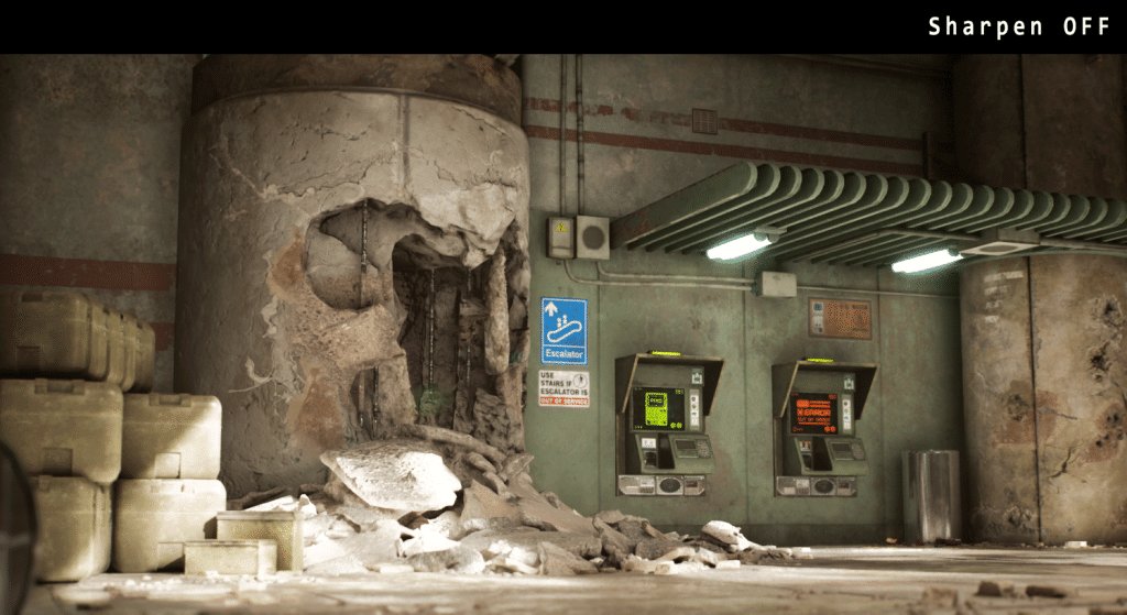
Finally, the tonemapper section of the Post-process is another setting that can be used to tweak the final look of the image. The Slope and Toe settings in particular are useful for adjusting the curves of the bright and dark regions of the image. The tonemapper also has a sharpening feature that currently has to be enabled by a console command r.tonemapper.Sharpen. I found this very useful when used at a lower value and can make the image nice and crisp.
Composition and Camera
One of the things I found most helpful in this project was to decide early what my main compositions will be and plan everything around that. For the main shot, I had the concept to work from which definitely helped a lot. For the other secondary shots, the main goal was to have an interesting composition with a distinct foreground, middle ground, and background. A common mistake while building a scene is to put too much detail everywhere, and I feel like it’s important to have some empty space as well. It is similar to the concept of negative space in a painting or photograph, this space helps guide the viewer’s eye to the focal points of the composition. Having too much detail spread uniformly can be visually confusing. Sometimes less is more!

Lastly, the Camera and CineCamera in Unreal are amazing tools for creating the final image. This was actually my first time trying out the CineCamera actor and I must say it’s very impressive. It works very much like a real-world film camera and all the settings can be a bit intimidating at first, but there are some excellent videos put out by the Unreal Engine team that explain all the camera properties in detail. Here I’ve tried to summarize what I learned using an image from the UE4 documentation.
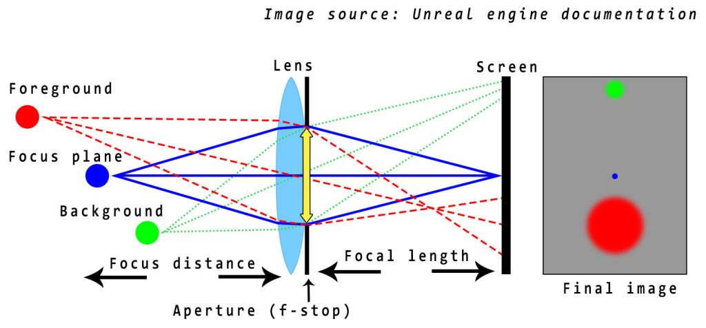
The main things to note are the aperture, focal length, and focus distance of the camera. The aperture is the diameter of the hole through which light enters the camera after being refracted by the lens, and its size controls how much light is entering the camera. The focal length determines the field of view (FOV) of the camera. Focus distance is how far the object in focus is away from the lens. In the CineCamera actor, a smaller aperture along with a short focus distance creates a stronger depth of field effect, where the objects outside the focus plane appear blurrier. This can be seen in the viewport by Visualize -> Depth of field layers, where the in-focus object appears dark gray, foreground is green and background is blue.
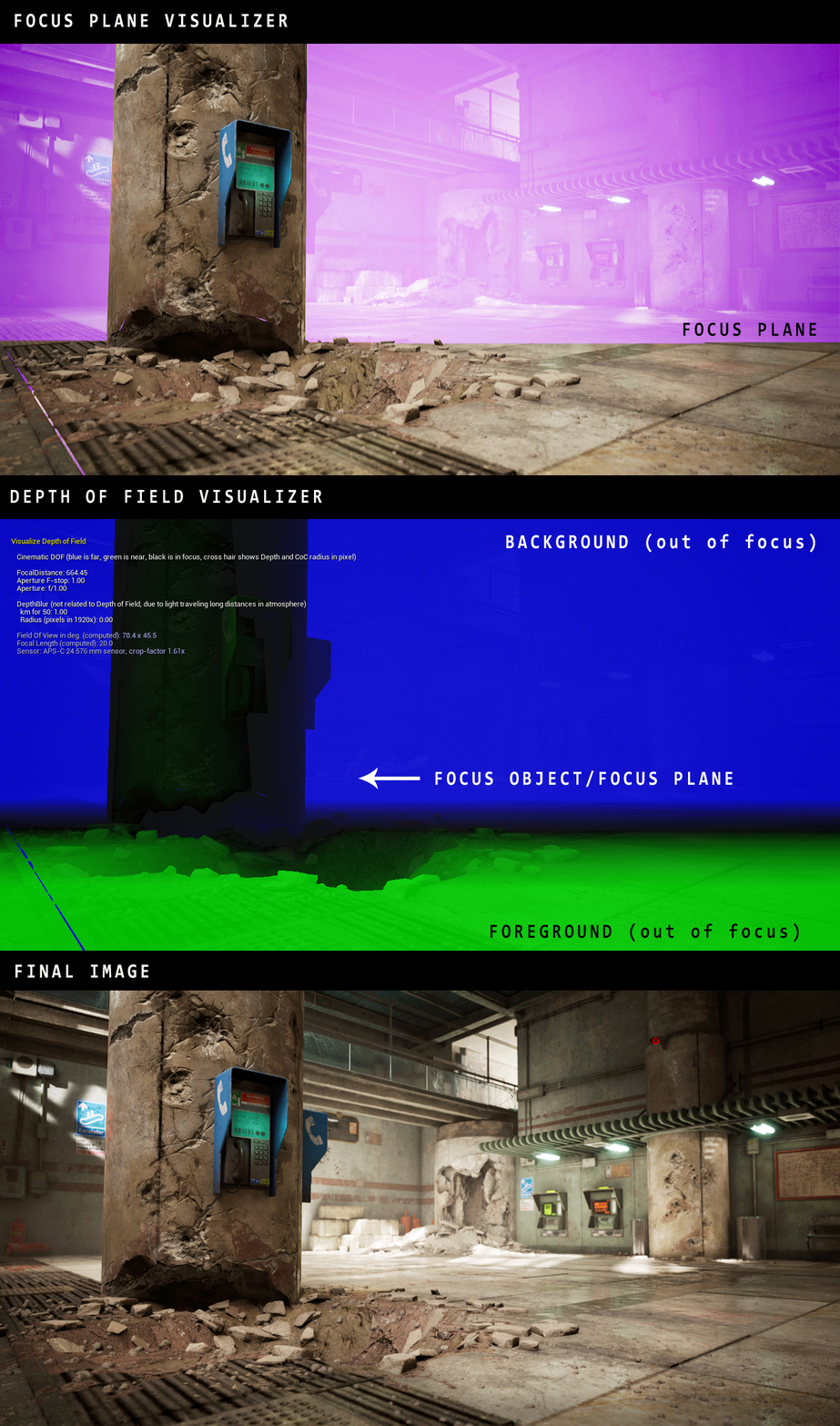
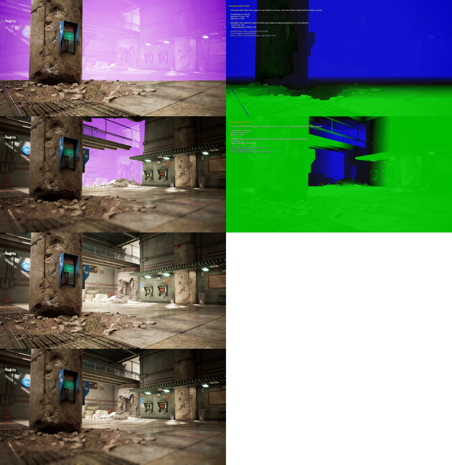
Please note that if the in-focus object is far away from the camera (larger focus distance), the aperture has to be smaller by an equal proportion to get the same depth of field effect. Also, every time the aperture is adjusted this will affect the exposure of the image, and this has to be adjusted accordingly by tweaking the ISO property or Exposure compensation in the post-process settings of the camera. For people wanting to dive deeper into this, Unreal Engine has a lengthy Cinematic depth of field training video.
Here I’ve tried to demonstrate how shifting the focus plane further back affects the depth of field of the image. This is achieved by lowering the aperture and increasing the focal distance while keeping the same focal length. The extra light entering the camera is compensated by reducing the ISO.
Conclusion, Challenges, and Lessons Learned
This project has been a huge learning experience for me, and it really pushed me out of my comfort zone. This was where having an experienced mentor like Clinton Crumpler really helped. His feedback and guidance proved very useful, and when I’d get stuck on some technical issues he’d help me out to the best of his ability. This was the first time in a personal project where I moved away from using a lot of unique assets and shifted heavily into using tileables, trims, and decals – this shift was certainly made easier by doing his course. However in the end, what you get out of it depends on how much effort you’re willing to put in.
I’d say the biggest challenge for this project and in past projects was to have the perseverance to take something from start to finish. For most artists working full time, this is the biggest obstacle, and a lot of times we start something with great enthusiasm but then lose the motivation to finish it. There were periods when it would get very hectic balancing work and during these times even to find 2-3 hours of free time in a day was a challenge. I’d say this is another area where having that extra accountability of showing weekly progress to a mentor helped push myself to be more productive. The entire project took 10 weeks from concept to finish.
One of the biggest lessons I learned from this project was how to get a natural and organic looking environment without relying on unique assets. Whereas unique assets might look cool and more interesting, often in an actual game production modular workflows are far more useful. I think it’s important to know how to do both, and to achieve the same kind of look using both workflows. This was my main learning goal and I definitely feel more confident now with a modular reusable workflow. Some of the other things I learned are how to use Megascans resources effectively without blowing up the texture or disk space budget. I also learned a lot of the technical aspects of Unreal Engine such as the new ray tracing features, cinematic camera, etc.
There is still a lot more to learn, however, and there are many things about this project that I think could’ve been handled better. Optimization is definitely one of the biggest things I’d want to improve, especially when it comes to real-time ray tracing. Currently, the scene runs at around 25-30 fps on an RTX 2070 which is not the best framerate. Also, since I was heavily focused on a few compositions and polishing around those, some other parts of the level lack polish – which ideally I’d have liked to bring everything to a similar level of quality. But just like with any art, it’s never truly finished and there’s always room to improve. One of the things I’m currently working on is to collaborate with a friend of mine who’s an excellent animator to create a short cinematic sequence using Unreal’s sequencer tools. There’s a major trend in the industry towards using Unreal for film, and this is definitely one area I’m excited to explore.
On a closing note, I’d like to thank Clinton Crumpler for his mentorship and support throughout the project. I’m also grateful to my friends Rudy Lamotte, Cat Yang, and Rahim Rahimi for their valuable feedback. And of course huge thanks to 80 Level for giving me the opportunity to talk about my project!
If you liked my work, please check out my Artstation and other socials linked below.
I’m always eager to connect with other people with a passion for Video Games and Art!


