Minimalistic Scenes in UE4
Vladimir Lepotic was kind enough to share a detailed breakdown of his Beton scene in UE4, providing tons of tricks on setting up the final look with lighting and additional effects.
Introduction
Hello, good people of 80 level. I am Vladimir Lepotic, a 3D Artist from Serbia.
The path that led me to my current position of 3D artist was a mixture of different interests and searching for the right one, which, I believe, I found. That mix was also beneficial to me because I learned different skills from different areas and trained my eye to understand things from various points of view.
I studied architecture at the University of Belgrade. After college, I worked as a graphic designer for Fnatic, one of the biggest names in competitive gaming. At that time I also knew a couple of things about 3D so I got the opportunity to work on my first 3D model for the game. I worked with my friend and colleague on the “hero set” for the Dota 2 which was imported into a game. Afterward, I was totally into 3D and gaming industry in general and started to pave my path in that direction. Since then I worked as a 3D artist for a couple of other independent studios and contract projects and recently started to work at Art Bully studio here in Belgrade.
The Project
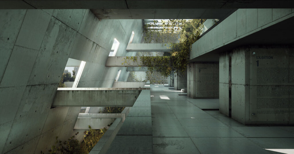
The main idea was to apply the concept “less is more” to the project. My starting point was to think about the kind of emotion I would like to get. I also wanted to test myself and my current knowledge of UE4. This scene wasn’t so demanding from the modeling point of view, therefore it was a perfect choice for the task.
The inspiration for all of that came when I was looking for some architecture projects and stumbled upon a project by Quang Le and Lien Hoang Phuong.
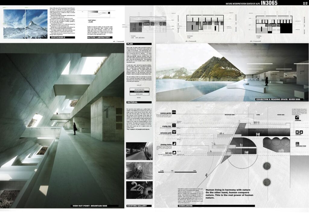
It was a very clear and strong concept and their project was a winner of INNATUR 3 propose fresh ideas of blending architecture and nature. I realized that I wanted to make a similar thing in UE4 and bring that scene to life with some extra touch and few ideas of my own, of course, to make it look more abandoned or maybe even post-apocalyptic.
The idea behind this project was to make the scene that is simple from a modeling point of view but also readable and a good base to make most out of the lighting.
Production
The first stage was to make the modular cubes (walls) and to block out the scene. I pretty much used only one mesh cube for the blockout phase so that part wasn’t so time-consuming.
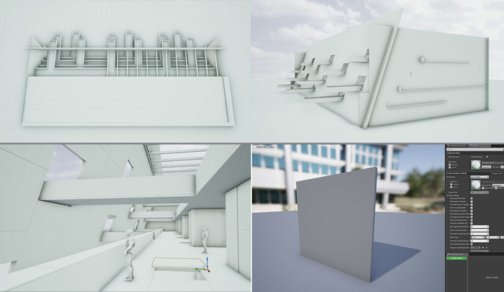
BLOCKOUT OF THE SCENE
At that stage, I used textures that were still WIP just to have some rough impresion of how things work together. After that, I added a couple of decals in the building for the labels. I also placed directional lights to have some starting point and something to work with.
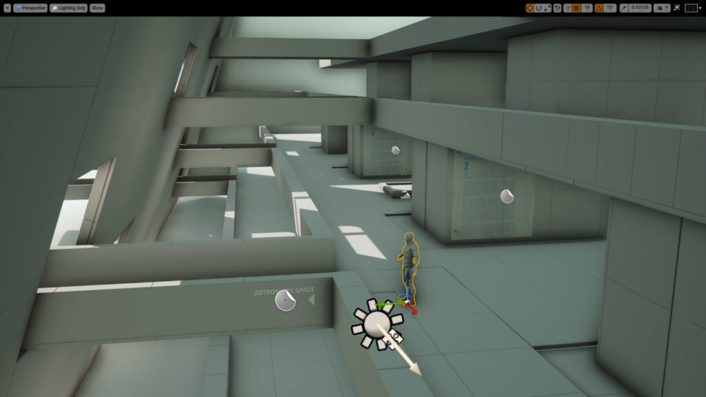
BASE LIGHTING OF THE SCENE
Texturing for this scene was pretty simple since it’s mostly about concrete. So it was about making good tileable textures of concrete. I used images from the internet and Substance Painter for extra touches. After that, I made 2 or 3 variations so I can use it for vertex painting in UE4. Also, the texturing is one of the most important aspects of any scene because small tweaks define a realistic look. I always pay attention here and tilt the sliders until I am satisfied with the results.
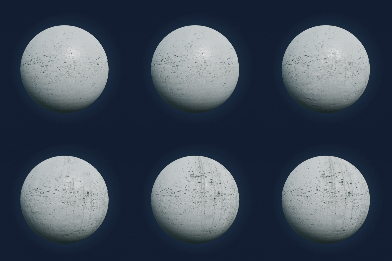
MINIMALISTIC LOOK
The key thing when working with minimalistic scenes is to make the most of what you have. Generally, you are overexposed when you are working with minimalistic stuff (that is also noticeable in graphic design, for example) and you just can’t hide things. In an overcrowded scene, you can hide some stuff that doesn’t really work, because the eyes are overwhelmed by all the information. When you work with minimalistic scenes it is even more important that things just work together as they should. The important part for any scene, for minimalistic especially, is lightning. It can elevate the scene up to the next level or totally ruin it.
Therefore, I would suggest paying extra attention to it, because if there are no interesting assets, lightning turns out to be of the highest importance. It sets the atmosphere of the whole scenario and brings it to life.
Foliage
Next part I was working on was the foliage. For the lianas, I used one texture atlas from the Megascans library. For the foliage placement, I used UE4 tool and tweaked some details.
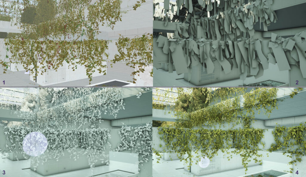
FOLIAGE PLACEMENT
Another important part of making a good-looking foliage was to set up materials properly, and by that I mean to add parameters for the color variation, subsampling, and wind movement. It is all about subtle touches but it makes the final model look more realistic.
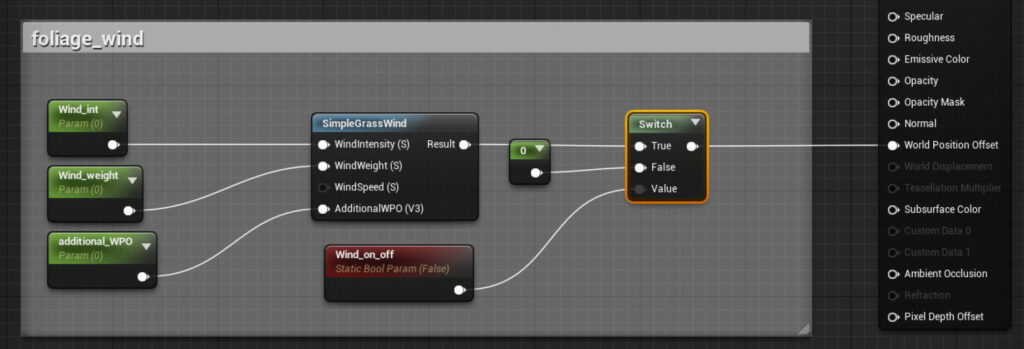
FOLIAGE MOVEMENT PARAMETERS
One trick that helps make foliage look better and more realistic is to pump a bit the intensity of a normal map. To do that, we have to make a 3vector with AppendVector and use the intensity control for only Red and Green channels and set the Blue one to 1.
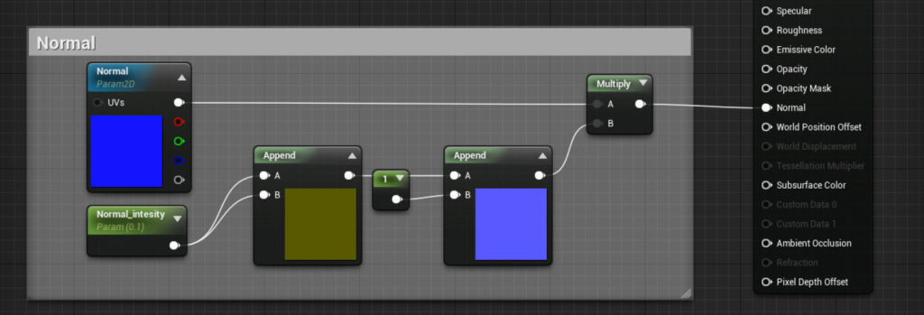
Normal map parameters
Adjustments
There is no big secret here, just tweaking and testing until the results look good. I have to add that even if I always tend to stay with the “game-ready” scene as much as possible, for this particular one it would still need work and optimisation to really be one and to drop FPS to more enjoyable levels for a player. Hence, I went for the more cinematic approach with this scene.
For the scene lighting, I used dynamic lights to speed up the process (movable lights in UE4) so there wasn’t any light-bake involved. I decided to choose one directional light. Beside directional light, I also used sky light, reflection capture spheres, and exponential height fog.
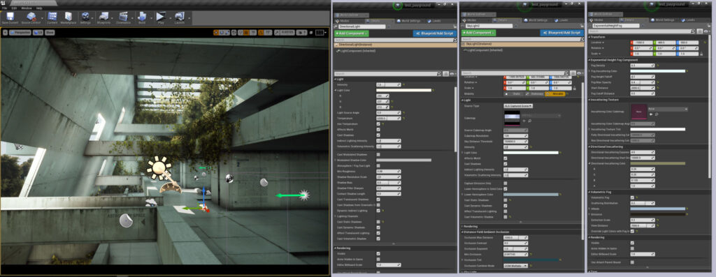
SOME OF THE SETTINGS AND PARAMETERS FOR THE SCENE
Also, I turned on “generate mesh distance fields” in UE4 “project settings” to boost up the shadows. It really helps to ground everything together and to boost the scene and make it more believable. It is necessary to restart the project before the effect appears.
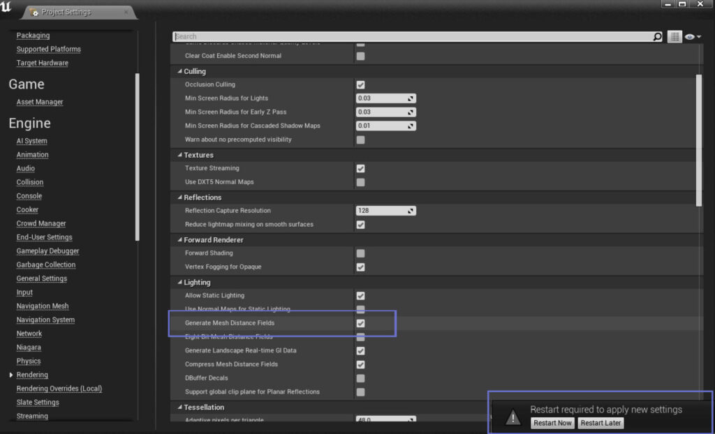
MESH DISTANCE FIELDS
Since the whole project was kind of a playground to test different things, I tried “Light propagation volumes” or LPV. To enable the feature, the command “r.LightPropagationVolume = 1” has to be put in “ConsoleVariables.ini” file because it can’t be changed at runtime. The file is located in Program Files\Epic Games\UE_”version”\Engine\Config and again the engine has to be restarted to see the effect. It is a bit tricky to get good results with it and I didn’t feel like I have much of a control over it, which is understandable since LPV is an experimental feature in UE4. From my experience, it is more of random tries and errors until you get something that looks good. Nevertheless, it can give you that additional boost for the lighting and occlusion of the scene. I would say it is more like a cherry on top of the cake and it can easily go without it. Here is a more in-depth explanation of LPV in UE4 documentation.
Also, there are some things that I really wanted to be visible but it just couldn’t be achieved with only one directional light. By that, I mean visible rays that come through windows and bounce a little bit on the surface border of the hole. That was the main challenge and finally, I decided to fake that effect with spot and point lights placed outside of the windows to boost the lighting coming through them.
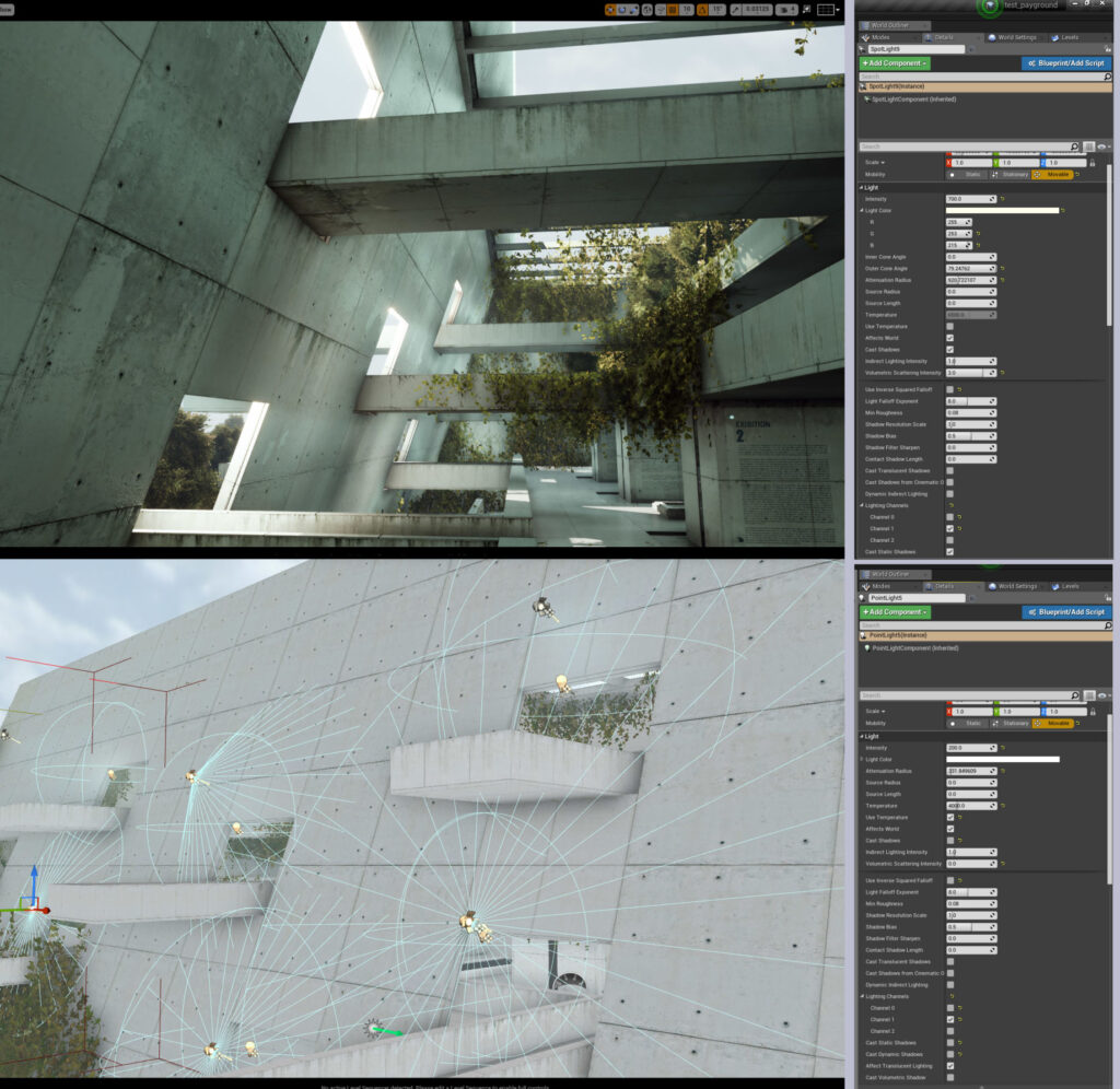
SETTINGS FOR THE SPOT AND POINT LIGHTS
An important thing for the spot-light is to set the outer cone angle to larger numbers to be less focused and to get more light scattering so it can better mimic the sun light. For the point lights, I turned off casting shadows because I used them just for boosting light in certain areas
I also paid attention to how to properly place the directional light to make the most of it and to get as many interesting shadows as I could.
I also used particle systems for the dust and falling leaves. It is barely noticeable, but it gives the scene a bit of dynamism, since without it, the whole scenery would be completely static. There are many good tutorials on YouTube that give a great explanation on how to make simple particle systems as these, so you can check that out if you want.
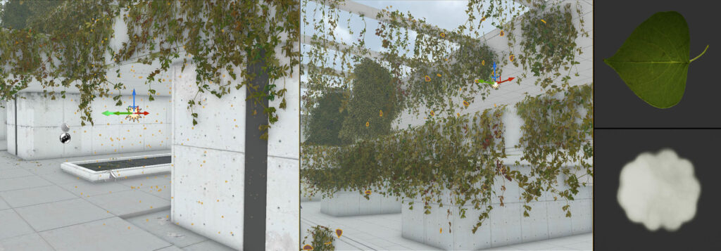
Picture 1: Dust Particles; Picture 2: Leaves Particles; Picture 3: Images That I Used for Particles
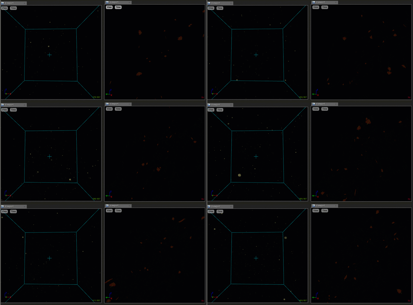
DUST AND LEAVES PARTICLE EFFECTS
One more important thing that I want to mention is the post-process. I use it as a final touch to make the image even more believable and to play with colors a bit more. It is pretty much the same process as the adjustments that are done on the images in Photoshop, for example. I placed one post-process volume box in the scene, set to unbound and adjusted parameters until I was satisfied with the final result. It all goes down to good using of color correction and “eye-balling” until the scene looks more pleasing.
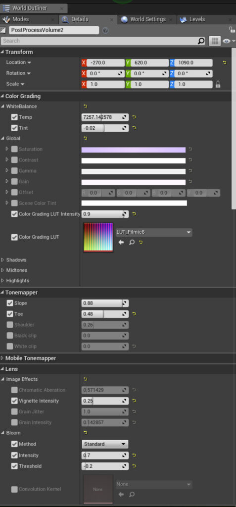
POST-PROCESS PARAMETERS FOR THE SCENE
As you can see in the previous image I used Look Up Tables (LUT) to achieve the desired colors because I find it to be the easiest way to achieve good results, at least for me. It is as simple as taking a screenshot of the scene and color correcting it in some program that you are most familiar with, then using the same adjustments for the LUT image and after that going back with that LUT and placing it in UE4 post-process volume.

LUT SETTINGS
I would also mention the sound as another important component. It is well known that visual and sound parts are always a good combination and goes hand in hand together so I always tend to find good music that will suit my scene and also enhance the emotion and feeling that I try to present.
Melody in the background for this particular scene is “Among Trees” made by – Krale. It is a beautiful music and it blended very well with the scene.
Lessons
A hard thing for me was to understand when to stop because I can always find something that can be better even now when I look at this project.
So I would suggest thinking that it is really okay not to be 100% satisfied with the result and to place the bar a little lower. In that case, if you work on something, you won’t end up in some never ending loop and going through a despair of not finishing anything completely.
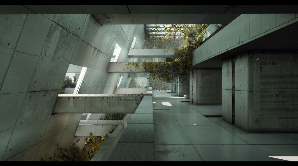
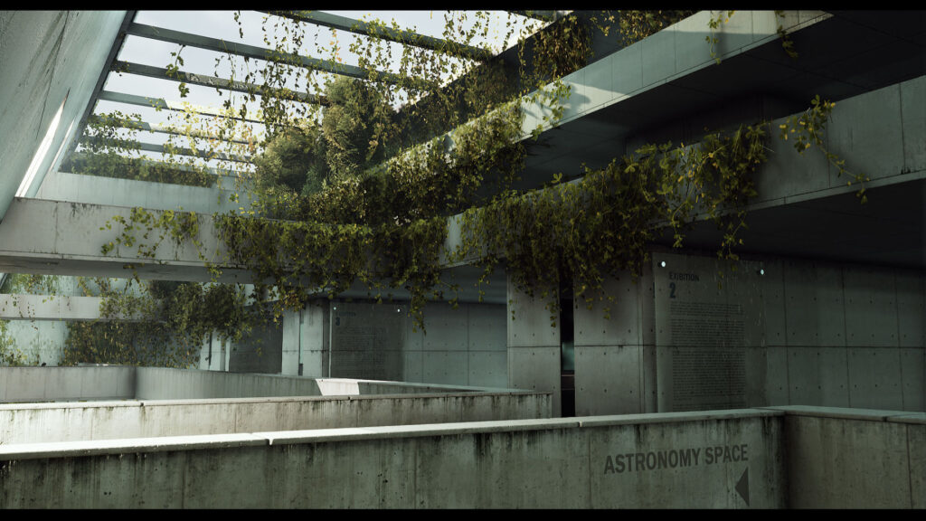
Final Shot from Unreal 4
At the end, I would also like to add that I learned a lot of new things about the environment art during a course at CGMA Academy where I was mentored by Clinton Crumpler. He is a really talented artist and a great guy in general and I would like to take this opportunity and thank him for his awesome teaching. I need to mention that I also learned a lot of new things from the internet, from guys like Koola and 51Daedalus (he has great UE4 lighting tutorials on Youtube) and I would like to thank them too for sharing their knowledge about UE4 and being an inspiration for me to learn more.
For more of my work, visit my portfolio on Artstation or my Facebook page to see what I am working on. This project can also be found on my Youtube channel.
Thanks for reading!


