Stylized Character Art: ZBrush and Maya Workflow
Yon Lee did a breakdown of a stylized character made during the CGMA Stylized Characters in 3D course and dived into the details of each production step in ZBrush and Maya.

Introduction
Hello! My name is Yon Lee. I’m a senior animation student at the Art Center College of Design which is in Pasadena, CA. I love making 2D works in 3D. It is always exciting to turn 2D paintings into 3D models! I like to see how I change 2D designs into 3D. I’m going to graduate this fall, so I’m working on my portfolio now.
When I learned ZBrush for the first time, I thought it was pretty cool software because you can make things like real sculpting, I mean like real clay sculpting. Learning about 3D sculpting was a totally new world to me, so I just fell in love with 3D sculpting. It is the most exciting work for me, so I really enjoy what I do. While working in 3D art, I have worked as an intern for Real Art Daily Productions and a freelance 3D modeler for Epix Animation Studios and Ignite Animation Studios. After finishing my freelance work, I’m currently working on my personal project, a devil mermaid. This is also from the CGMA class.
About CGMA
The reason I decided to join the CGMA course was because of the instructor, Hannah Kang. She is a 3D modeler in Dreamworks Animation, and I have seen her wonderful artworks, so I thought it would be a great time for me to learn about 3D sculpting from Hannah Kang. My goal in the CGMA course was to be more professional. I thought: “Yeah, it is time to be more professional… Let’s do it!”. I wanted to know more about ZBrush sculpting and also the animation pipeline. Especially, I want to learn how to build details in ZBrush because I was not good at building details in ZBrush.
Working on the Idea of the Character

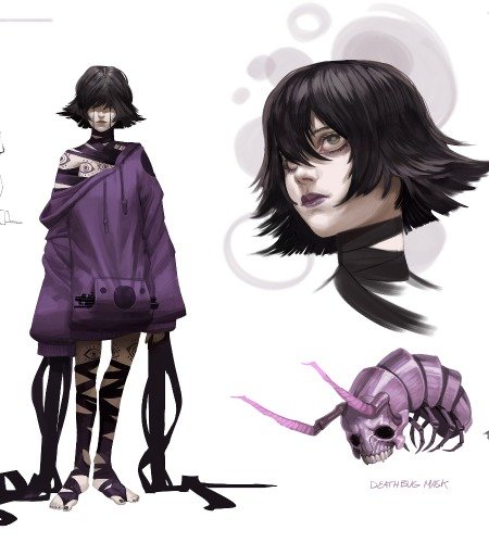
First, I decided to pick concept art which has big and small, nice stroke flow, and great proportion. David’s artwork has a big and small shape and nice stroke flow(look at his legs!), so it stood out among artworks. Also, David is a really great artist, so I always wanted to make his artwork into 3D. Thanks to the CGMA course, I could have a chance to turn David’s art into 3D. When I saw this artwork, I thought he is a nice guy who enjoys his life. Look at his face. You can feel how the character is relaxed and ready. So I tried to bring his nice feeling into 3D. Relaxed smile and eye-looking for a date, haha.
Modeling

First, I made a body and face without clothes. It was important to keep an eye on the proportion because if you set the wrong proportion, it would be hard to fix when you posed the model. During this process, I mostly used ZBrush. By using clay build and dam standard, I make details on the body and face. Turning the camera view, so I make sure the model looks nice in every angle. While I worked on the body, it became heavy and heavy because I did dynamesh. When I thought my model was heavy, I always did Zremesh.

After making the body, I moved to the next part, clothes. For the suit, I used Maya because it was pretty hard to make the suit in ZBrush to me. Good thing was the original concept art doesn’t have much detail, so I could just keep focusing on the proportion of clothes. Comparing my work and the original art, I tried to follow the stroke flow of the original artwork. This was different from realistic modeling because when you work on the stylistic character, it is always important to keep the stroke flow. I know it sometimes doesn’t follow the anatomy, but it is for the stylistic world. It is fine, you don’t have to make everything realistic.
Working on Colors
I matched colors on the original art because I wanted to bring the mood that the original artwork has. I used the Arnold shader in Maya. I didn’t put detail for the texture because what I wanted was making people focus on the shape for the first.
Working on a cartoon-y character is tricky. It is like a wire-walking between stylistic and realistic. I wanted my model to look fine in the turntable, so I made the list for 1 to 10. The first thing was matching the front view of the concept art. It was the most important thing to me. Then, I turned the camera and checked if it looked okay in every frame. If there were any mistakes, I went back to ZBrush and fixed it.
Clothes Workflow
For the detail on the suit, I sculpted all wrinkles in ZBrush. As the character is stylistic and cartoon-y, I avoided making clothes too realistic. My character has nice stroke flows, so I tried to keep these flows in wrinkles, too.
I also wanted to make a wireframe turntable video, so I did retopology for everything like the body, the suit, the hat, and etc. The wireframe should look clean, so always keep in mind to keep the clean and nice topology. The good thing about the wireframe is you can check overlapped polygons on wireframe mode. If props overlapped too much, I fixed one of them. It always helps to keep a clean and nice wireframe.


Lighting
Lighting progress is fun, but also hard work for me. What we need to get from lighting is the nice shape language, but if you use too many lights on the scene, you will get a flat and boring render. Before doing lighting in Maya, I used ZBrush BPR render process. It is good to use ZBrush lights before rendering in Maya. You can get a fast test render by using ZBrush lights. If you think test lights look fine, then move into Maya and set lights.


Try to set lights as similar as possible like in ZBrush. When you test the render, keep the render setting as a low resolution for saving time. You can set the high resolution after the test render looks nice. As I said above, I didn’t want my character to look flat because of too many lights. Therefore, I only used three lights. Two lights are for showing the nice silhouette. Lights on the edge of the character help to show the shape. However, sometimes you want to make some parts darker. Especially when the light hits too bright on the shoe. When I tested the render, I found that the left shoe looked too bright than the right shoe. So, I put the light blocker to make the left shoe a little bit darker. Then, I added one more area light for the face. The face is the most important part for me. I always want people to focus on my character’s face for the first time, so I usually put one more light on the face. Making the face part brighter than the feet part is helpful to hold people’s eyes on the character’s face. When you put the focus light for face, don’t forget to make it smooth to avoid too many differences from the bottom part.
Biggest Challenges

Posing! Posing is the biggest challenge for me. It is always tricky to pose the character even though you put the original concept on the side. In my case, I render in Maya, so it always has small gaps between the ZBrush camera and Maya camera. When I sent my first ZBrush pose to Hannah, she gave very detailed feedback. As you can see in the left pic, my first pose was in the wrong position and proportion. Also, his eyes were too big, and it didn’t have a relaxed smile on his face. It is helpful to ask for feedback from other people because when you are working on the project for a long time, your eyes cannot catch the wrong parts due to tiredness. In my case, Hannah’s feedback was correct to fix my posing.
Based on Hannah’s feedback, I fixed the proportion and rescaled eyes. After fixing the pose, I imported everything into Maya. When you set up the camera in Maya, you will realize that camera is not the same as in the Zbrush. So, there are some differences when you render in Maya. It happened to me, too, so I fixed again in the Maya. When I pose the character, I try to put the mood of the original art. As I said, I wanted this character to have a relaxed and ready smile on his face, and the body should have a nice shape flow. When you fix posing and it looks fine, then it is time to render!
Final Thoughts
During the CGMA course, I learned that every stage in sculpting is important. Blocking, sculpting the body and clothes, retopology, rendering. Every stage is important to make a nice 3D model. You can’t just say “Ah, I don’t like sculpting the body, I’m gonna fix it later when I do posing” like this. Keep eyes on from blocking to rendering. One small part that you missed can come up with a big flaw later. So put your focus and love on each stage!
I’m going to make some environment models for the next, and my goal is to make the character with the environment, so it looks like a shot of animation.
Thank you!


